
Payette Provisions
A Boise original gets ready for its next ride.
Our Role
Brand Research & Competitive Analysis
Brand Strategy & Positioning
Naming & Brand Architecture
Visual Identity & Brand Guidelines
Messaging & Copywriting
Packaging Design
Naming & Brand Architecture
Creative Direction
Campaign & Community Activation
Since 2011, Payette has been part of Boise's craft beverage story, building a following around good beer, outdoor adventure, and a gathering place along the Boise River.
Fifteen years later, the beverage landscape—and Payette itself—had changed. With a growing lineup of ready-to-drink cocktails, evolving production operations, and new expectations from customers, it was time to rethink what the brand could be.
The Opportunity
Changing market. Unchanging values.
Craft beer wasn't the booming category it once was. Consumer preferences were shifting, competition was growing, and Payette was navigating its own evolution from brewery to a broader beverage company.
But the challenge went deeper than the products.
After 15 years, Payette had built considerable brand recognition and community history. The opportunity was to preserve that equity while creating a more relevant, inclusive brand with room to grow.
Payette needed more than a new look. It needed to reconnect with its community, make room for new audiences, and create a brand that could carry its next chapter.
A grown-up brand for those who play.
The Research
Before the Rebrand, the Reality Check.
Before touching the identity, we set out to understand what people really thought about Payette.
We fielded a customer survey with approximately 200 responses, analyzed Google reviews, and mapped the competitive landscape to understand where Payette stood—and where it could stand apart.
The findings revealed a compelling contradiction.
59.6% of respondents visited for the outdoor space, reinforcing the value of Payette's location and gathering environment. Yet only 20.2% considered it a destination.
Customers expressed genuine nostalgia for the Payette they remembered, alongside concerns about its changing local identity, beverage variety, and overall experience.
One insight rose above the rest: Payette's greatest competitive advantage wasn't just the beer. It was its ability to bring people together.
That became the foundation for a new positioning—one that could reclaim Payette's community roots while giving the brand permission to evolve.
The Solution
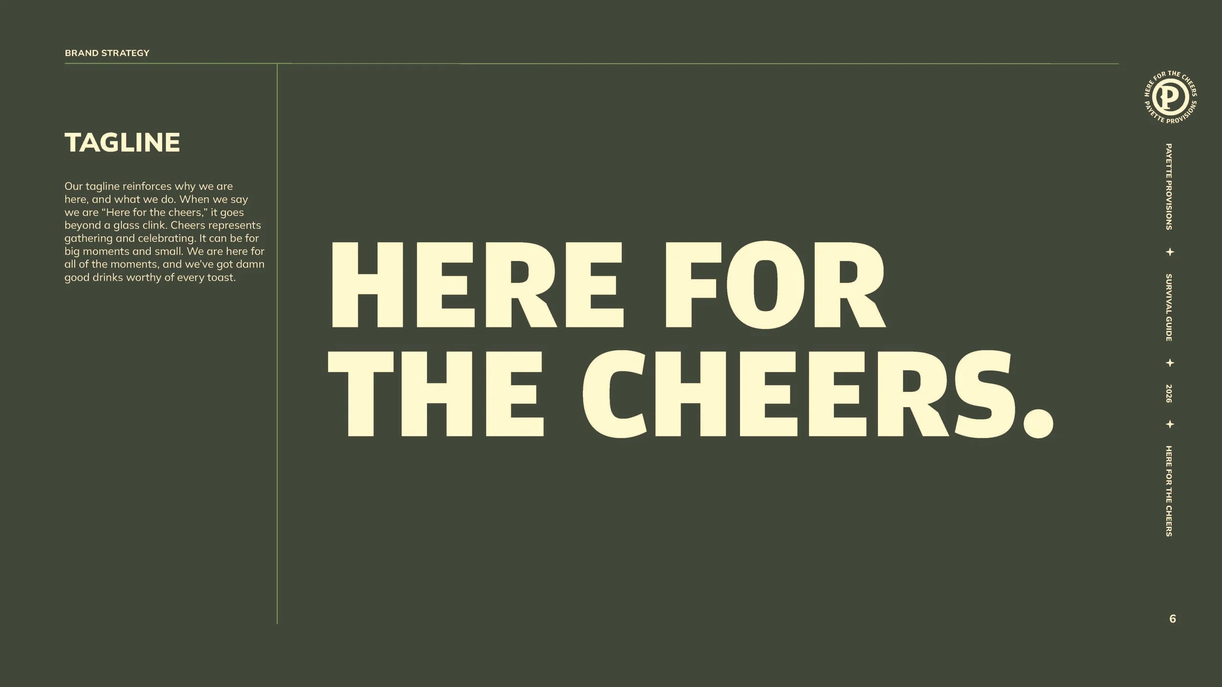
Here for the cheers. Not just the beers.
The research gave us a new way to think about Payette: less as a brewery defined by its products and more as a gathering place defined by its people.
The conversations. The celebrations. The familiar faces and new friends. The feeling of finding your people.
We repositioned the business as Payette Provisions, a name that could encompass beer, ready-to-drink cocktails, and whatever came next without being defined by brewing alone.
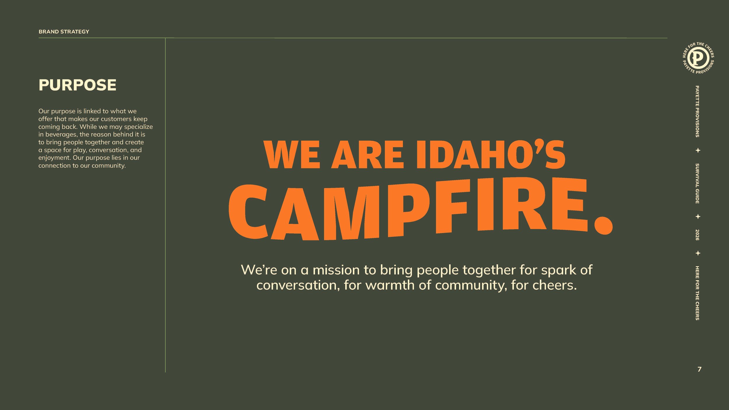
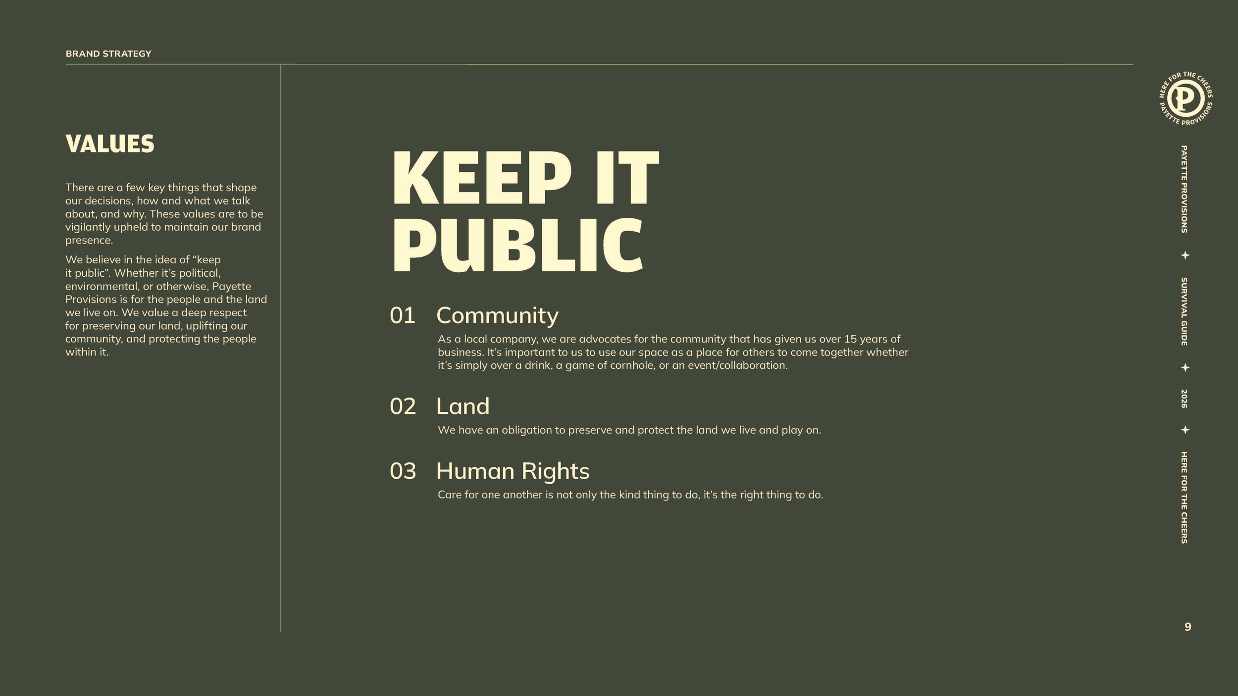
At its heart was a simple idea: Payette is Idaho's campfire.
A place to gather, share stories, and feel welcome. A brand grounded in the outdoors, nostalgia, play, and community—with a new tagline to bring it all together:
Here for the Cheers.
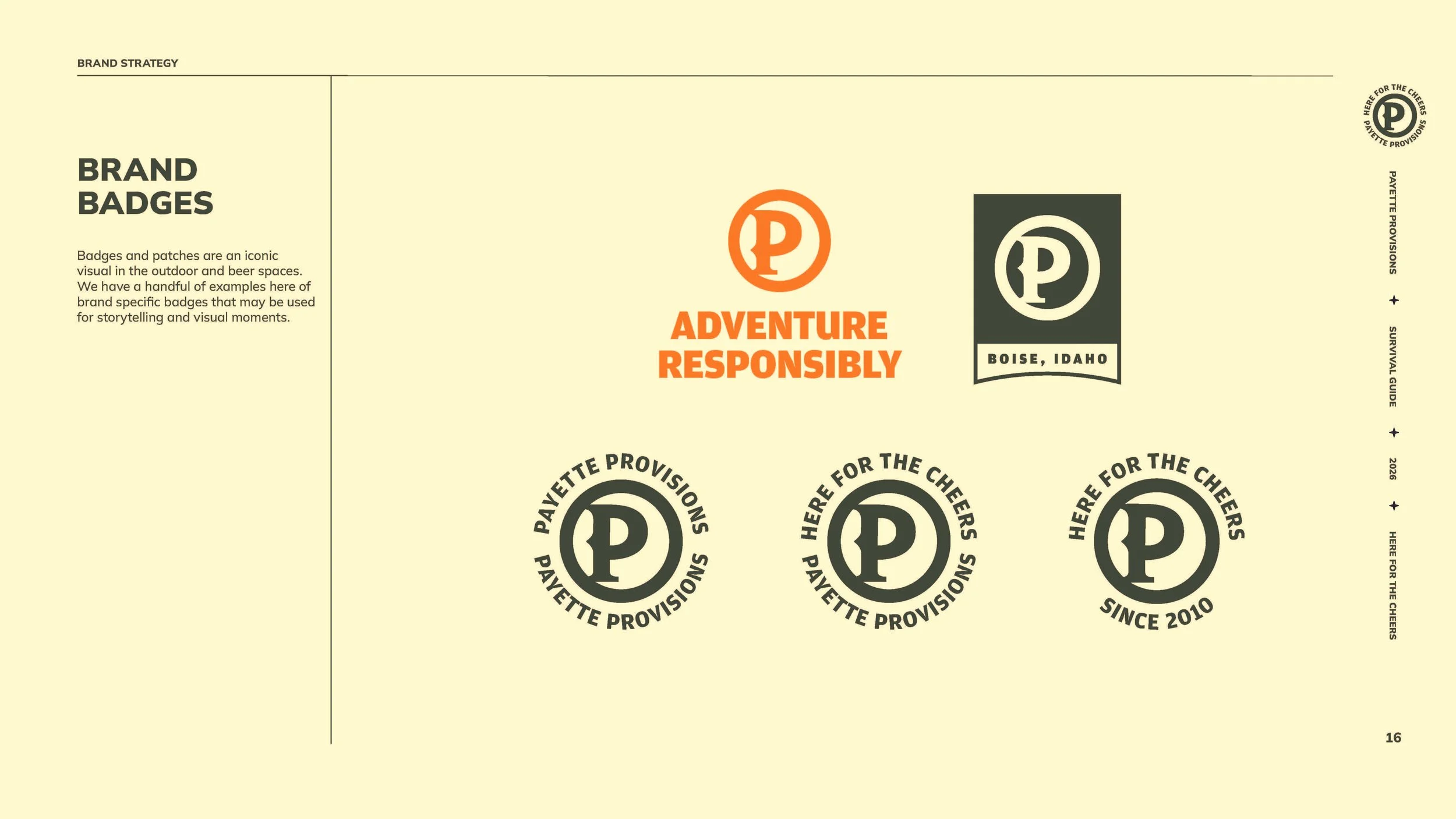
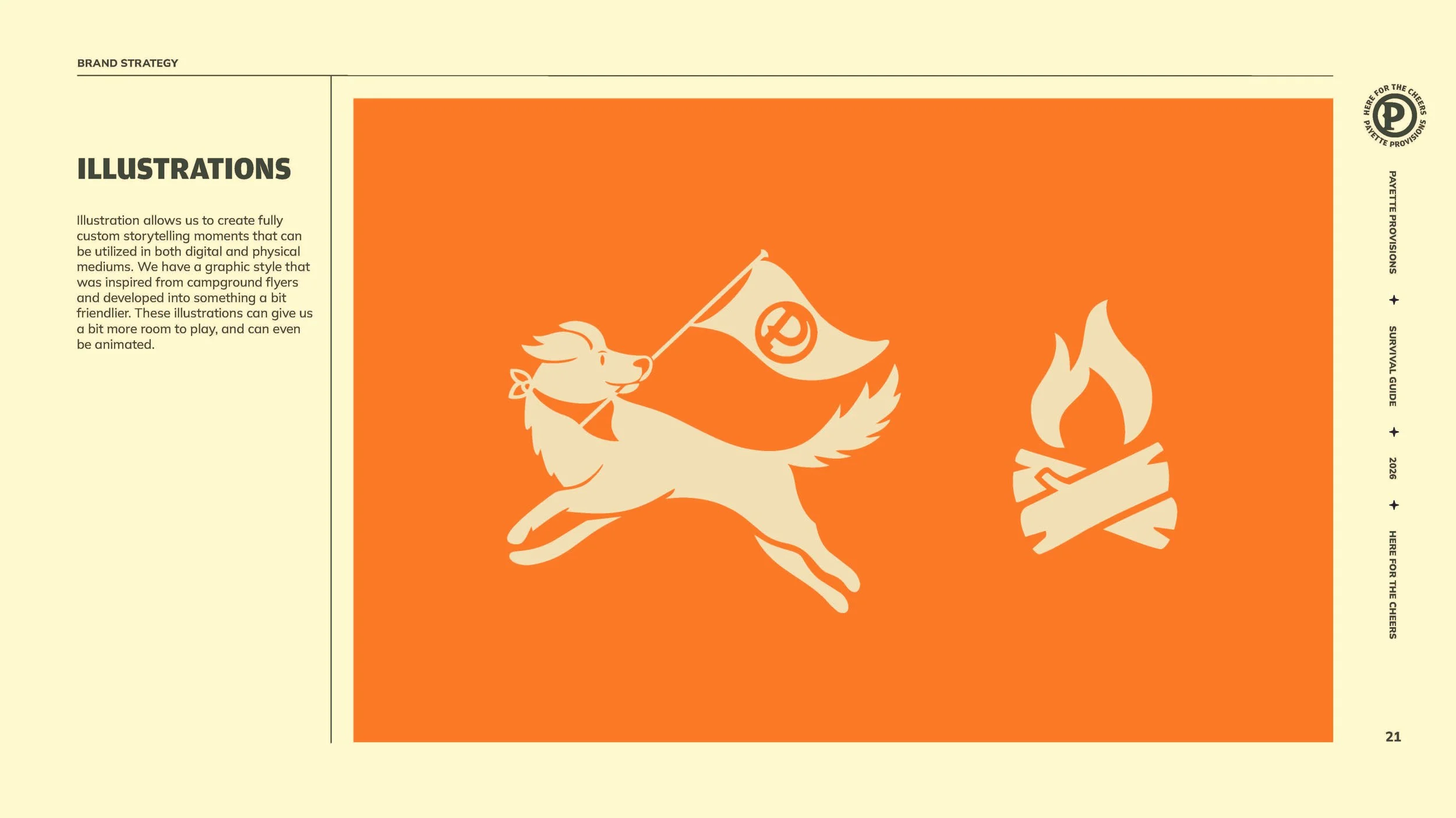
01 / Bring Back Camp.
A little nostalgia. A lot more personality.
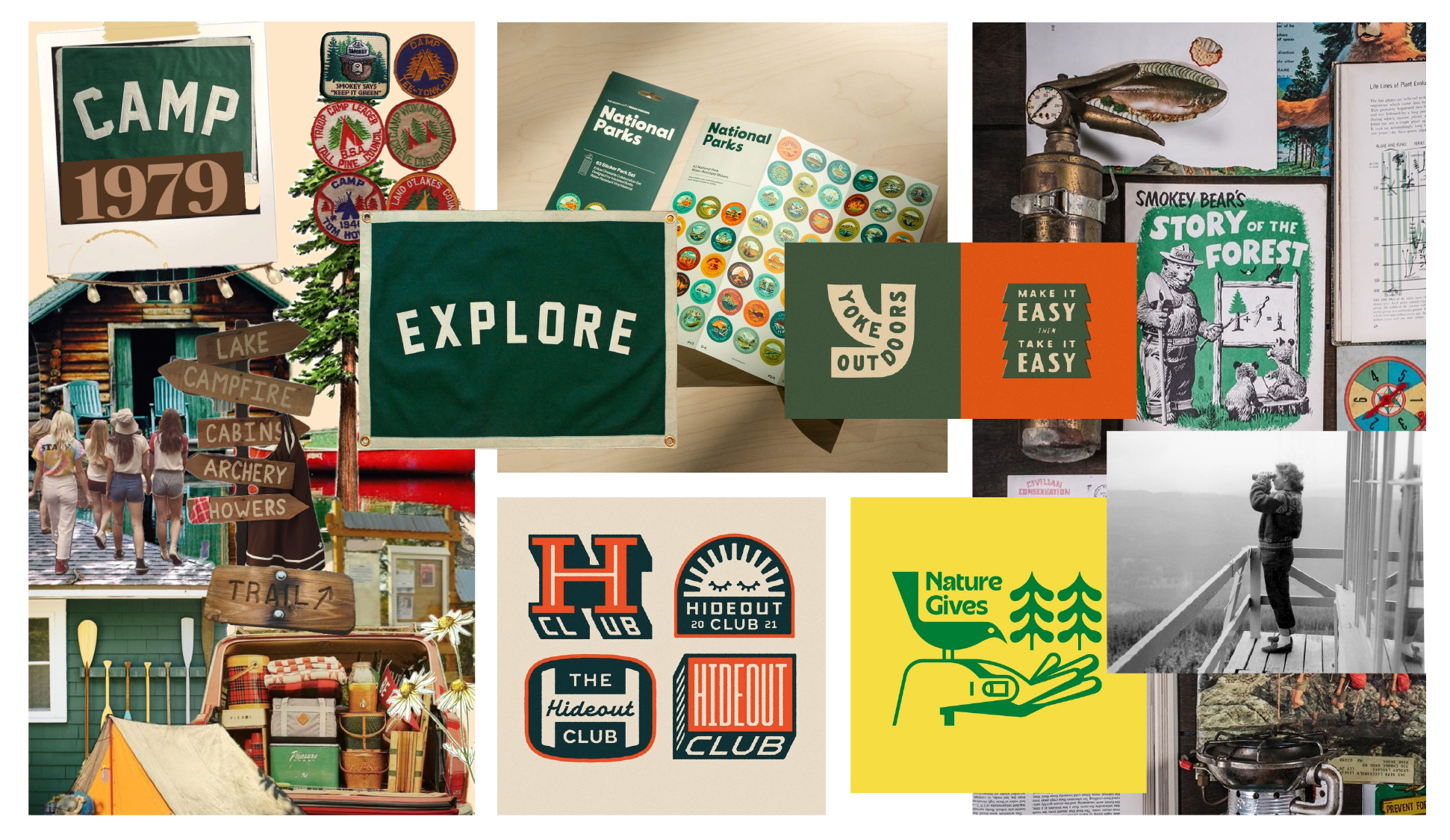
We looked to the familiar magic of summer camp for a visual identity that felt warm, playful, and distinctly outdoorsy.
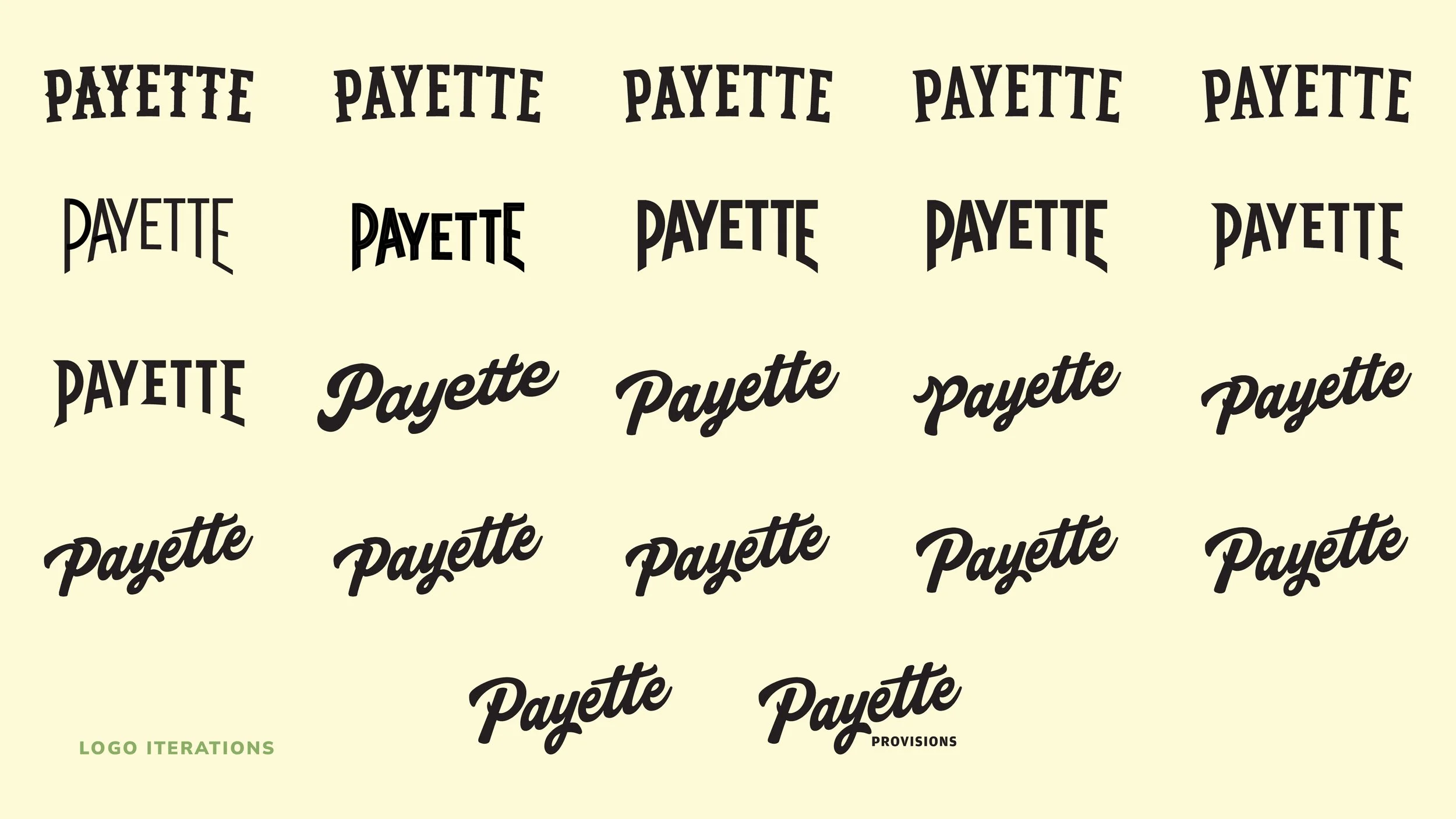
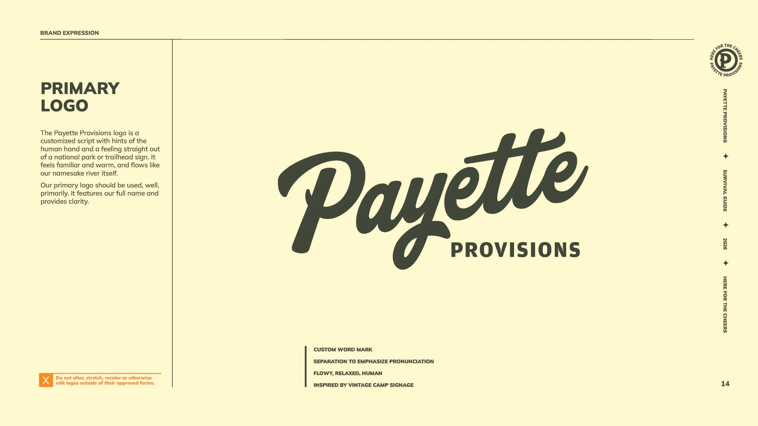
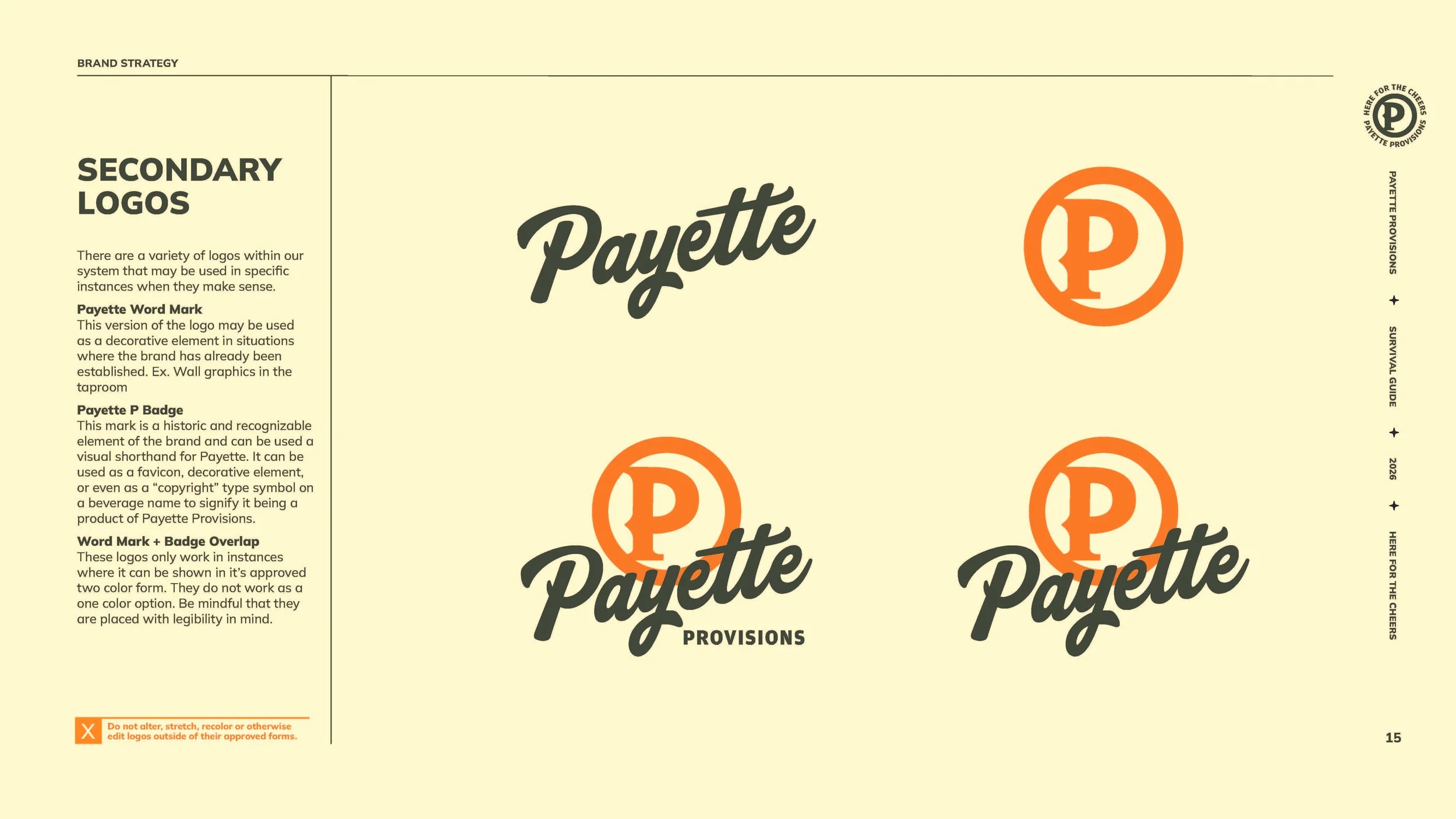
Vintage trail signage, campground badges, worn textures, retro colors, and custom typography informed a flexible design system that honored Payette's roots while giving the brand a fresh personality.
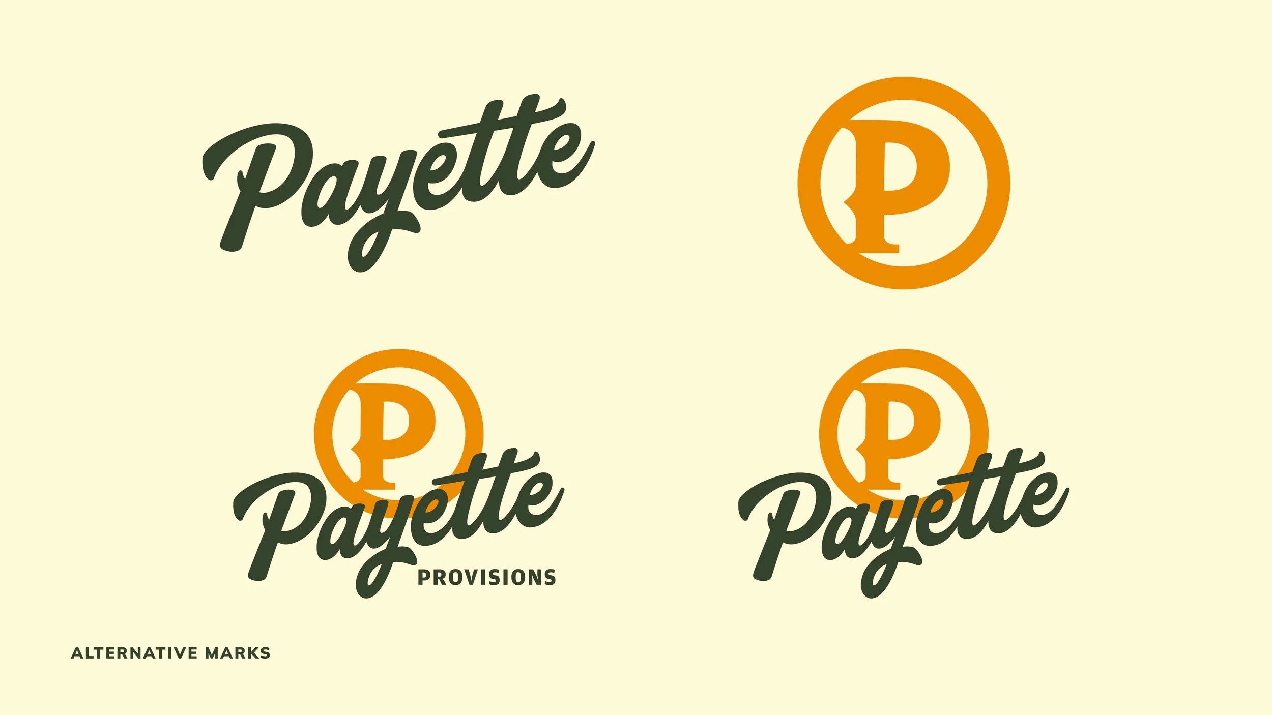
The identity carried through a new logo system, brand voice, photography direction, illustration style, and comprehensive brand guidelines.
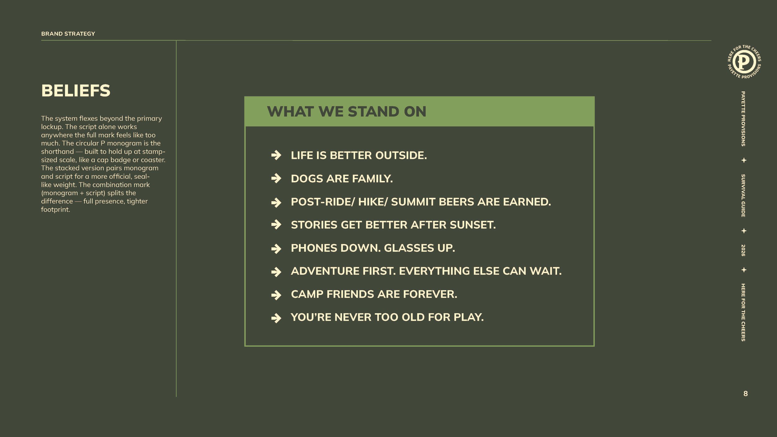
And the campfire idea wasn't just visual. It shaped the brand's values and invitation to the community:
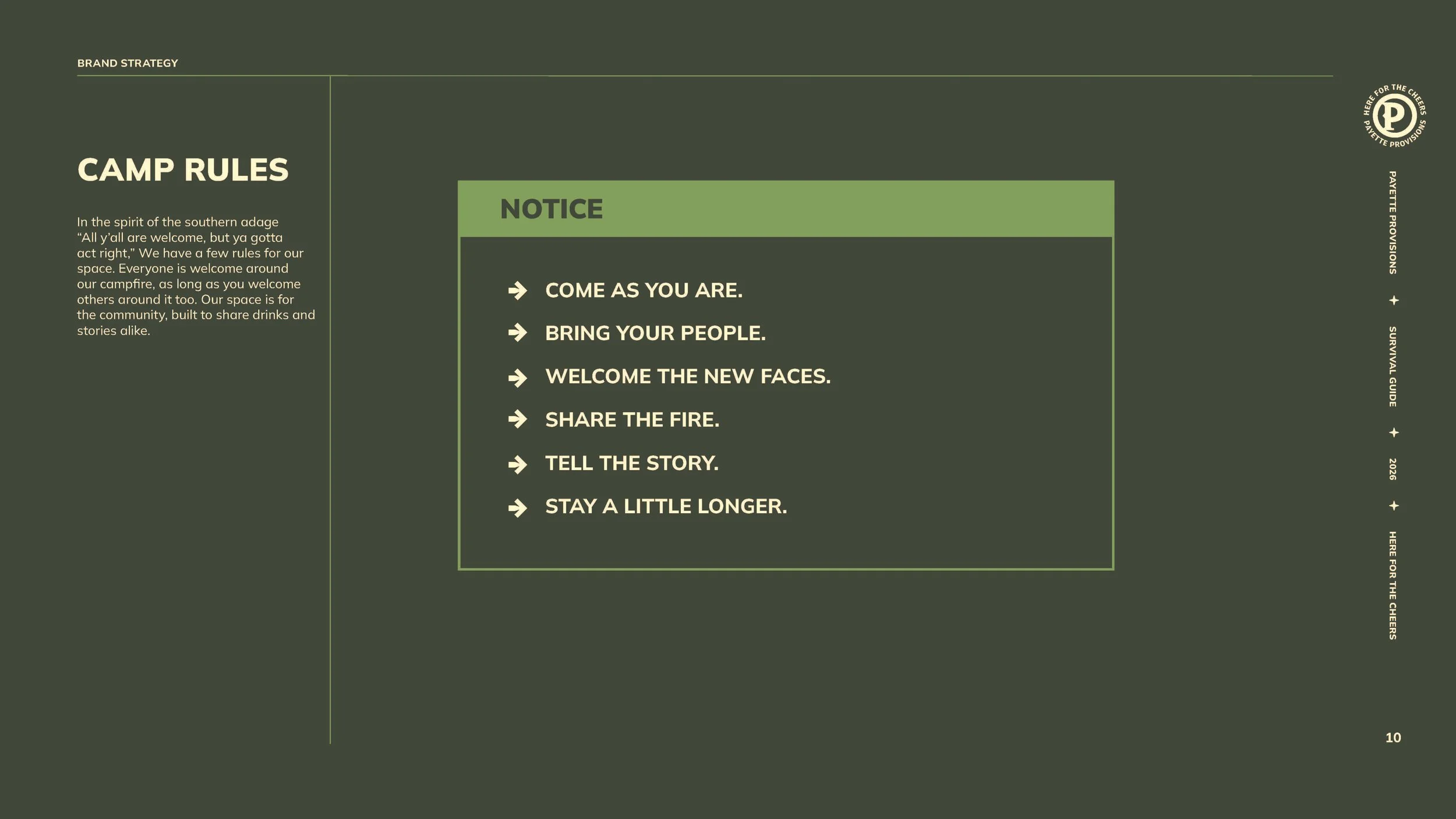
Everyone is welcome around our campfire, as long as you welcome others around it too.
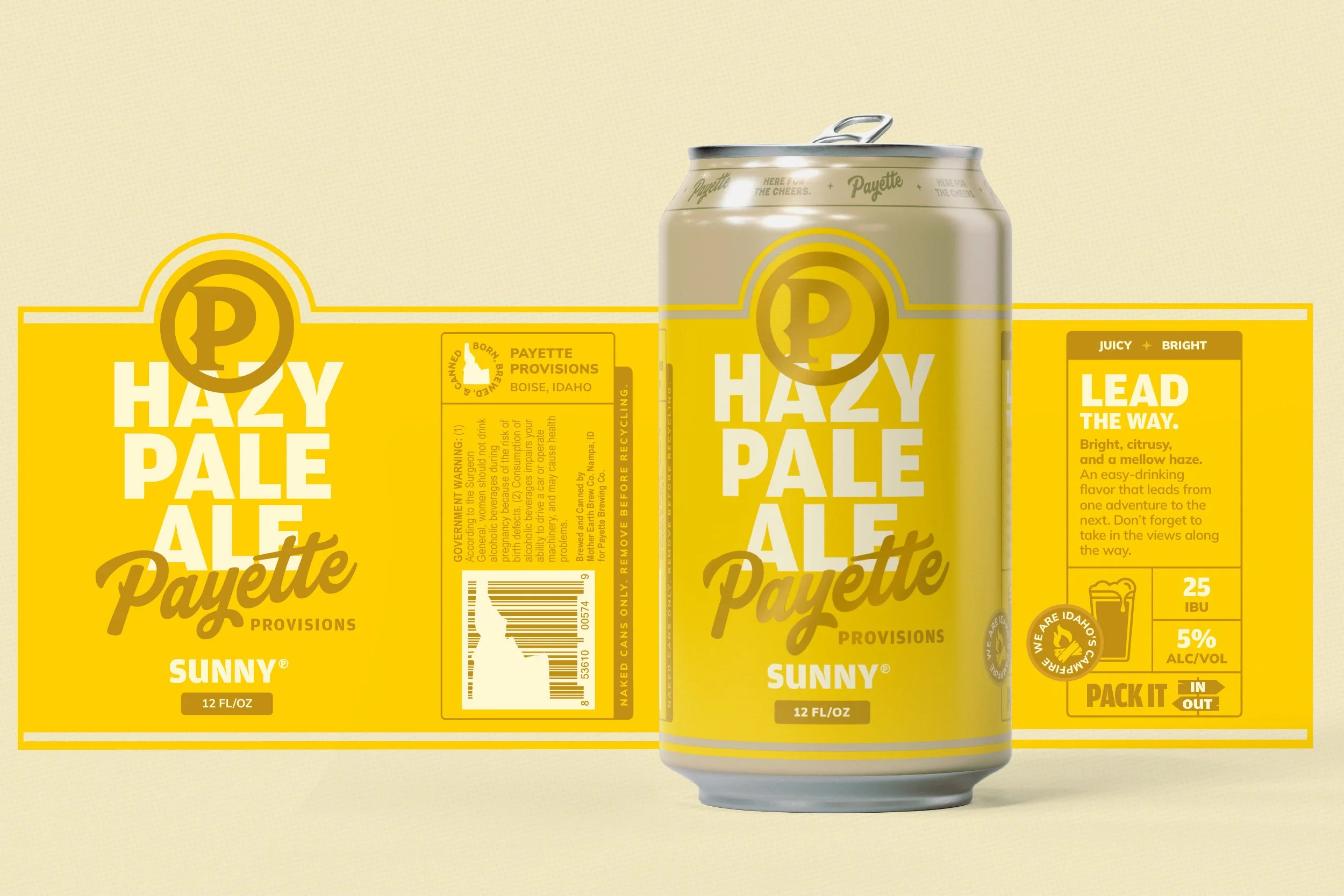
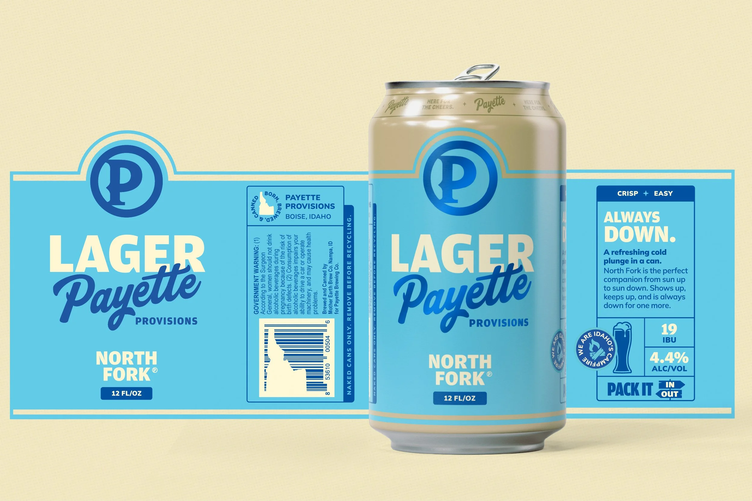
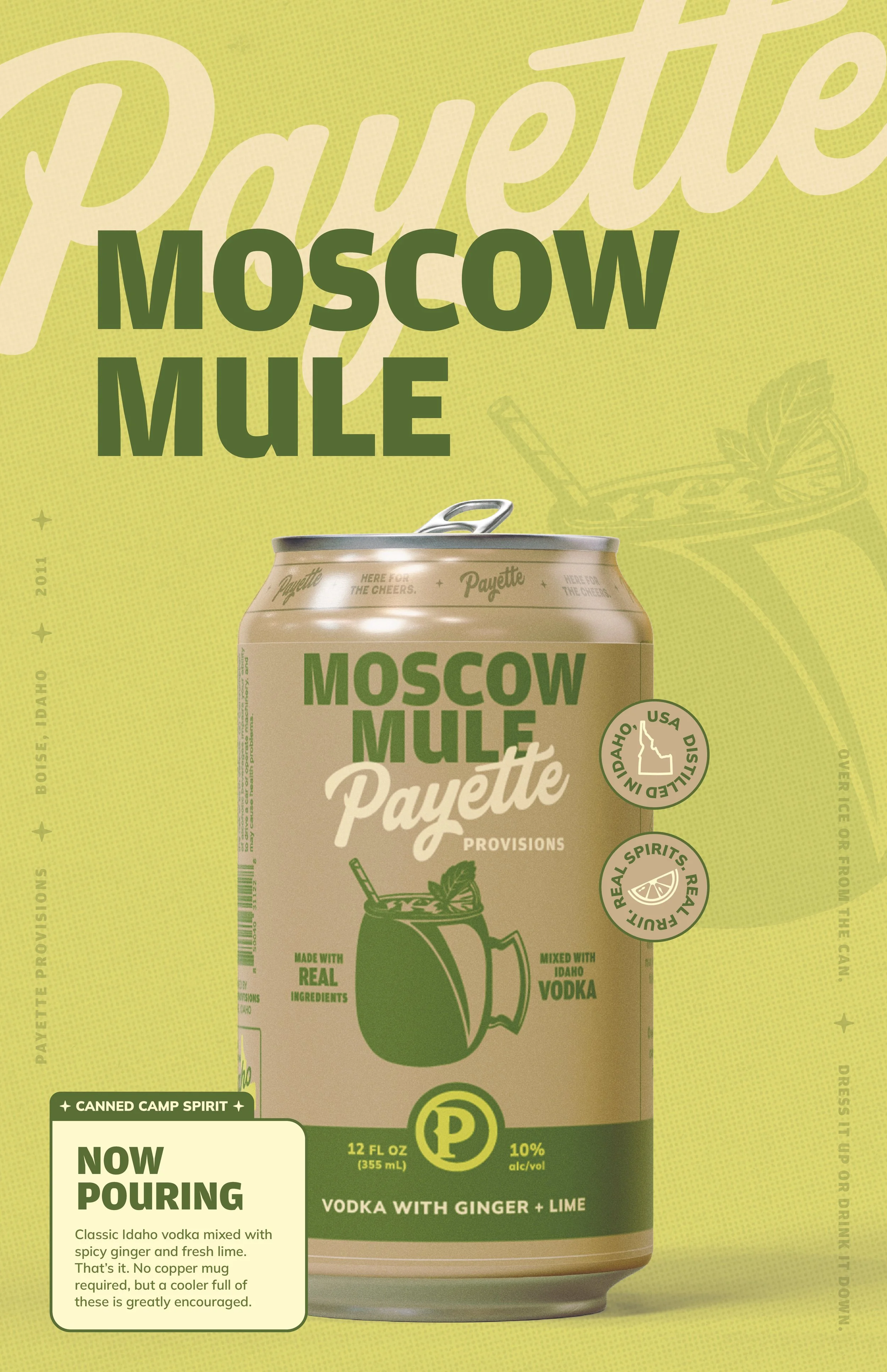
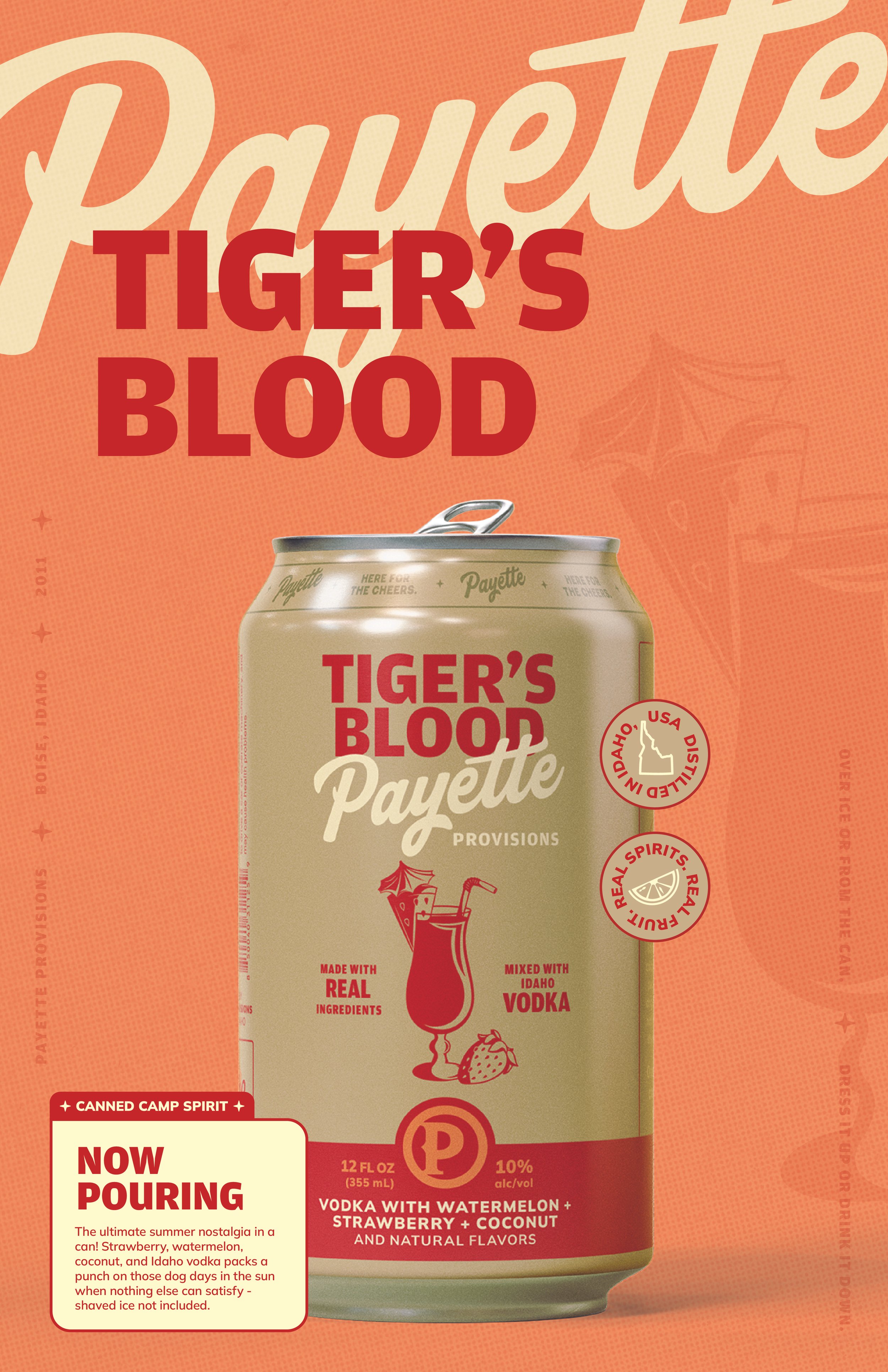
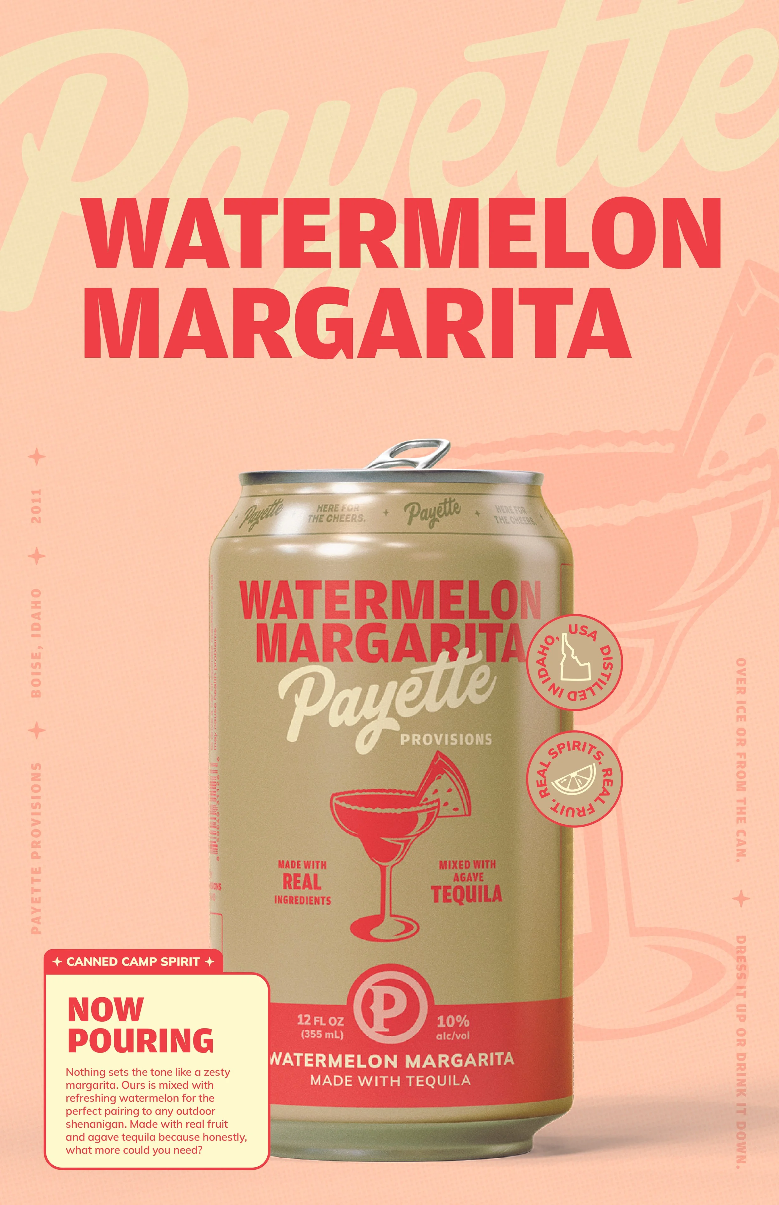
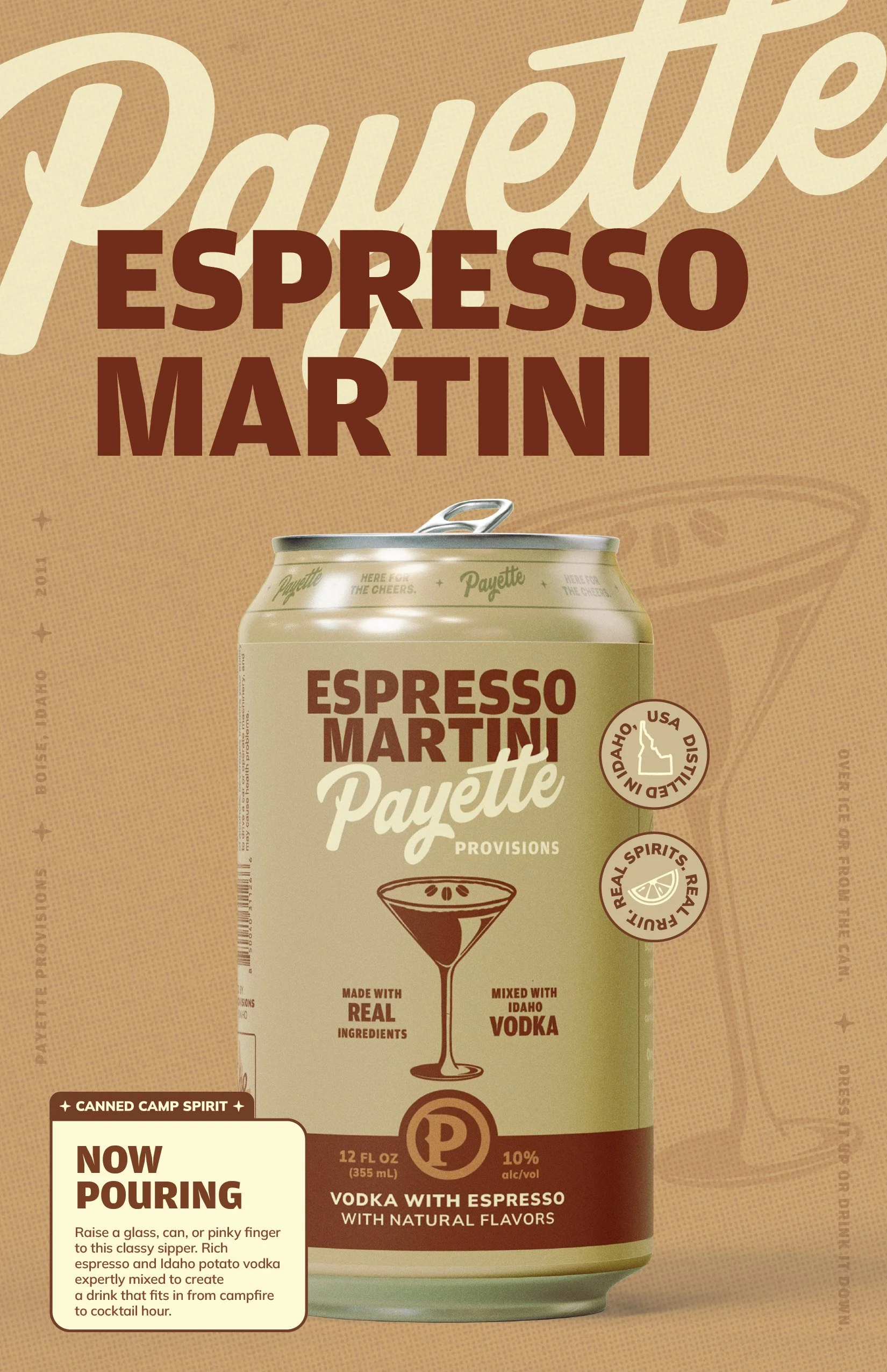
02 / Pack for the Next Adventure.
A new identity made to travel.
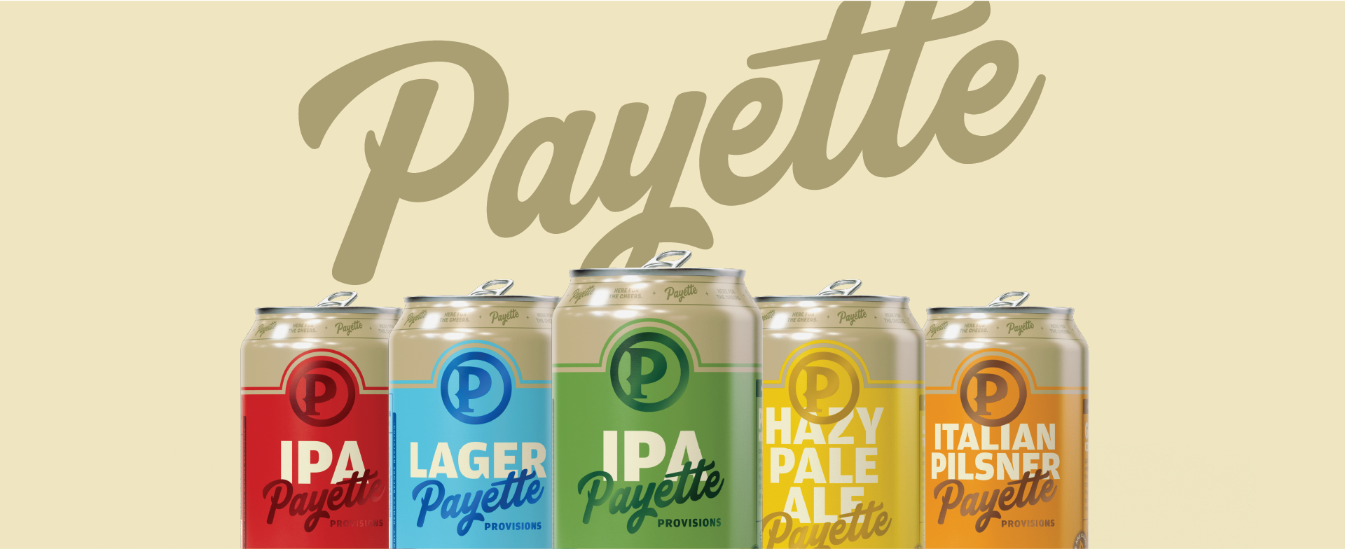
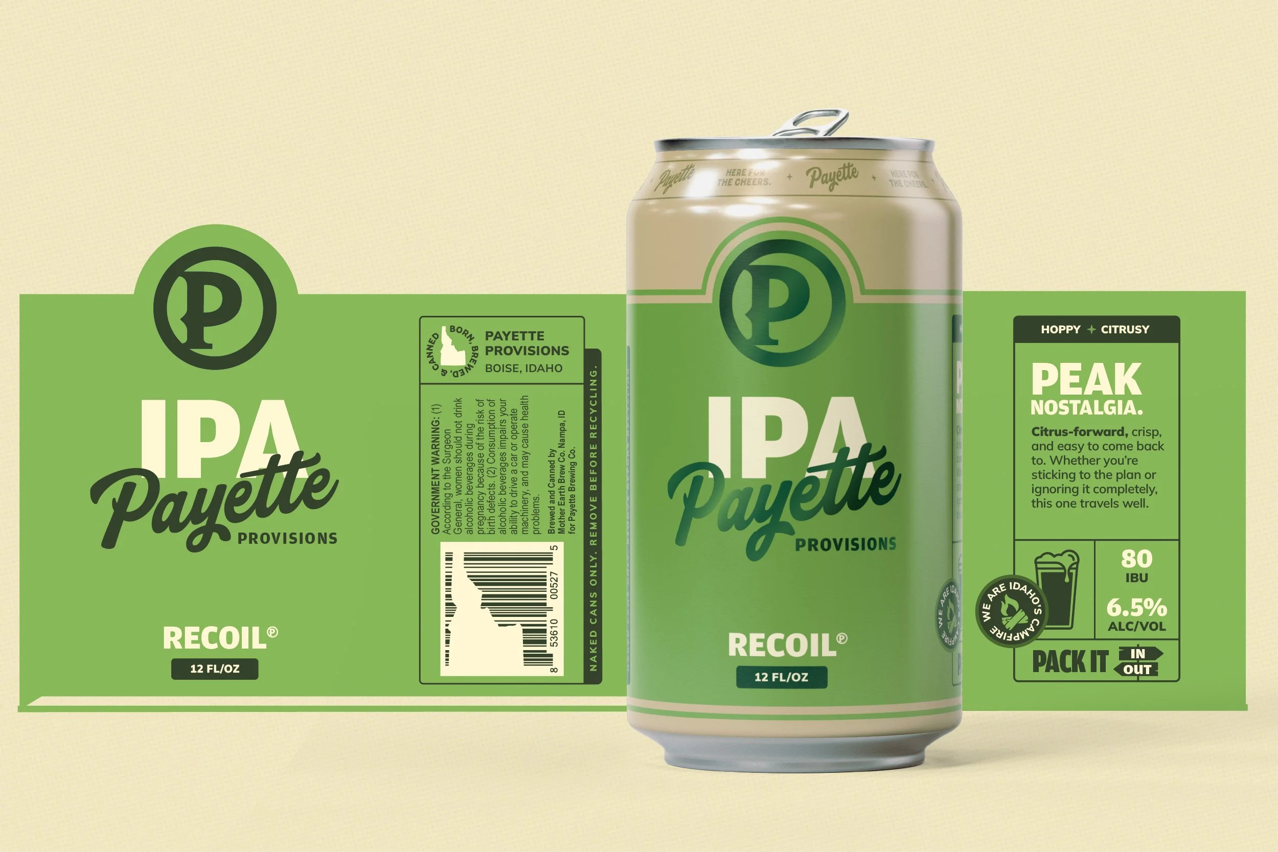
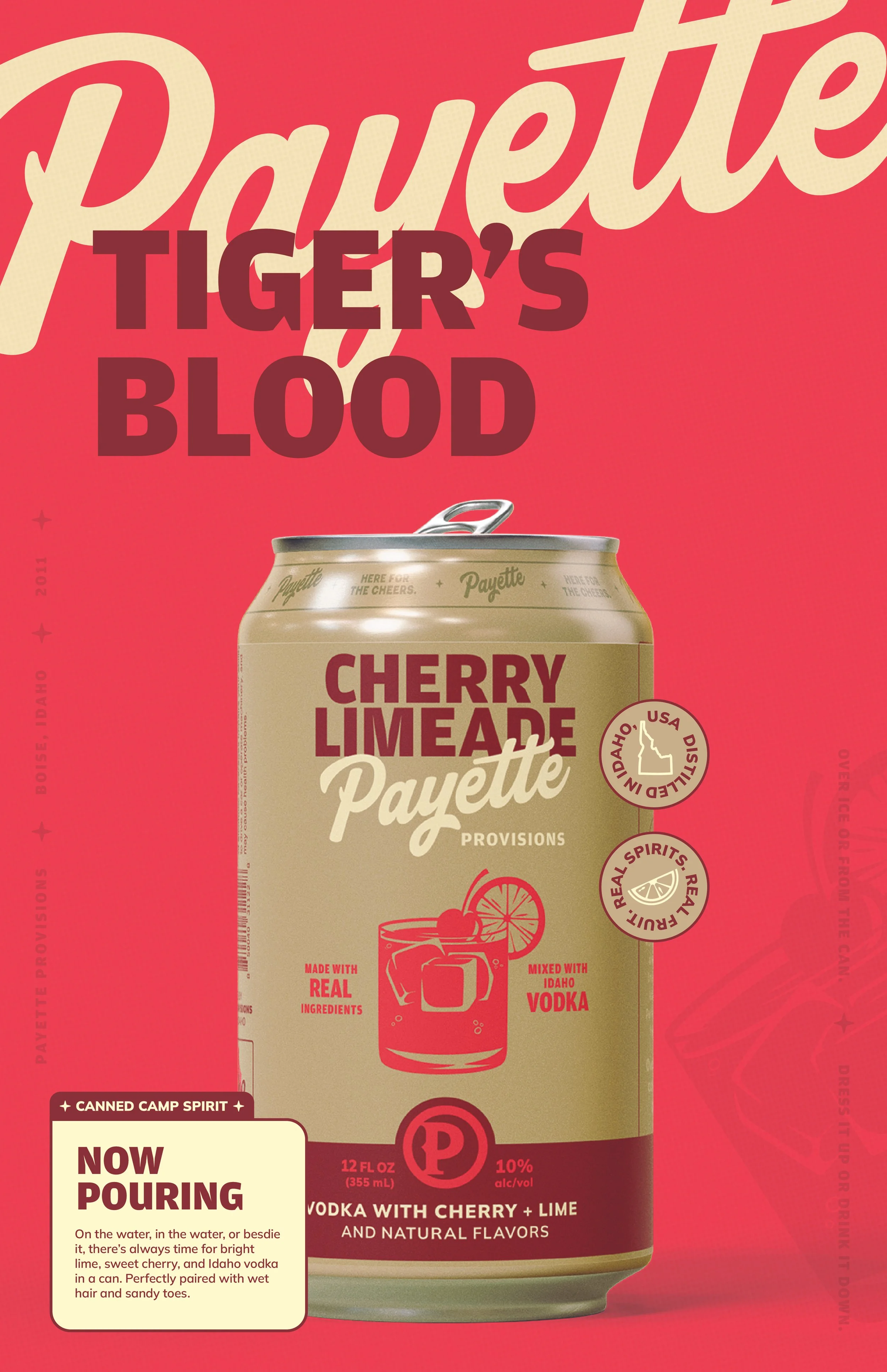
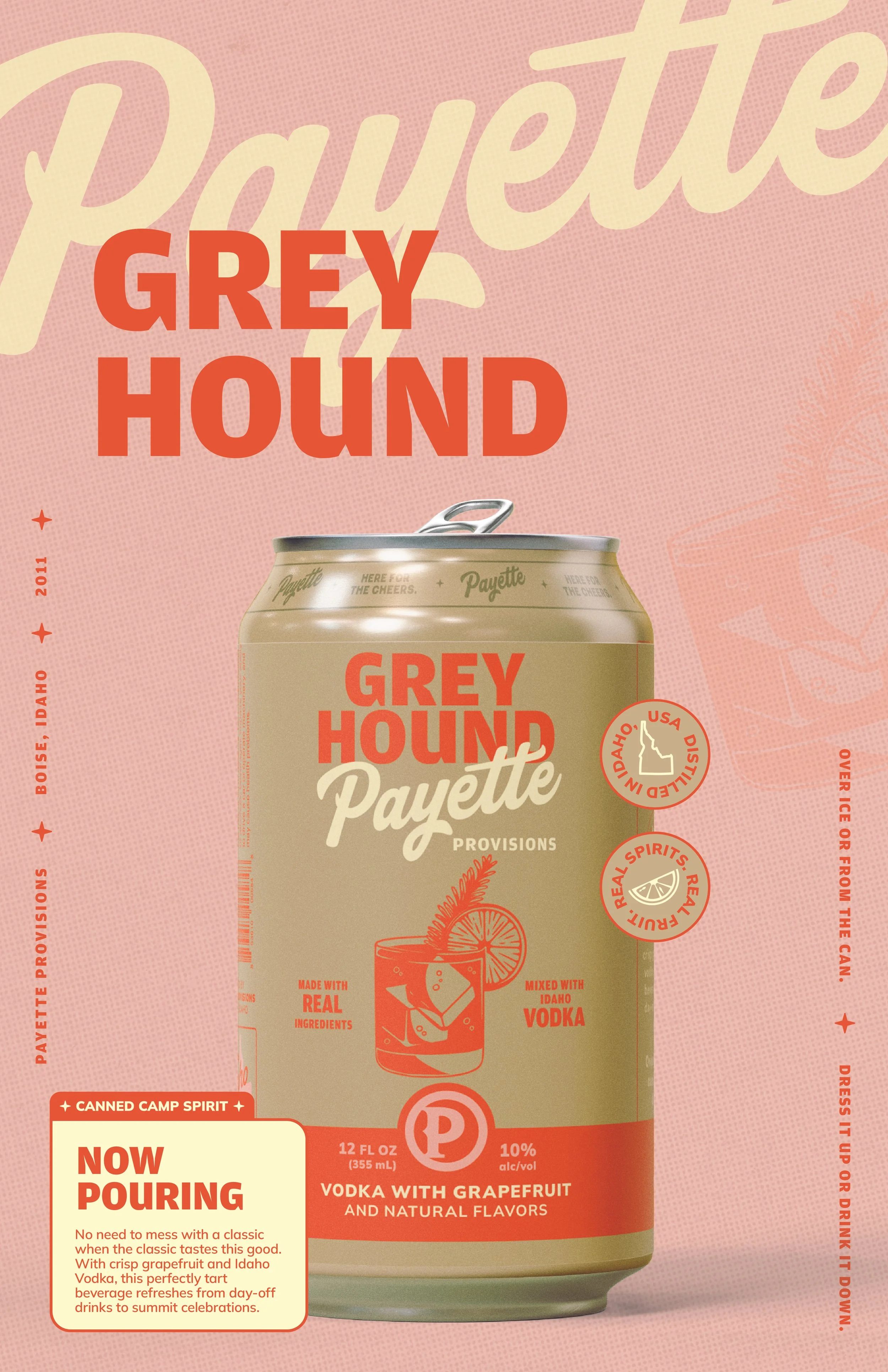
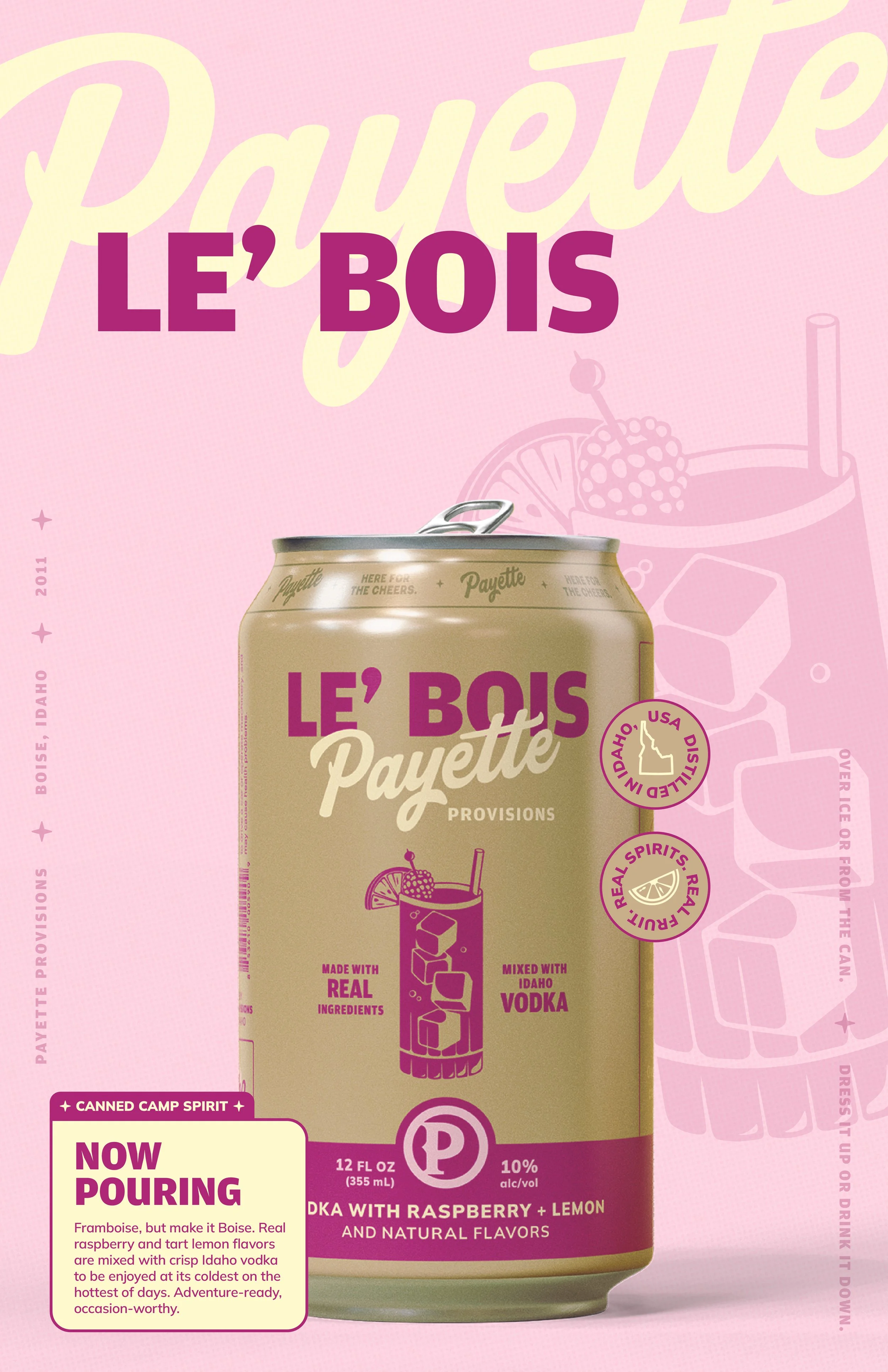
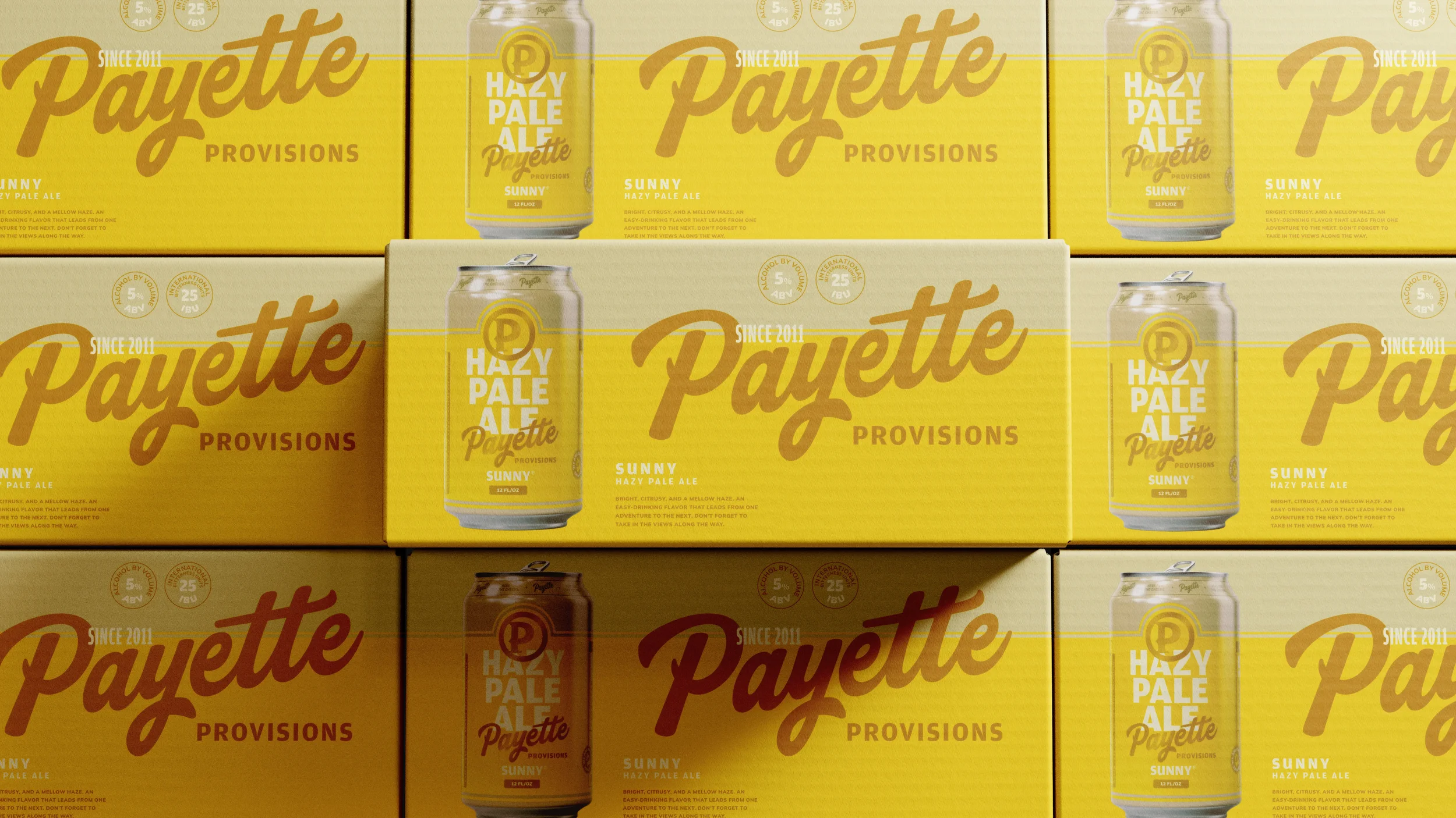
Packaging was a major expression of the rebrand—and a critical opportunity to make Payette's expanded product lineup feel like one recognizable family.
We brought the new identity to life across beverage packaging, connecting the nostalgia and personality of the brand with the practical need to distinguish products on shelves and in coolers.
The shift also brought Payette's ready-to-drink cocktails, previously marketed as Any Timers, under the Payette Provisions name, with product-forward naming that made the offering easier to understand.
The result was a packaging system that could stand out on shelves, feel familiar in the hands of longtime fans, and introduce Payette to a new generation.
03 / Make Room Around the Campfire.
A brand promise brought to life.
A more inclusive brand needed to show up in more meaningful ways—not just say the right things.
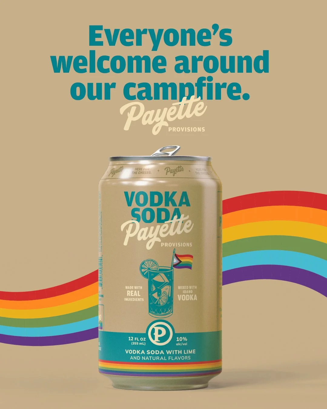
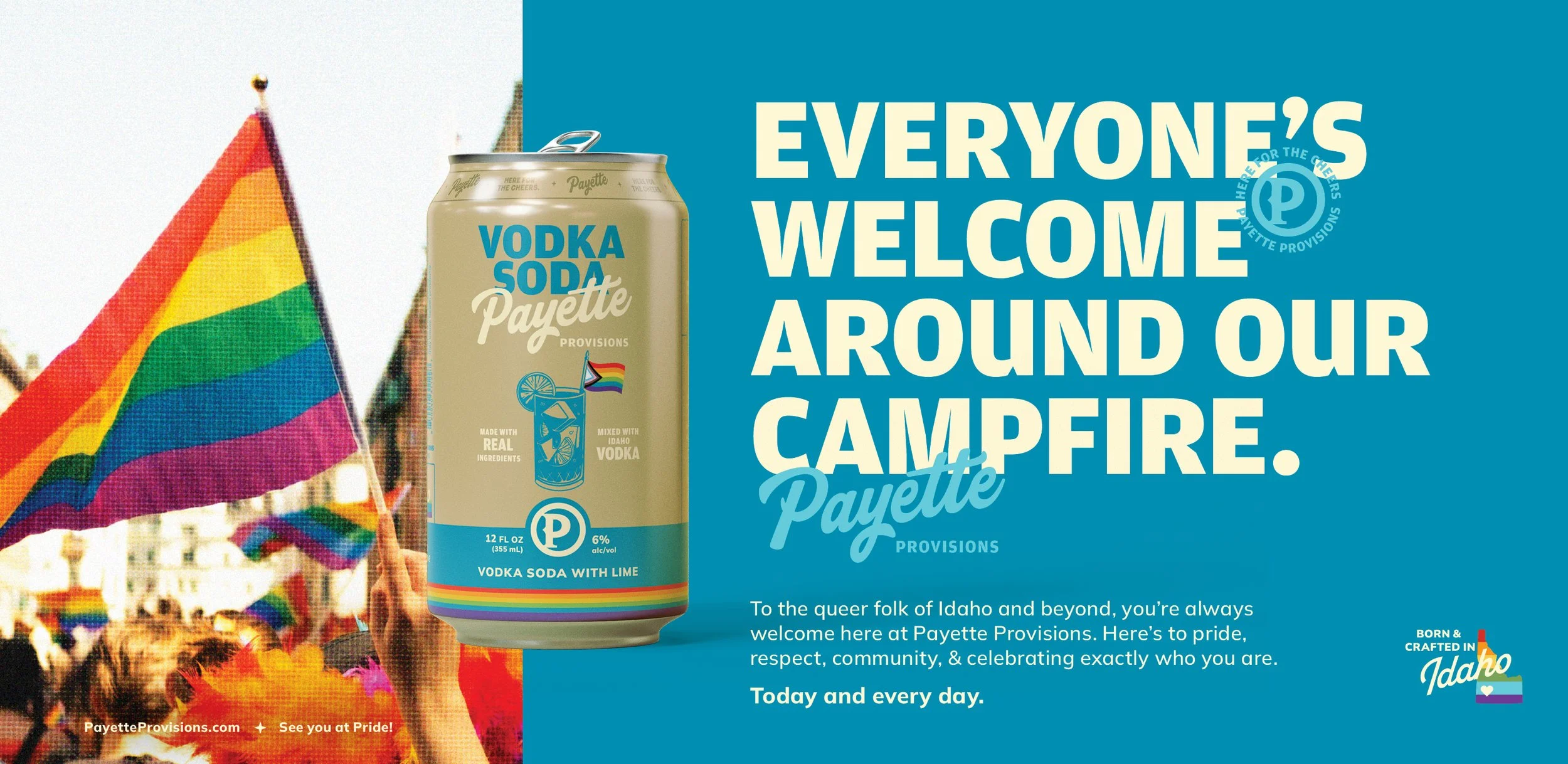
We extended the refreshed identity into community activations, including Payette's participation in Pride through a specialty canned cocktail, print advertising, and a festival presence.
These expressions brought the brand's positioning beyond packaging and into the community, reinforcing a simple belief: everyone deserves a place around the campfire.
Same roots. A whole new reason to cheers.
One Refreshed Brand Identity
Honoring 15 years of Boise history while creating room for the next chapter.
One Unified Beverage Portfolio
Bringing beer and ready-to-drink cocktails together under Payette Provisions.
A Packaging System Built for Recognition
Honoring 15 years of Boise history while creating room for the next chapter.
A Clearer Community Promise
Expressed through the brand platform, creative work, and participation in moments like Pride.
The result is more than a new name or a new look. It's a more flexible, welcoming foundation for a Boise original—one that celebrates where Payette came from while making room for everyone who's coming next.
Here for the Cheers.