
Happy Day Brands
packaging design that stops the scroll—and the shopping cart.

Our Role
Branding
Package Design
Go-to Market Strategy
Digital Marketing
Brand Strategy
Market Research
Creative Strategy
E-commerce
Happy Day Brands is busy creating smiles by crafting delicious, all-natural, non-GMO, and organic products like oatmeal, chocolate, and coffee. On top of making products that are genuinely good for you, they feed the hungry in communities across the West through their ”Good for You. Good for All.” initiative, where they donate one meal to a local food bank for every purchase made. They’ve donated millions of meals through their network of food banks and are not planning on slowing down anytime soon.
Happy Day indeed.
The Opportunity
Turning Packaging into a Magnet for Joy—and Sales.
Great brands don’t just sit on shelves; they jump off them. Happy Day needed packaging that could do more than just hold a product—it had to radiate joy, build trust, and turn casual shoppers into lifelong fans. Their brand was full of heart, but their packaging had to work harder to tell that story at a glance.
—
The challenge? Making sure every oat, chocolate bar, and coffee bag felt like a tiny celebration while maintaining a cohesive look across product lines. The mission was clear: craft a packaging system that’s as magnetic as the brand itself.
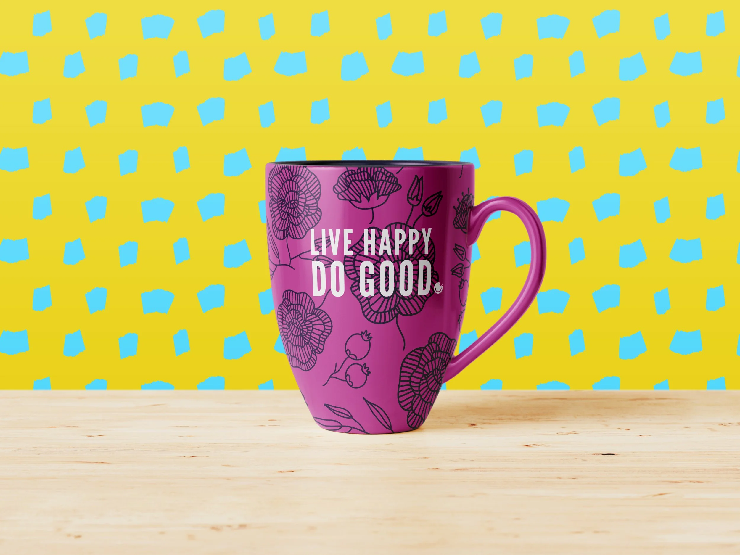
Joy isn’t subtle, and neither is Happy Day. We designed packaging that makes happiness loud and actionable.
Market Research
Happiness: now available in the pantry aisle.
First, we hit the grocery aisles like packaging detectives, analyzing every competitor to uncover white space opportunities. Shelf tests, consumer insights, and deep dives into category norms helped us pinpoint exactly how Happy Day could stand out in a sea of sameness.

Brand Strategy
Retro-stalgia-hip.
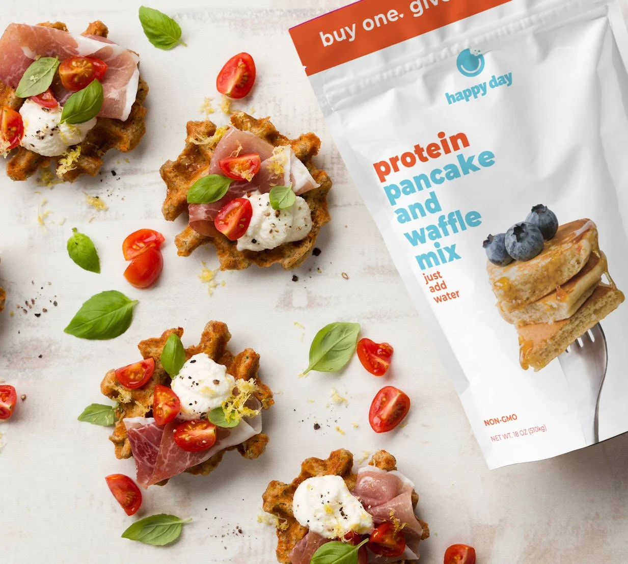
To cement Happy Day as the most joyful brand on the shelf, we leaned into a "Retro-stalgia-hip" aesthetic—with bold colors, friendly lowercase typography, and an undeniably joyful visual energy. Messaging was distilled to what matters most: mission, flavor, and premium ingredients. We also reimagined how their "Buy One, Give One" promise was communicated to make it impossible to miss.
A Color System Built to Grow.
We created a strategic framework with over 987 color combinations, ensuring scalability and future-proofing as new SKUs hit the shelves.

Packaging Design
Shelf Confidence
We didn’t just design packaging; we designed an experience. Vibrant, attention-grabbing colors? Check. Playful yet clean layouts? You bet. Every touchpoint was engineered to be unmistakably Happy Day—bold, bright, and bursting with good vibes. The result? Packaging that doesn’t just sit on a shelf but shouts, “put me in your basket, take me home, and love me forever.”


Direct Marketing Strategy
Hitting the sweet spot
Beyond the shelf, we made sure Happy Day’s message landed in the right hands (and inboxes). Our strategic mix included:
Splash Pages
Laser-focused messaging with calls to action that pack a punch.Email Drip Series
Personalized, dynamic emails that adapted to engagement levels.Paid Social Ads
Boosted brand love and awareness across key audiences.Sample Kits
Thoughtfully curated kits blending product samples with sales materials to seal the deal.


Smiles on the shelf and success in the market.
Increased
Sell-through
Packaging and marketing that drive faster turnover and higher sales velocity at retail.
Stronger Retail Partnerships
A brand presence that attracts distributors and secures prime shelf space.
Scalable Growth
A cohesive system designed to support product expansion and market entry with ease.
Joy looks good on Happy Day. With a bold new design and a mission-driven message, the brand is set to feed more people, inspire more smiles, and make every purchase count.

