
Boise Co-op Market
A WEBSITE AS GOOD AS THE STORES.
Our Role
Creative Direction
Discovery & Strategy
Information Architecture
UI/UX
Web Design & Development
Brand Application
Copywriting
Content Strategy
SEO
Boise Co-op Market isn’t your average grocery store. Since 1973, this community-owned institution has championed local farmers, makers and better food, giving Boise a different way to shop. With two Treasure Valley locations, a third on the way and a fiercely loyal following, Boise Co-op is built on a belief that where we shop, what we eat and who we support matters. In the aisles, you can feel it. Online, it was harder to find.
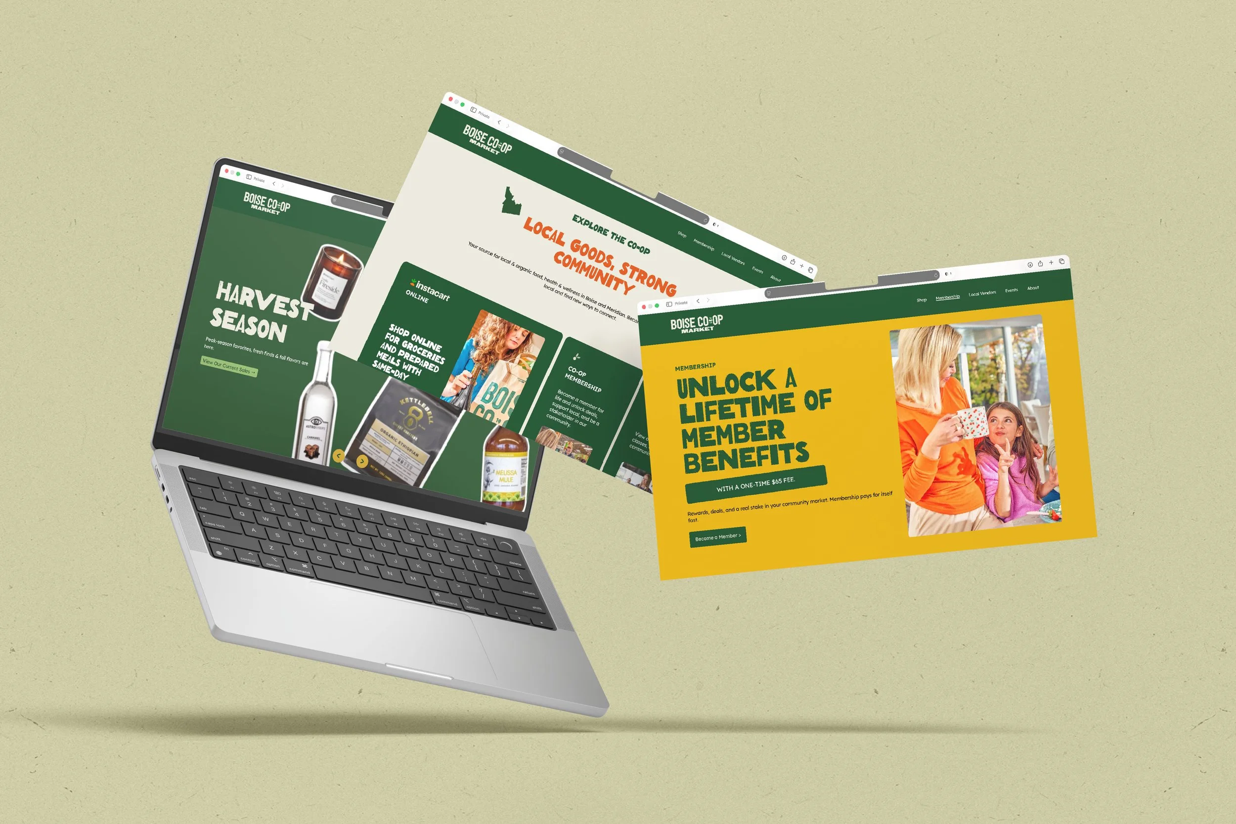
Against partnered with Boise Co-op to reimagine its website, giving shoppers an online experience that’s easy to use, simple to shop and as rooted in community as the stores themselves.
The Opportunity
Loved in the aisles. Lost online.
With updates passing through many hands and no shared playbook to guide them, Boise Co-op Market’s website had filled up over time with mismatched layouts, duplicate pages and broken links. Its most-visited page, Current Sales, showed a flyer and nothing to do with it.
Meanwhile, Boise Co-op’s best stories weren’t being told. Its product standards, the high bar every item clears to earn a spot on its shelves, were barely mentioned. Shoppers still asked whether they needed a membership to shop. And even though Instacart was bringing in strong online sales with no marketing behind it, Boise Co-op had never had a real online store.
With a third store on the way, the opportunity was to rebuild the site from the ground up. It needed to work well on phones, be accessible, and be easy for team members to update. The goal was a site that sells and tells Boise Co-op’s story at once, “actionable yet inspiring,” and turns casual visitors into devoted regulars.
A 50-year story, buried under a website that couldn’t keep up.
The Solution
Every page with a purpose.
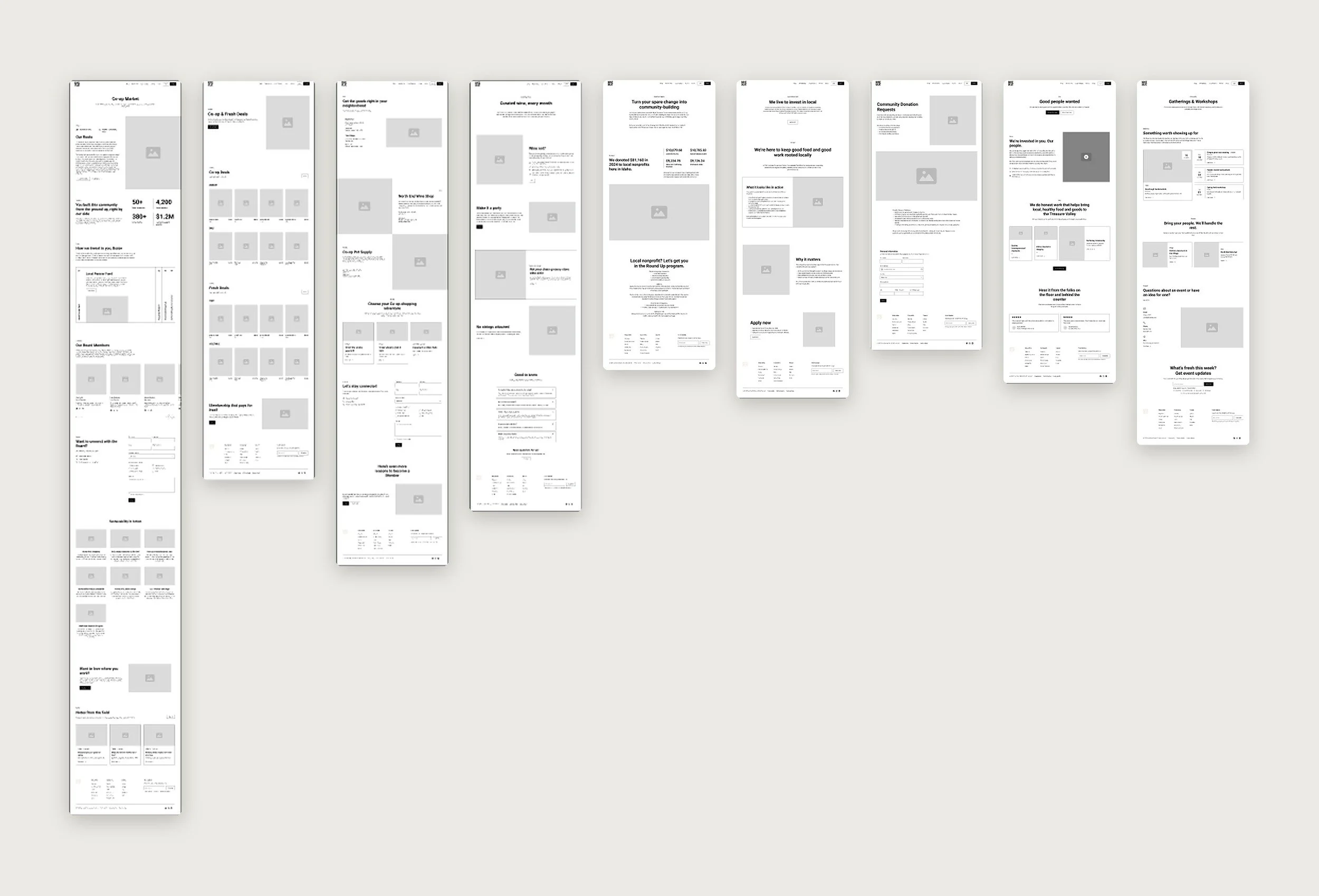
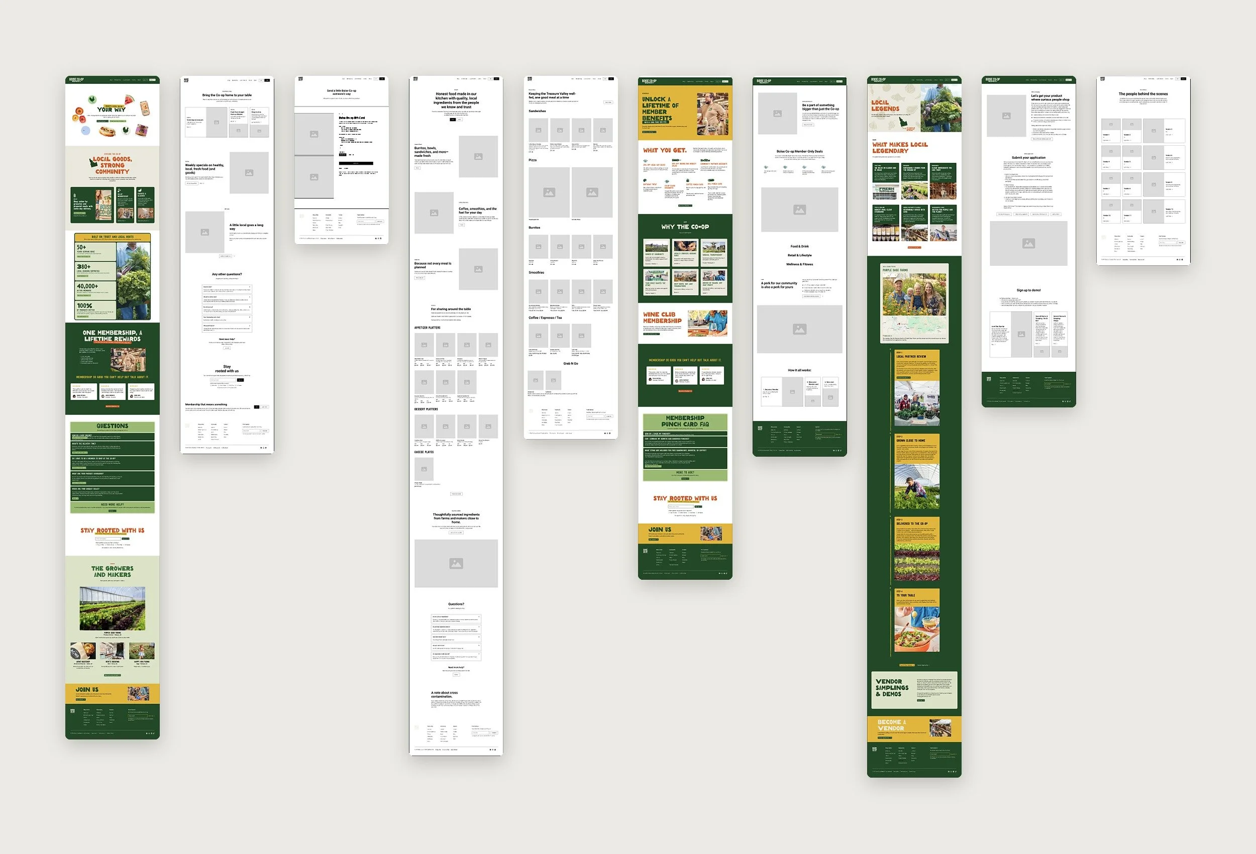
We began with wireframes, mapping what visitors actually came to do and recommending what to keep, combine or cut. Then we built the new site from the ground up, matching it to the brand’s current look so the experience feels the same online and in store.
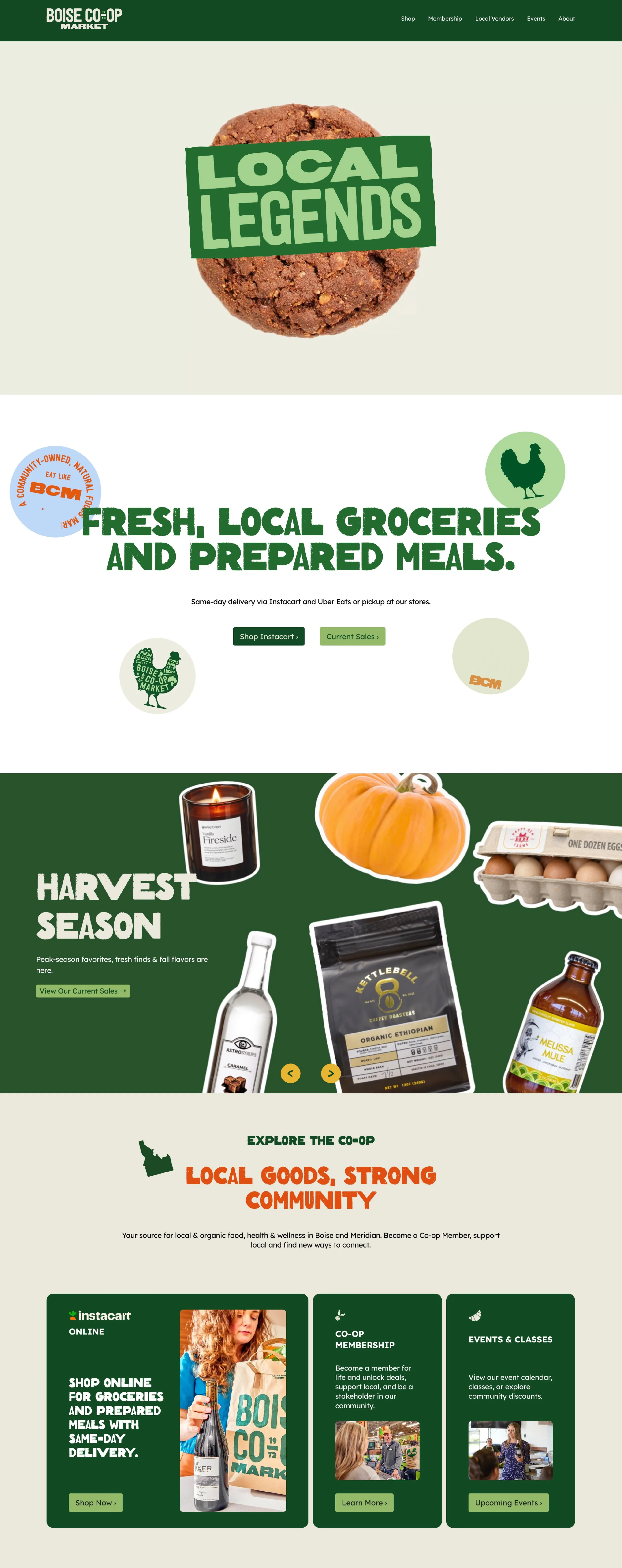
We wrote the copy in Boise Co-op’s well-known voice: warm, transparent and rooted in its values. Dense pages became clear and easy to scan. Community moved to the forefront, and product standards and local impact came to life through simple infographics and photography that puts real food and real people first. Ways to shop online are now just a tap away from anywhere on the site.
The Research
We started by listening. Working sessions with Boise Co-op’s marketing team showed how the site was really being used: who updates it, what shoppers look for and where they get stuck. We audited every page of the existing site, mapped how first-time visitors, regular shoppers and members move through it, and studied grocery sites people love, then used those findings to shape every decision that followed.
The Work
Where commerce meets community.
Boise Co-op Market’s new site had to sell and tell its story, without leaning too far either way. We organized the work around six focus areas.
Simplify the ways to shop
Shoppers were choosing between delivery, curbside, deli pickup and third-party apps with no clear guide. Bringing every option into one simple hub made Instacart the clear front door to online grocery shopping. It also made the busiest pages, like Current Sales, easy to act on.
Put standards and community at the center
Boise Co-op’s product standards, local vendor partnerships and community impact are what set it apart, but they were hard to find online. These became core pillars of the site, and every page made one thing clear: everyone is welcome to shop, member or not.
Clear the clutter and make it actionable
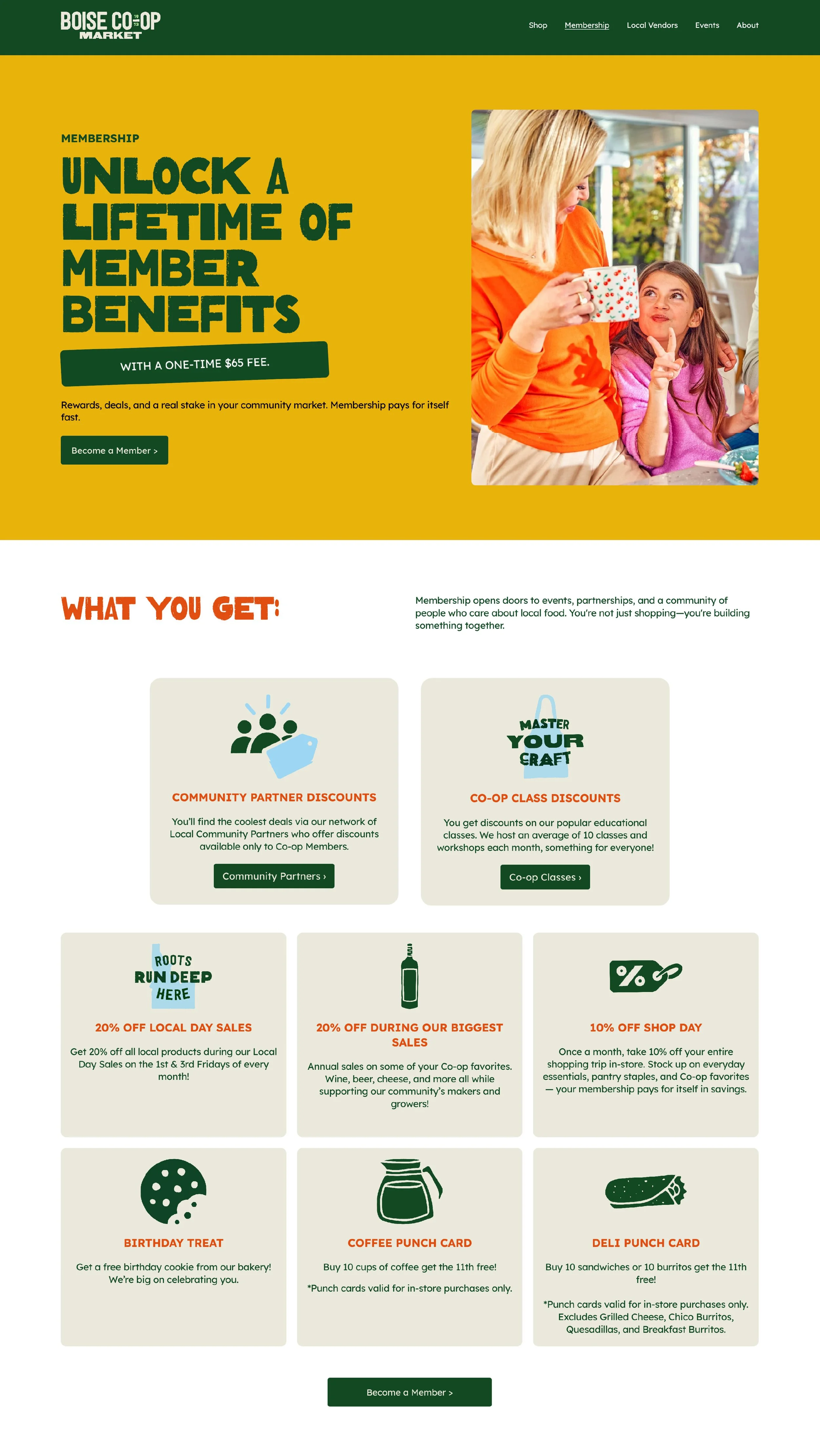
The old site had grown into a “kitchen sink,” so we cut duplicate pages, condensed dense information and gave every key page a clear next step. Membership now shows how easy it is to join and what members get, while making clear that everyone is welcome to shop. Careers now tells the story of working at Boise Co-op, events are easier to browse and sign up for, and the local vendor directory highlights the hundreds of local partners behind the shelves.
The Work
Look and sound like Boise Co-op
Every page reflects the brand shoppers already know from the stores. The colors, type and photography match the refreshed in-store look, and the copy is written in Boise Co-op’s warm, transparent voice, rooted in community. Clear, simple copy replaced dense blocks of text, so the site looks and sounds like Boise Co-op wherever you land.
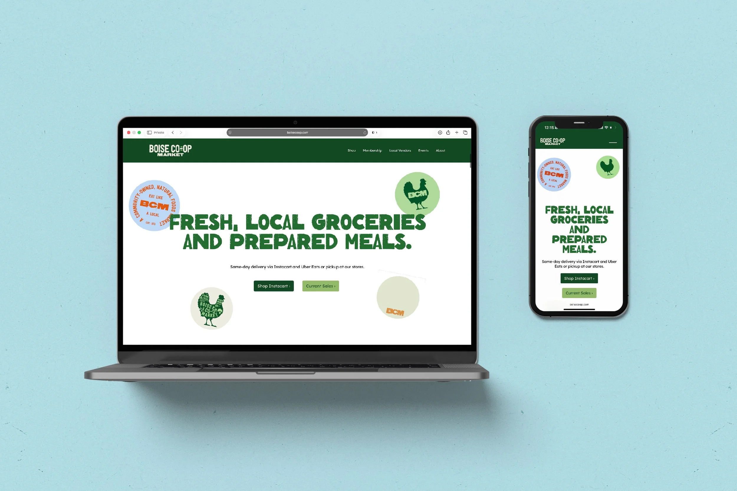
Design for every screen and every shopper
Most visitors arrive on their phones, so every page was optimized for mobile so it’s just as easy to use on the go as on desktop. Accessibility was built in from the start.
Lay the groundwork to be found
A structured SEO approach and better tracking help Boise Co-op show up in local search and measure what’s working.
Built to be used.
Easier to Shop
Every way to shop is now a clear tap away.
Easier to Get Involved
Clearer paths to events, membership and careers led to more event sign-ups and more visits to the membership and careers pages.
Truer to the Brand
The website now feels like walking into the store: warm, transparent and full of the growers, makers and members behind Boise Co-op. Everyone’s welcome, and it shows.
The new Boise Co-op Market website finally works as hard as the stores do: actionable yet inspiring, and rooted in the community it serves.