
Athletic Club Boise
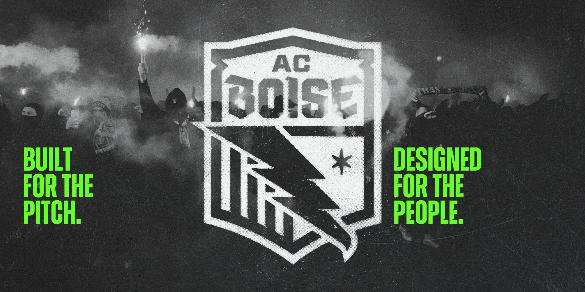
Built for the pitch.
Designed for the people.
Our Role
Tech & Digital Buildout
Campaign Messaging
Sales Enablement
Event Identity
Public Relations
Brand Strategy
Market Research
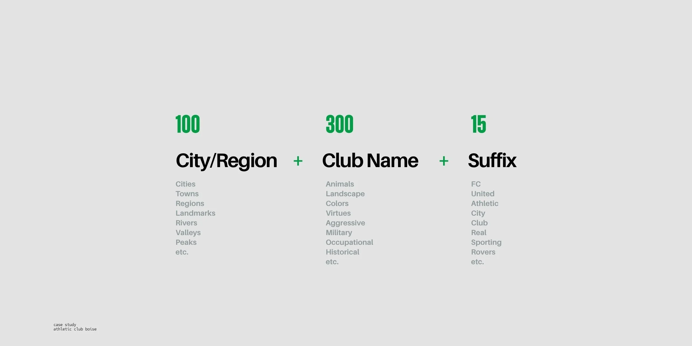
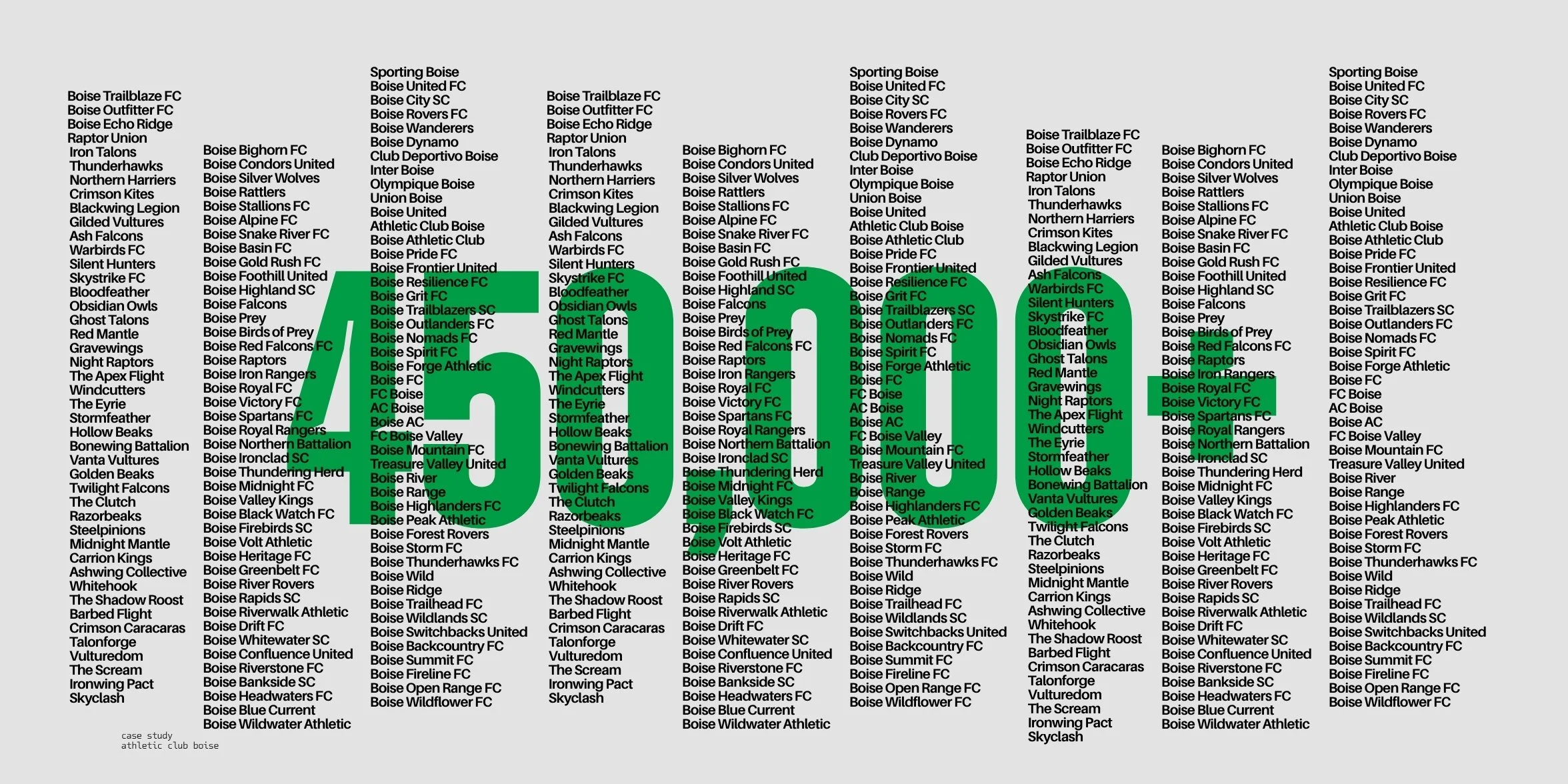
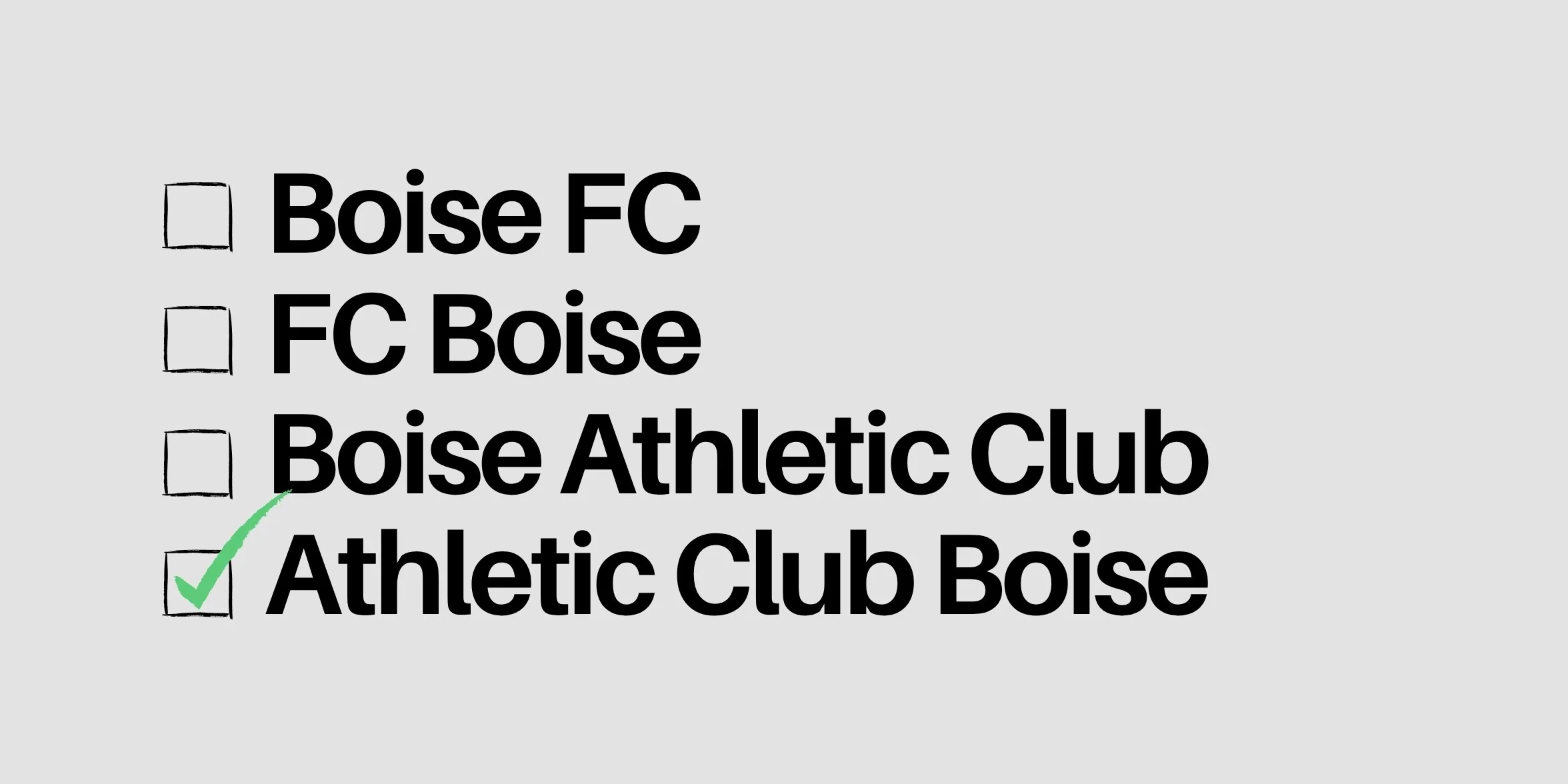
Messaging & Naming
Crest & Symbol System
Branding
Photo & Video Production
Athletic Club Boise is Idaho’s first professional soccer club, launching a men’s USL League One team in 2026 and a women’s USL Super League team in 2027.
The Opportunity
How might we create a brand that brings people together, inspires pride, and elevates Boise on the national and global stage?
Athletic Club Boise isn’t just a new team. It’s a cultural landmark in the making. The first professional sports brand from Idaho with the potential to shape how the world sees us, and how we see ourselves.
The goal? A brand built with intention: polished enough for the national stage, but personal enough for local fans.
Athletic Club Boise wasn’t branded; it was unearthed.
The Strategy
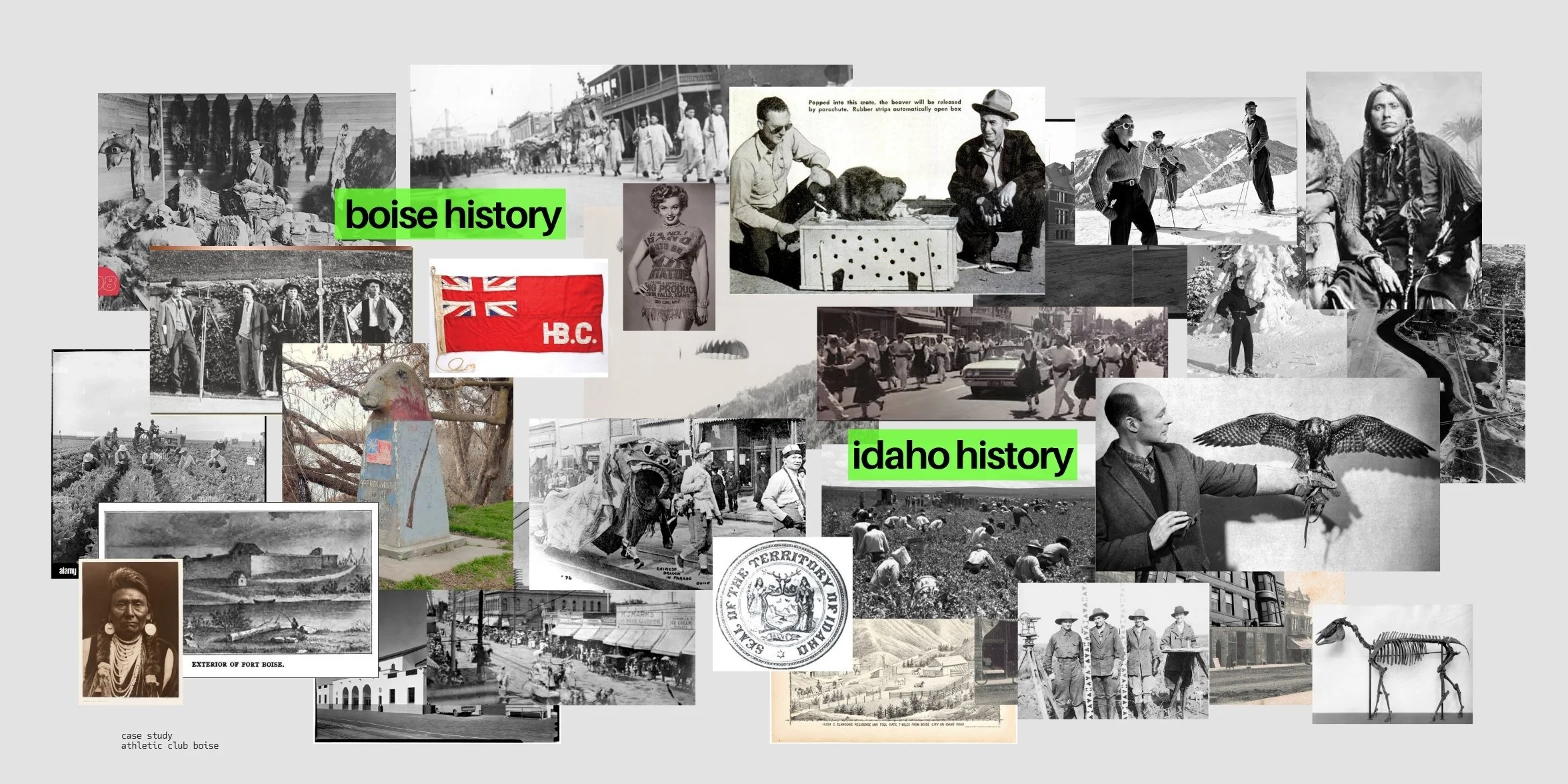
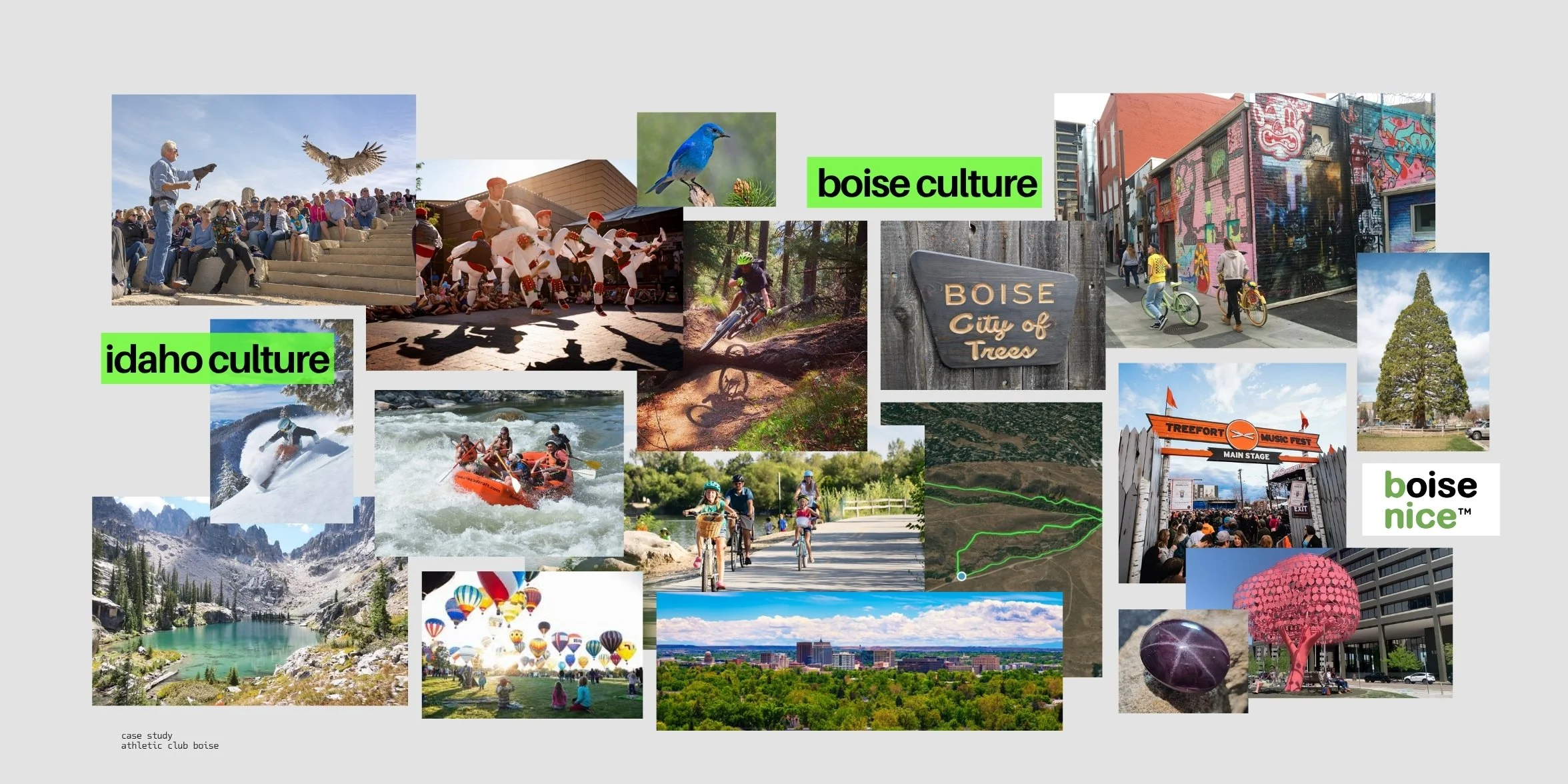
This wasn’t just about launching a soccer club. It was about launching a civic identity , one that could hold old Boise and new Boise, grit and growth, nostalgia and ambition. We weren’t here to market to the city. We were here to mirror it, to make something locals could see themselves in and build upon.
Undefeated in spirit: where anticipation, symbolism, and community ownership set the foundation.
Undefeated in practice: where rituals, enrollment, and real cultural equity take the field.
Every decision, from the name to the crest to the comms — worked toward one goal: This isn’t Boise-branded. It’s Boise-built.
The Solution
Athletic Club Boise isn’t just shaped by Boise culture.
It solidifies it.
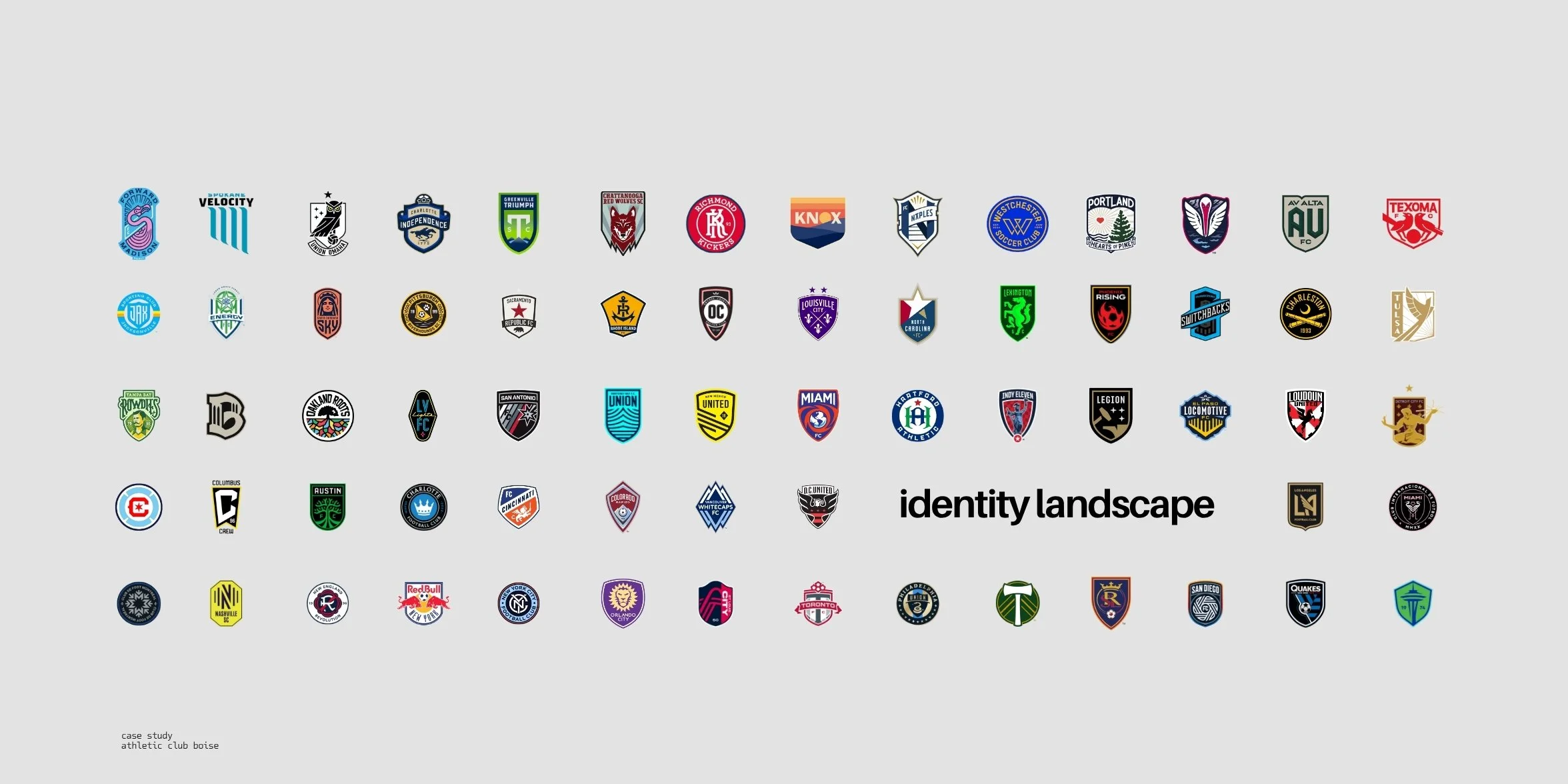
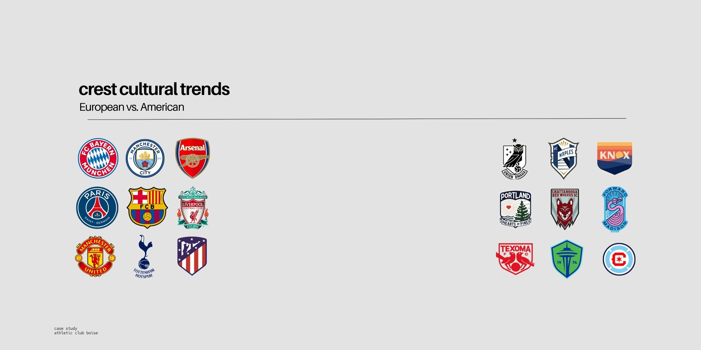
In a league where clubs fold or fade and identities feel borrowed, ACB cut against the grain. We’re building a club that feels local on game day, legendary on game tape, and generational in community memory.
AC Boise is unbought by outsiders, undefeated in spirit, and unmistakably Boise. Not a product of marketing, but a product of place - rooted in structure, symbolism, and heart.
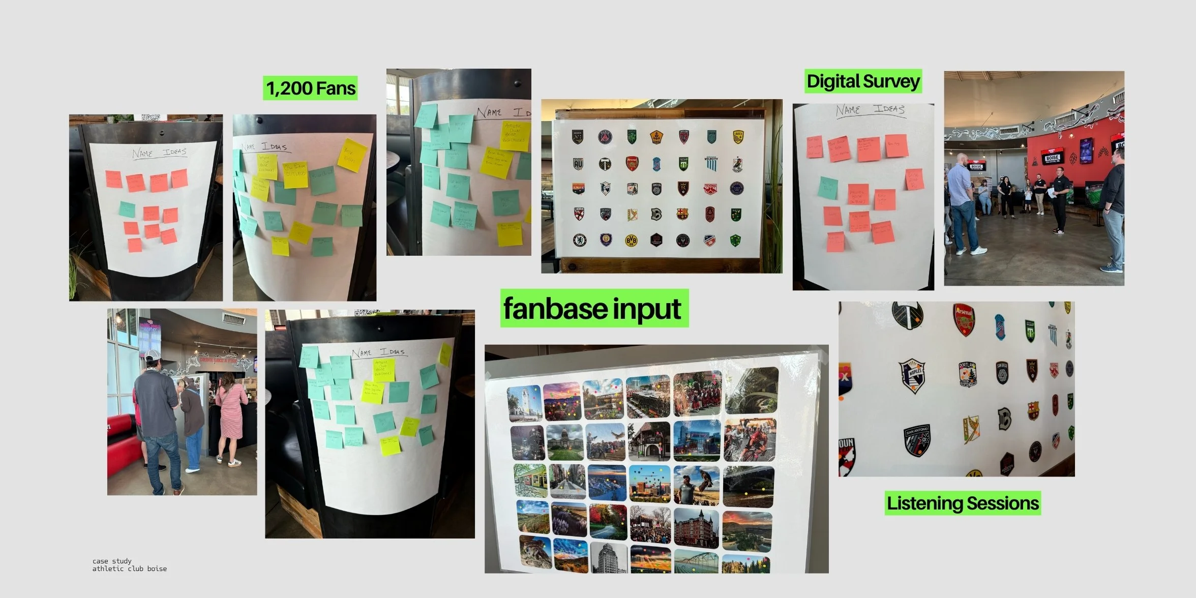
This wasn’t about building a fan base. It was about enrolling a city.
Not about chasing wins, but proving a city was never the punchline.
It’s the prototype.
From crest to campaign, every detail was shaped to feel like Boise made it, because it did. We’re not marketing to Boise. We are marketing Boise to the world.
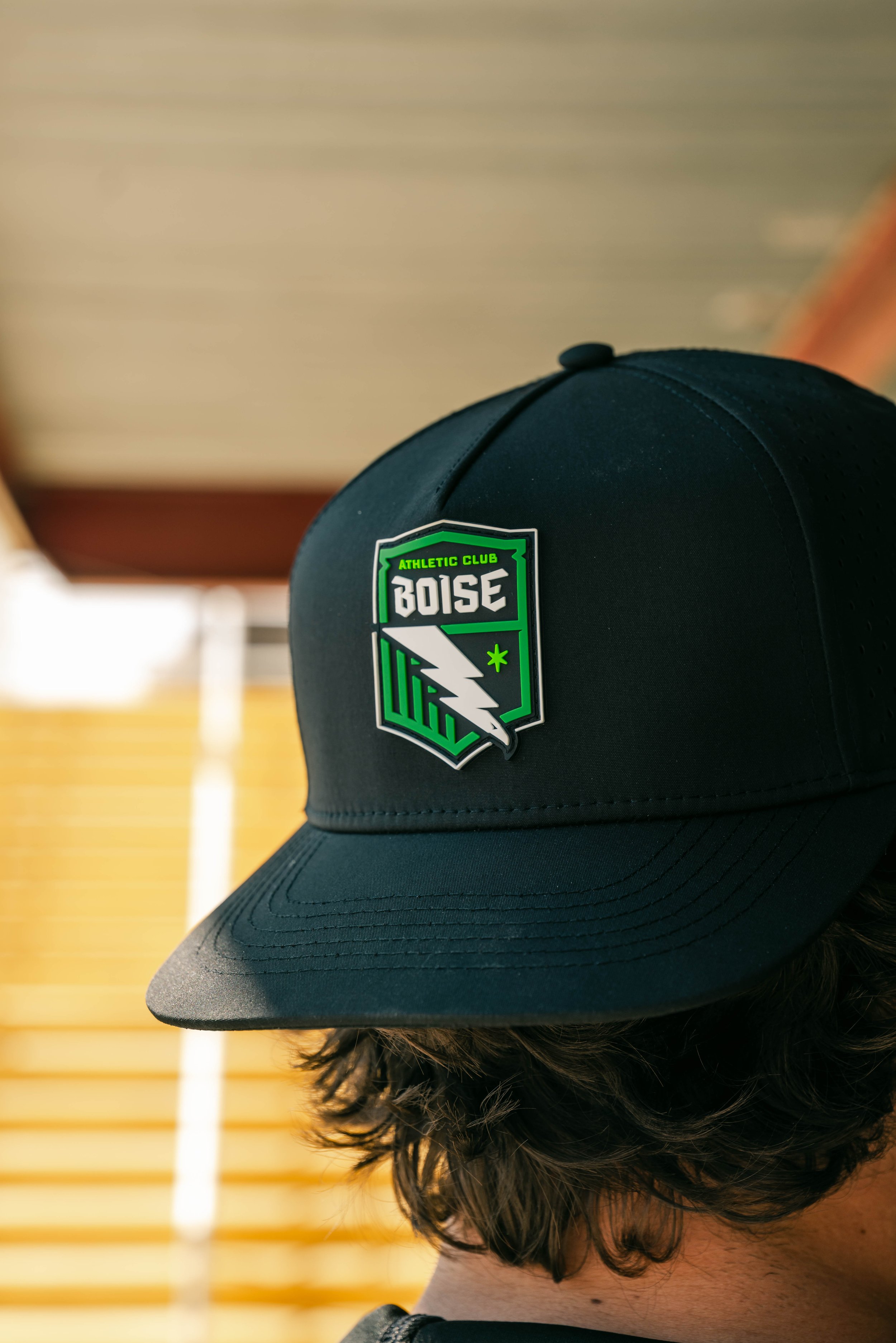
tHIS IS NOT A CREST
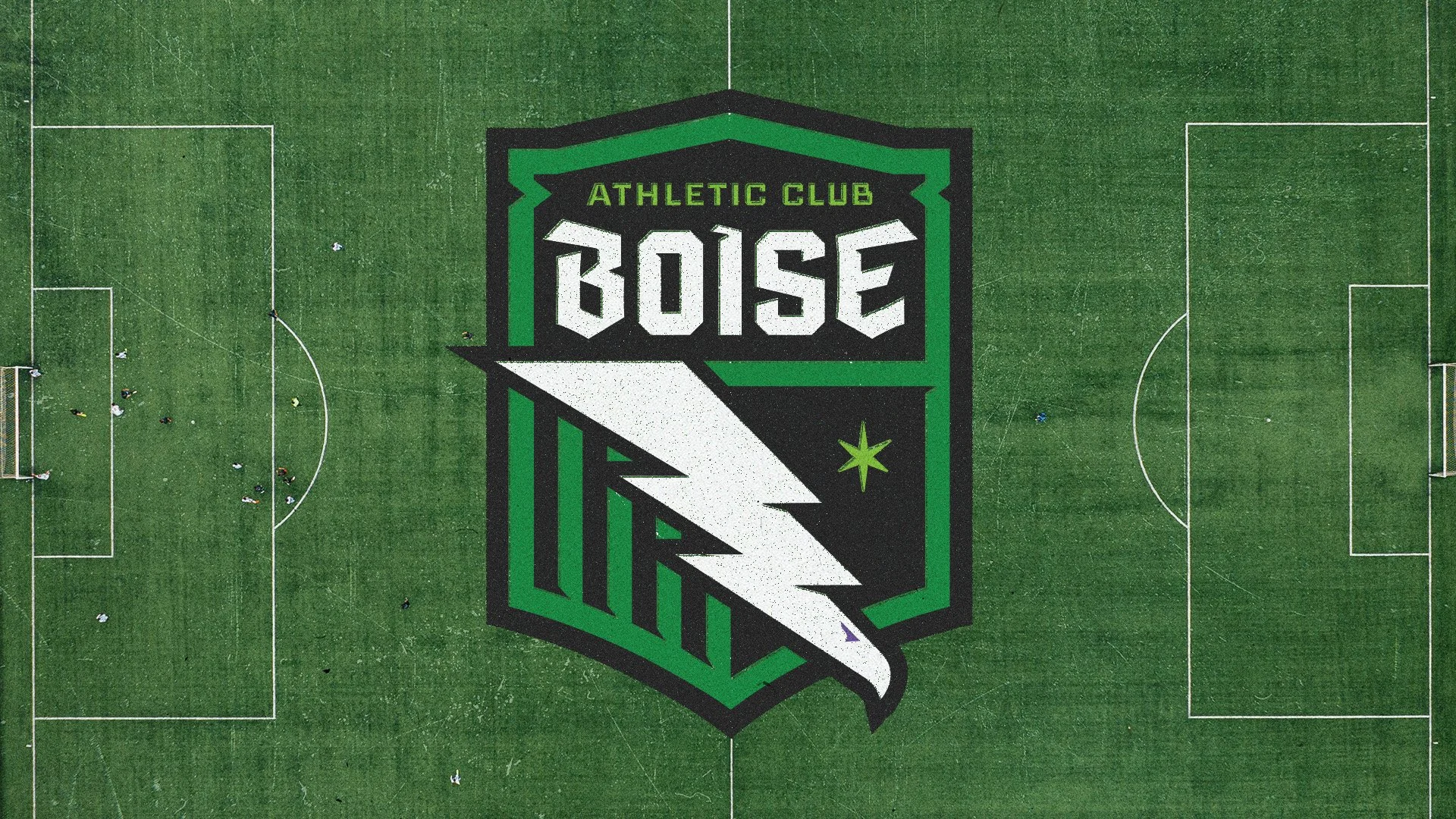
It’s a banner.
A challenge.
A declaration of who we are.
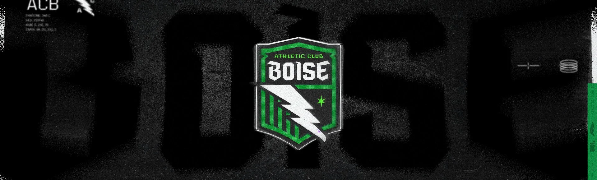
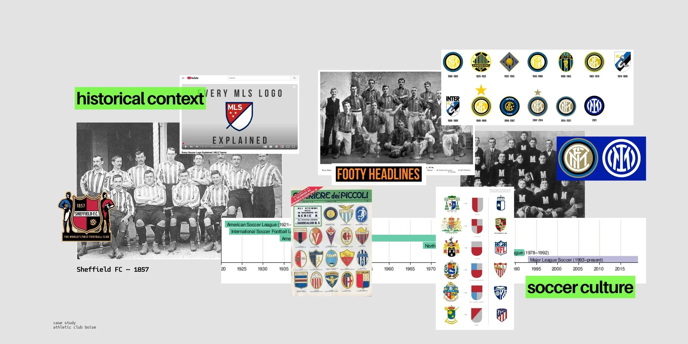
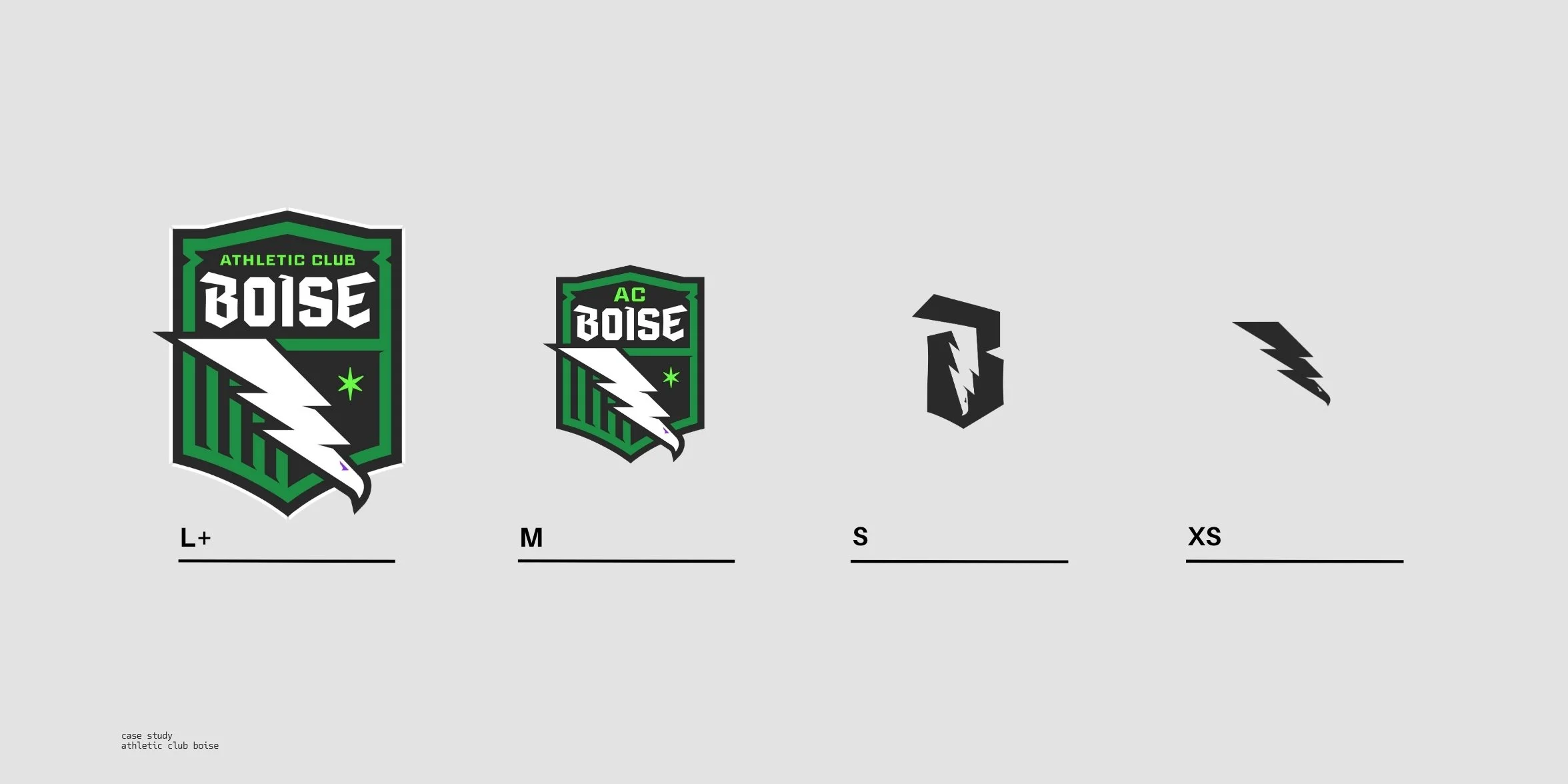
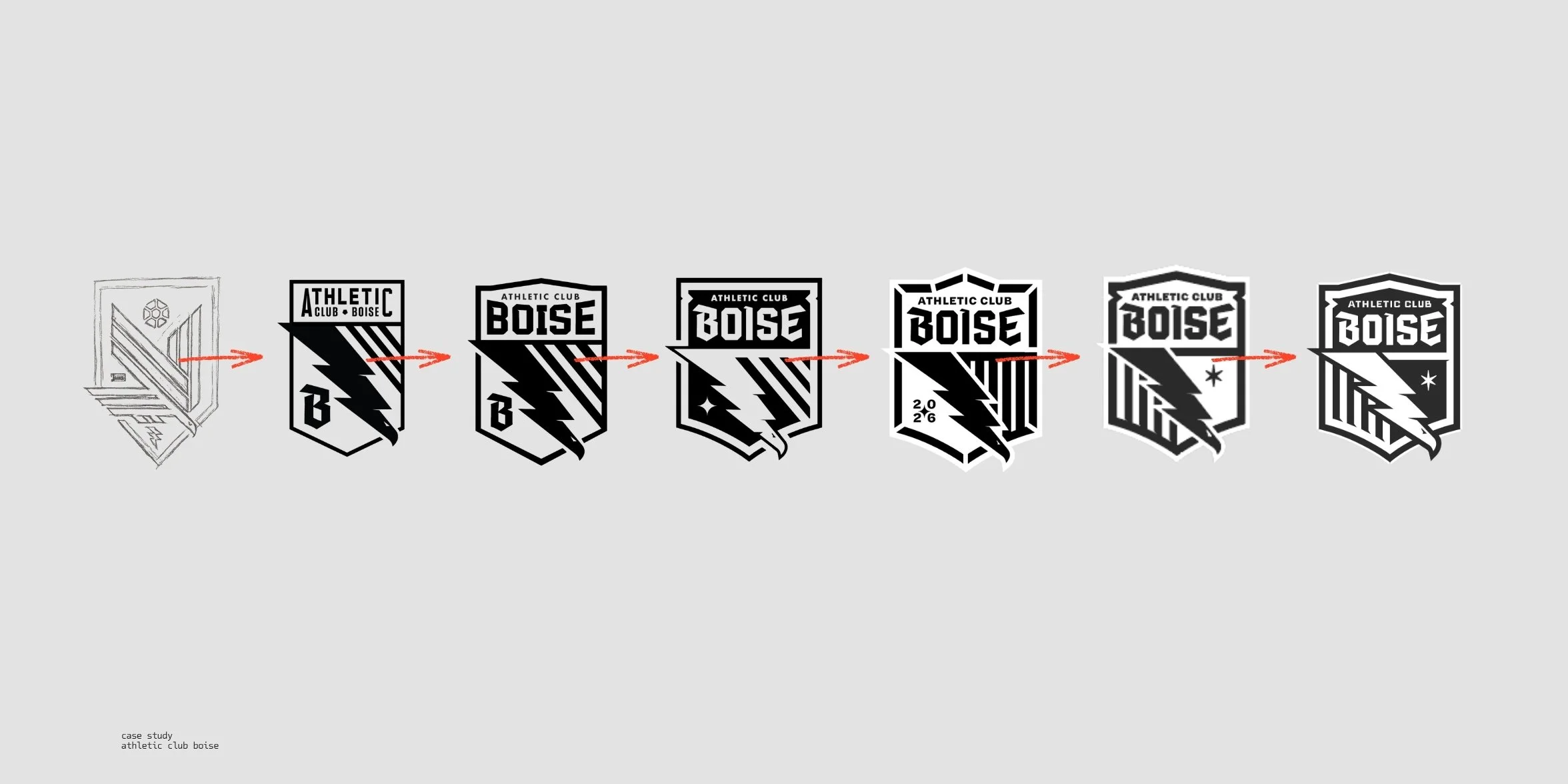
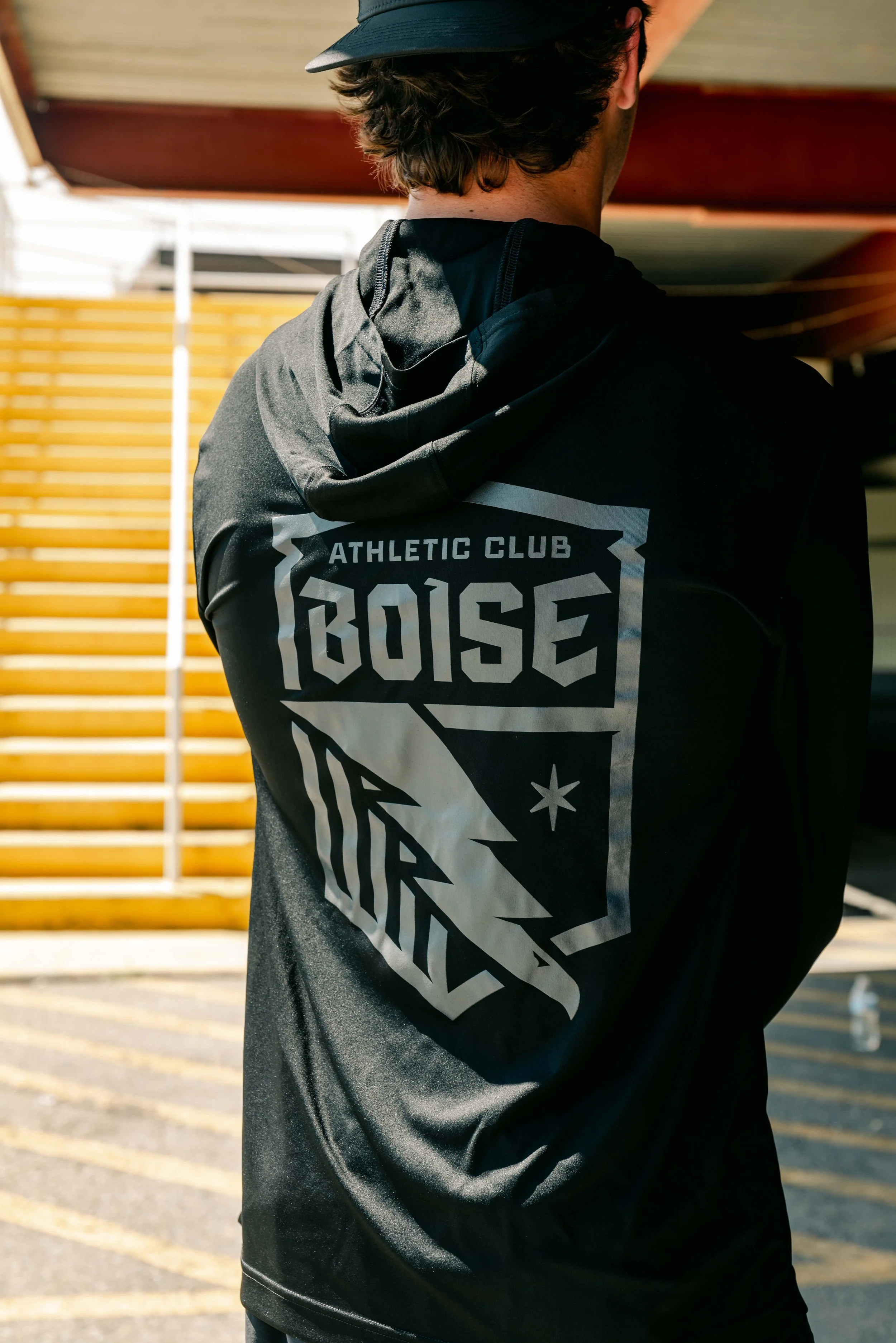
Forged at the intersection of history and defiance, this crest is rooted in tradition but cut with edge. A signal to every opponent: we know exactly where we come from. And we’re here to win.
The Symbolism
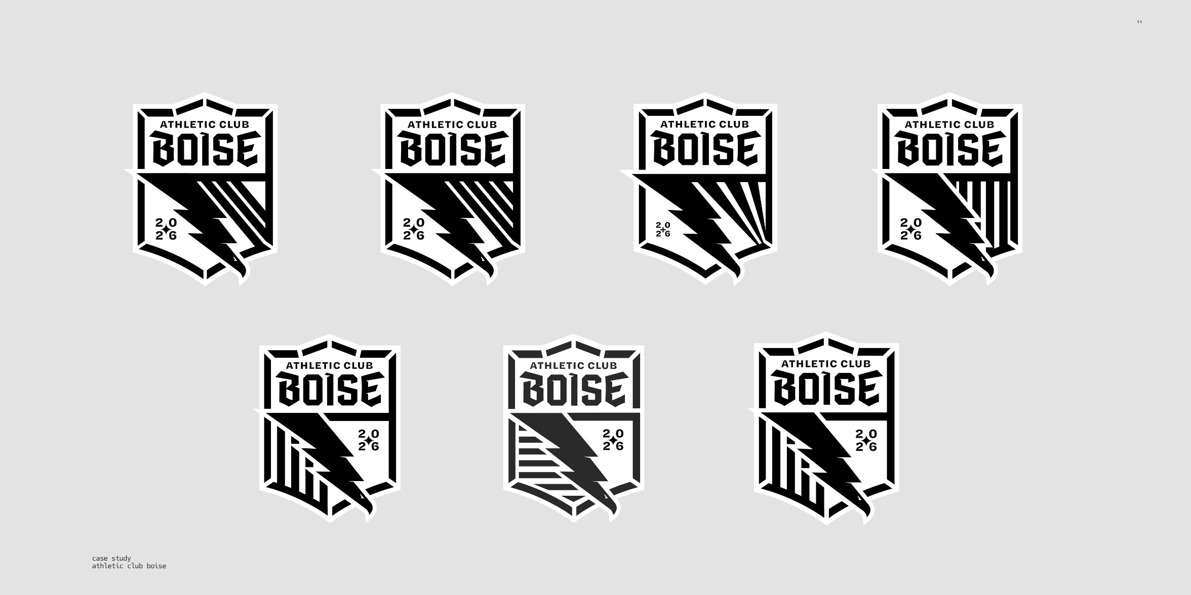
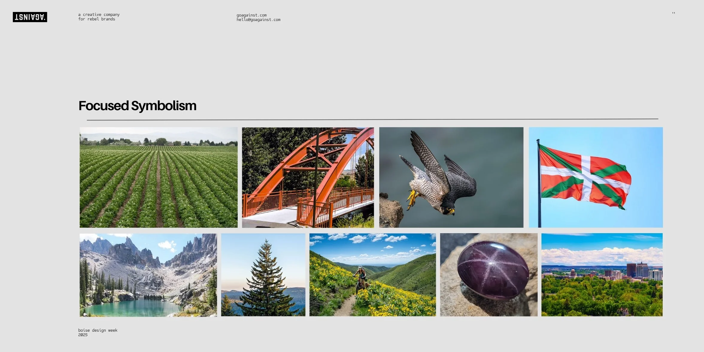
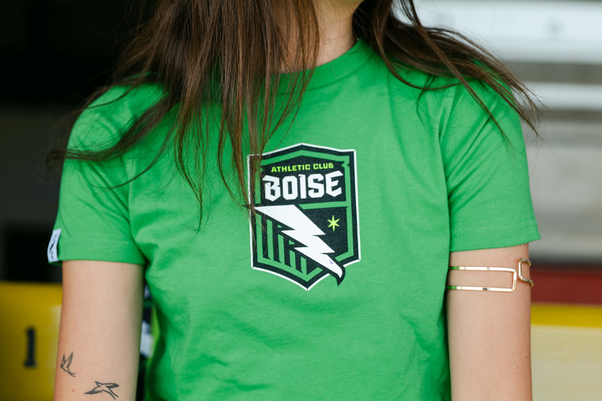
Every element of the crest carries weight, not just in form, but in meaning.
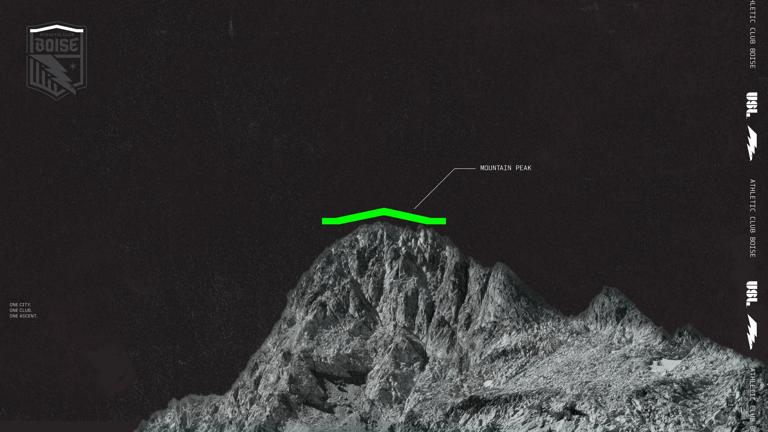
Mountain Peak: The mountains speak to elevation, yes, but more than that: to effort, perspective, and the long view.
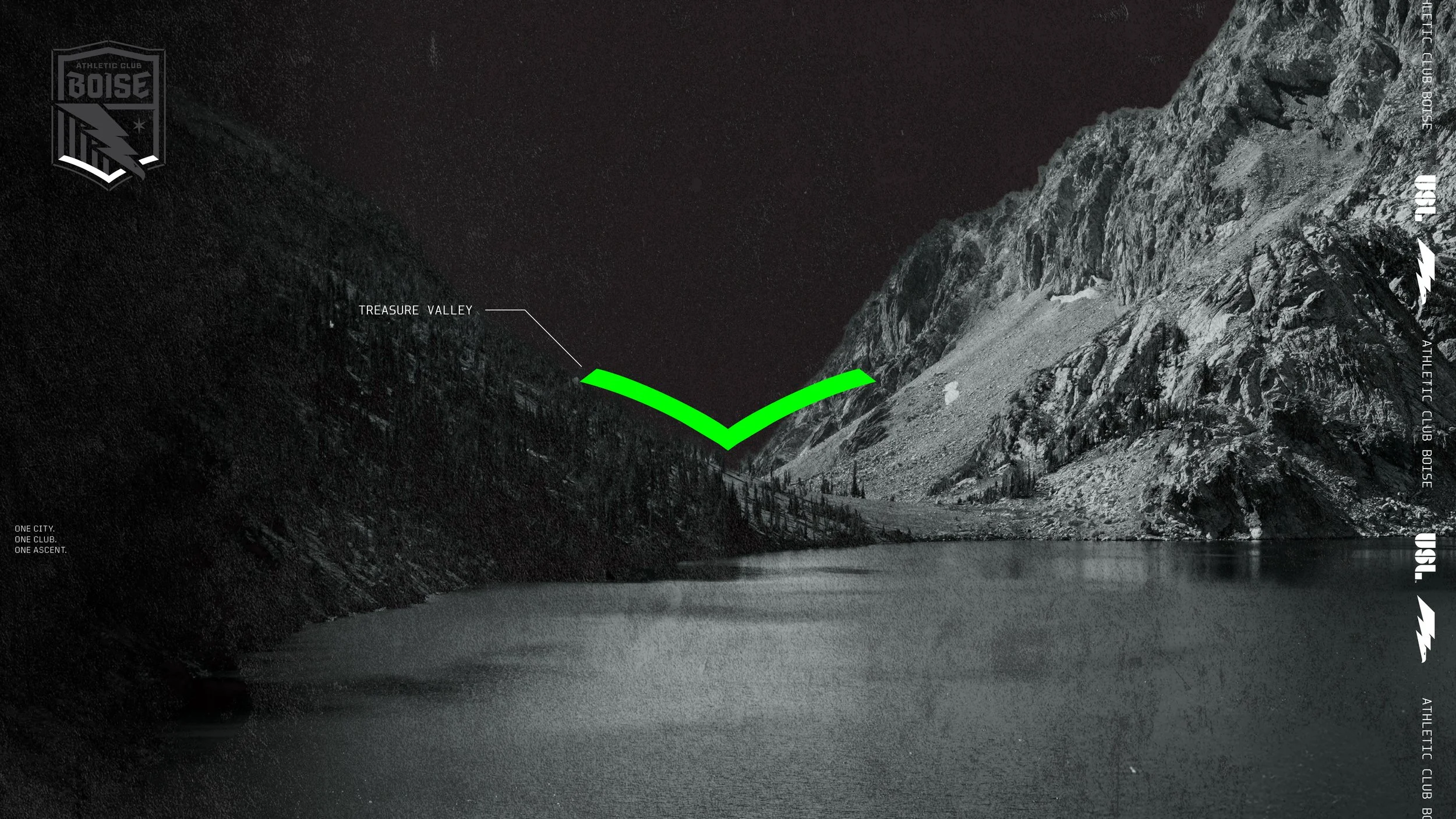
Treasure Valley: The valley grounds the club in place, a point of convergence, not just geography.
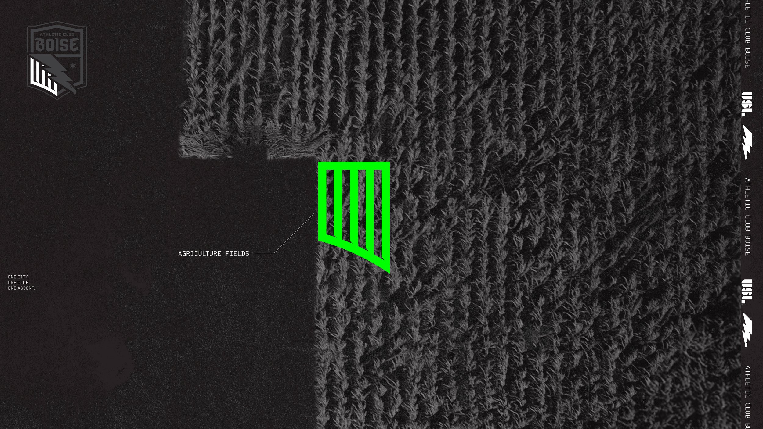
Agriculture Fields: The agricultural lines echo rhythm and labor — work that builds over time.
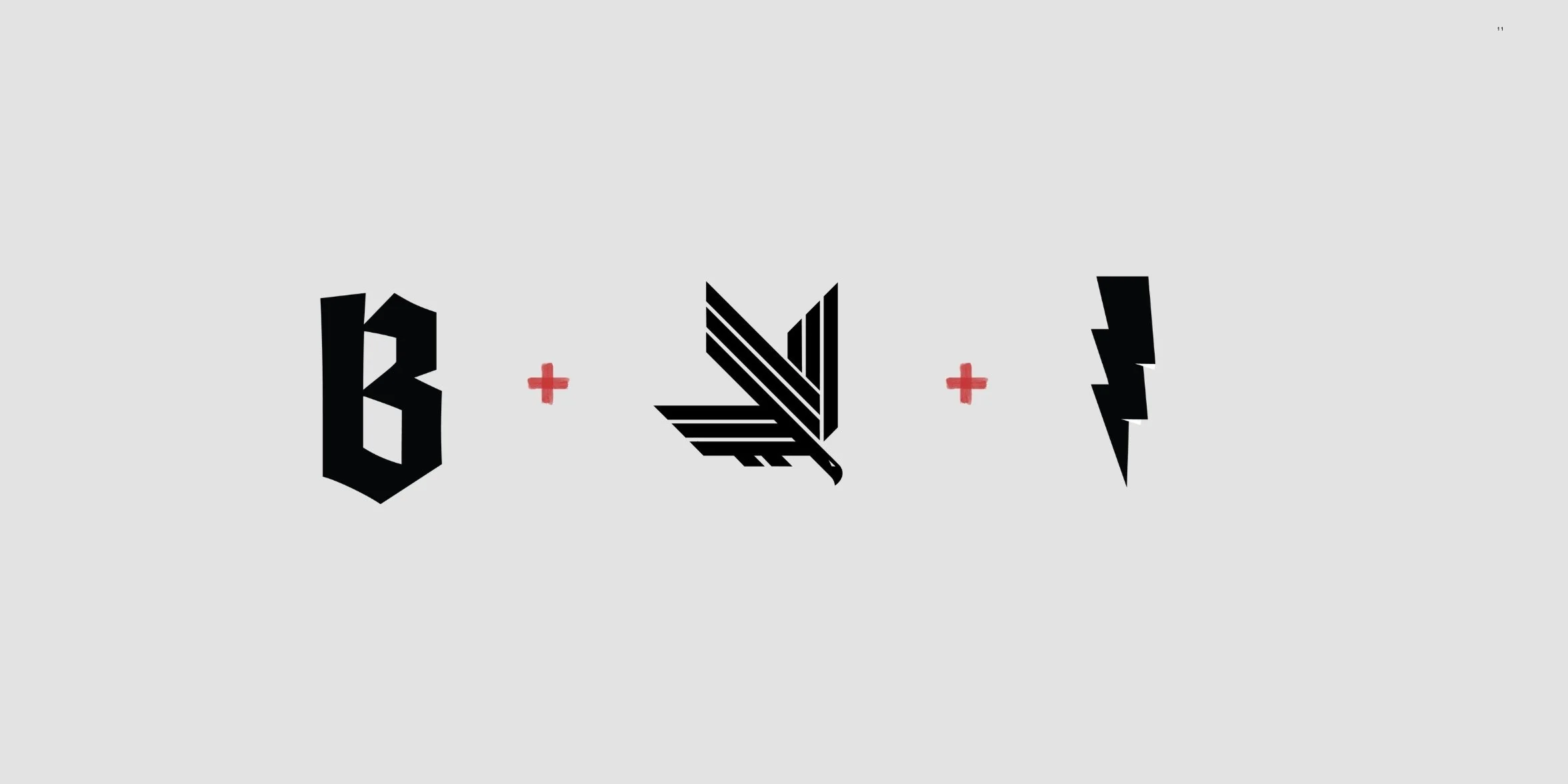
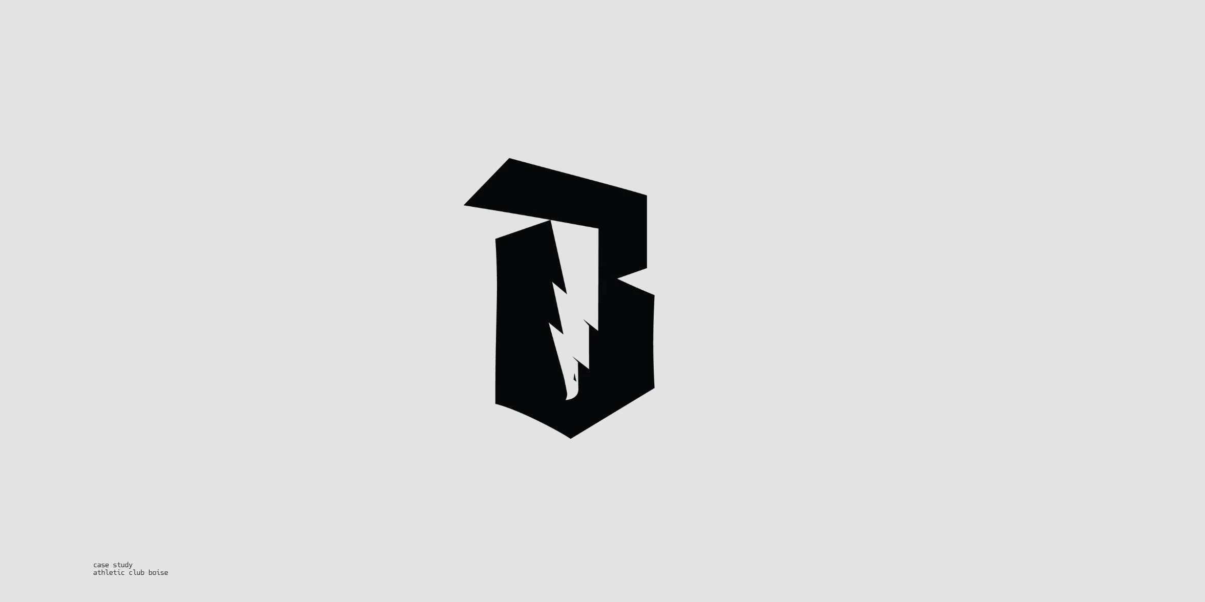
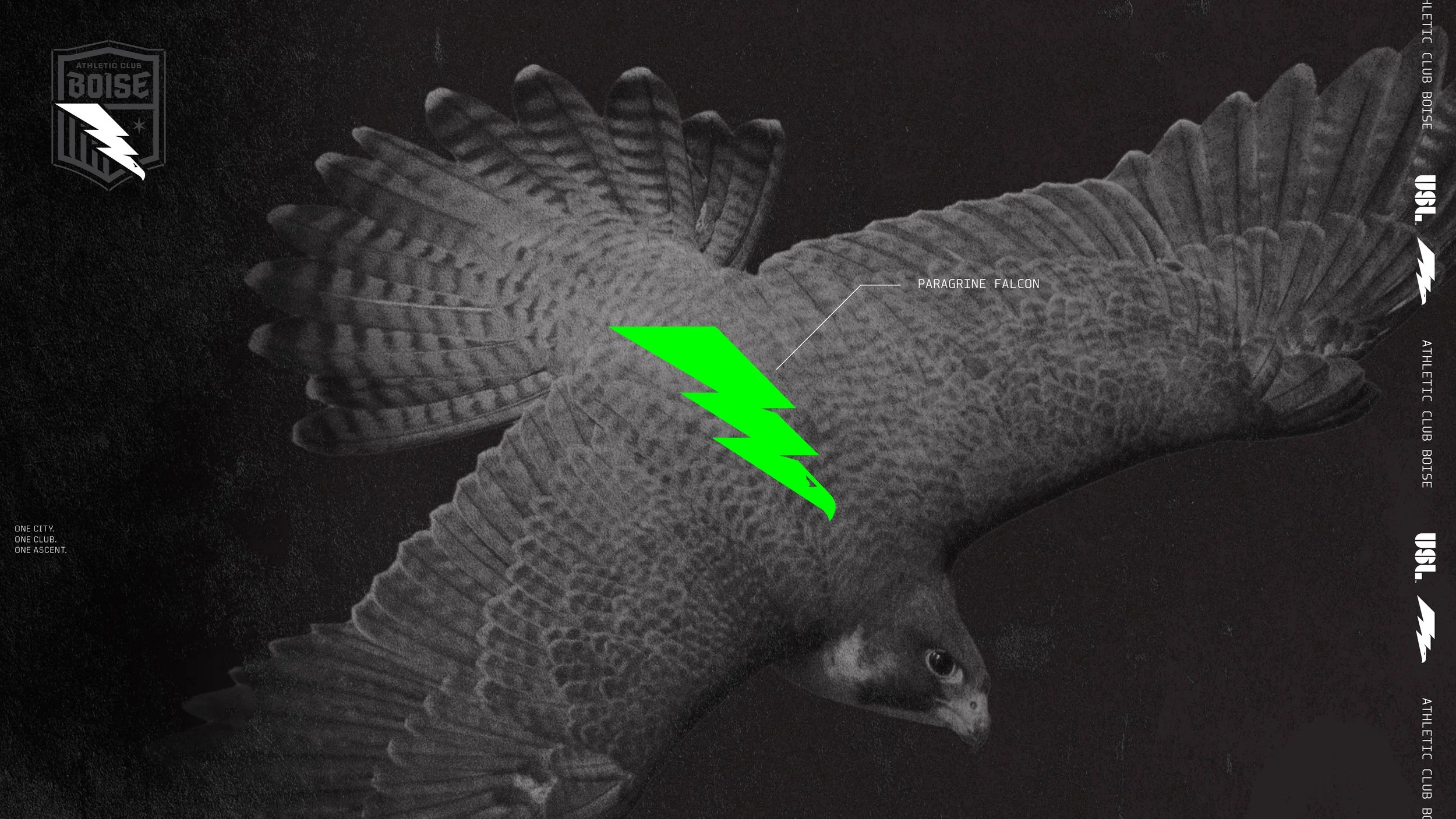
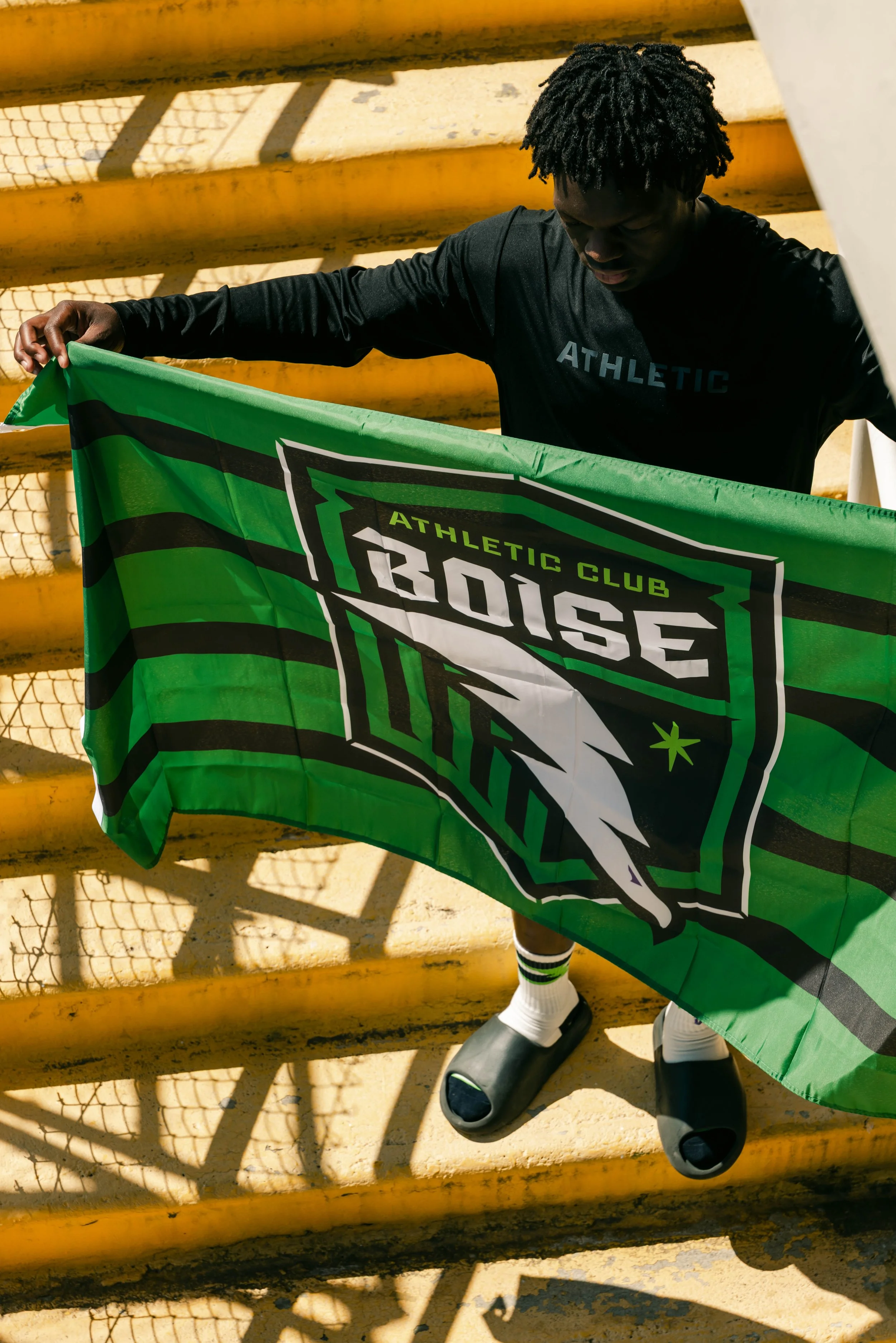
Peregrine Falcon: At the crest’s center, the falcon flies, fast, focused, and fierce. A symbol of precision and power, it nods to Boise’s honored global role in raptor conservation and evokes the instinct to strike with purpose.
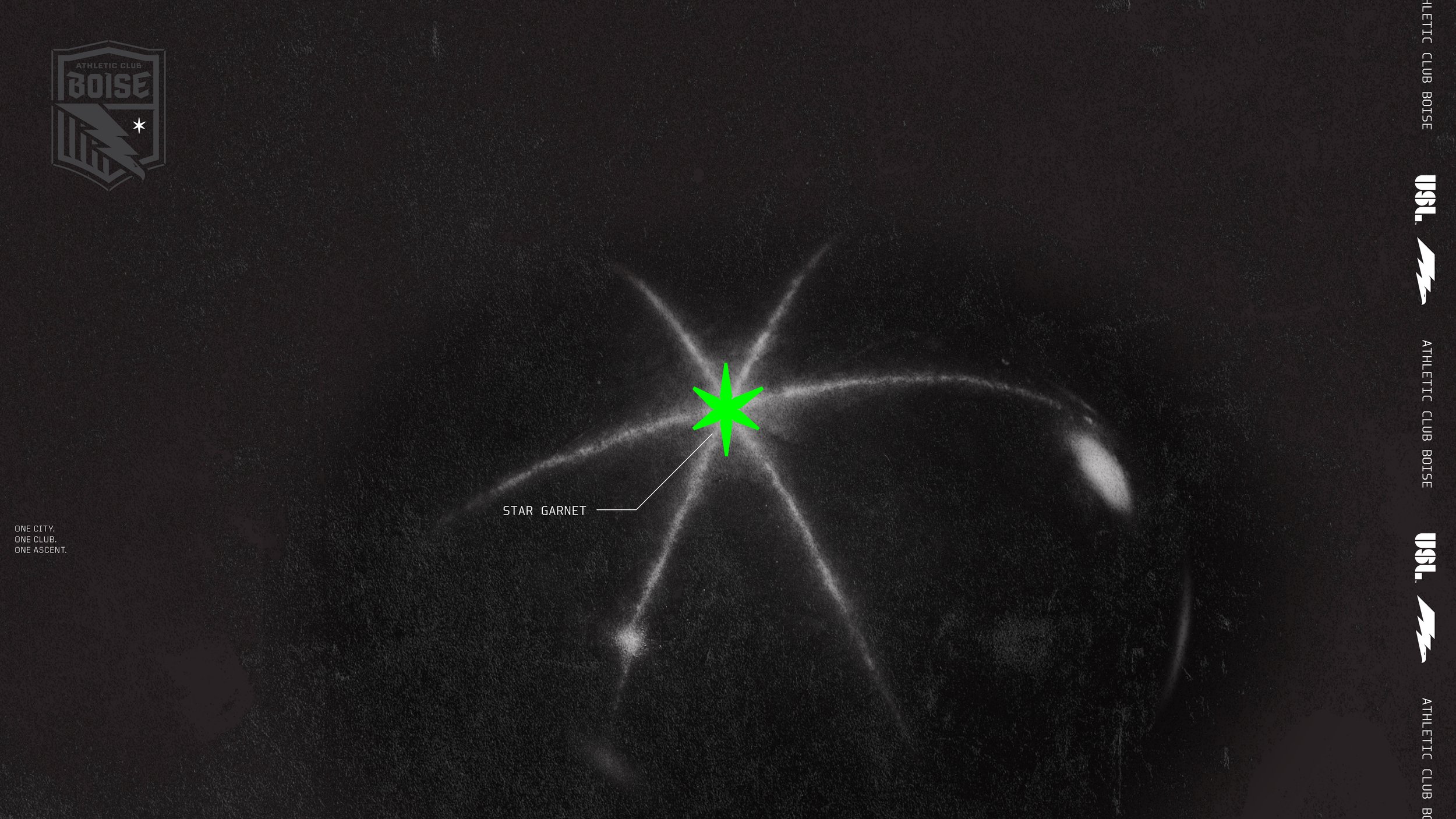
Star Garnet: The garnet holds its ground quietly, like strength that doesn’t need to raise its voice.
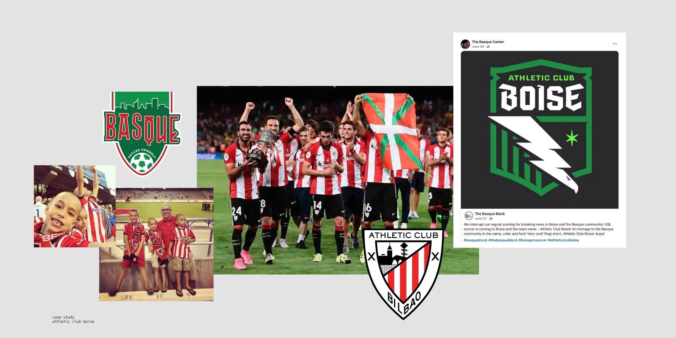
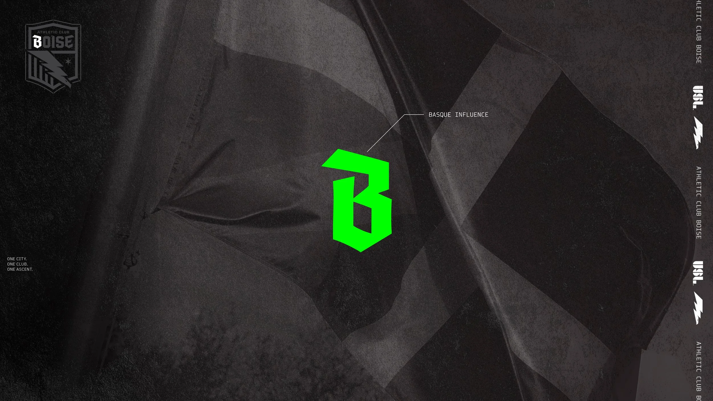
Basque Influence: The letterforms, shaped by Boise’s Basque heritage, stand confident, distinct, enduring, unmistakably of this place.
This isn’t symbolism for the sake of symbolism. It’s a system of meaning, built to honor the city it was built for.
The Palette
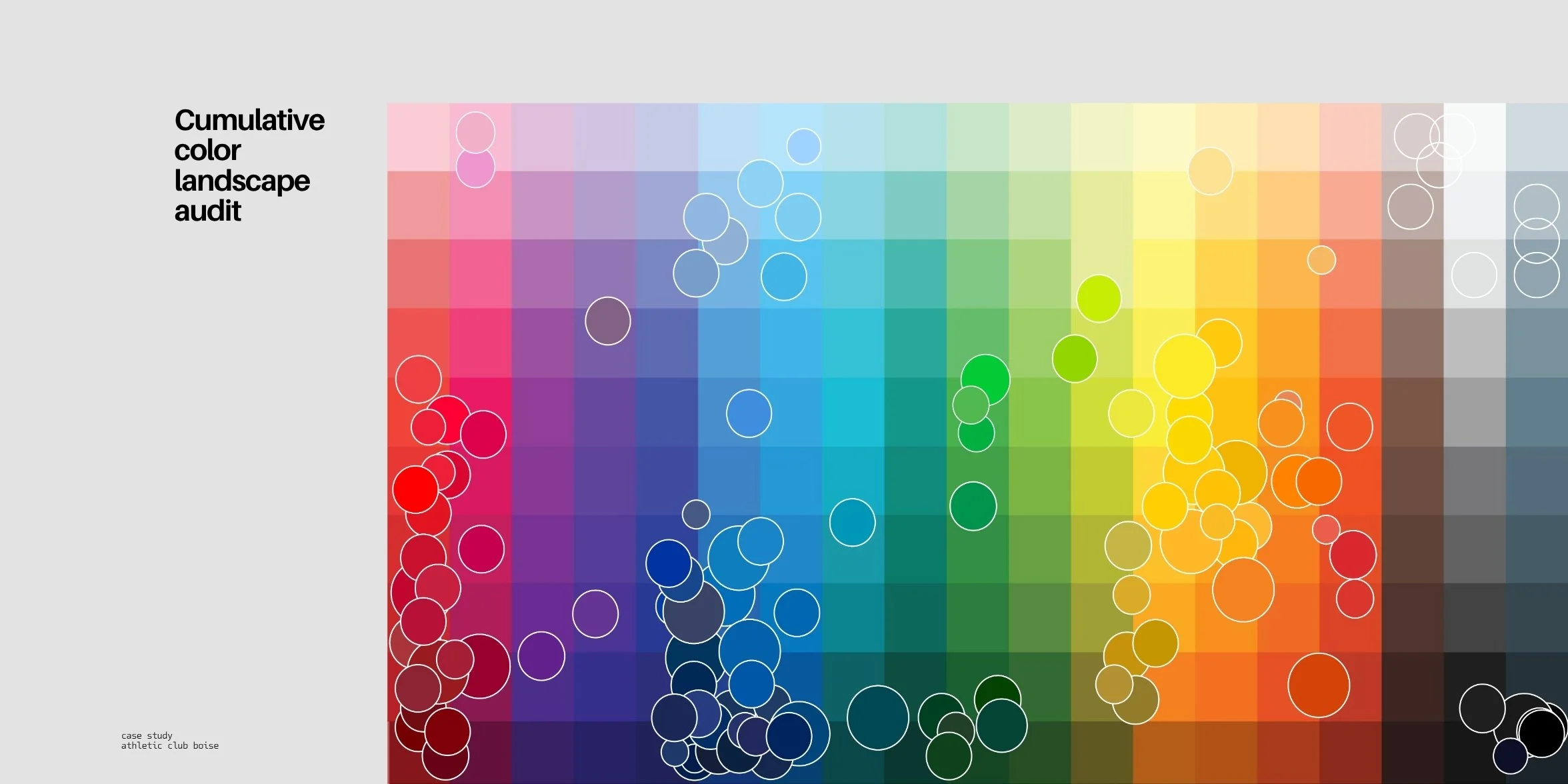
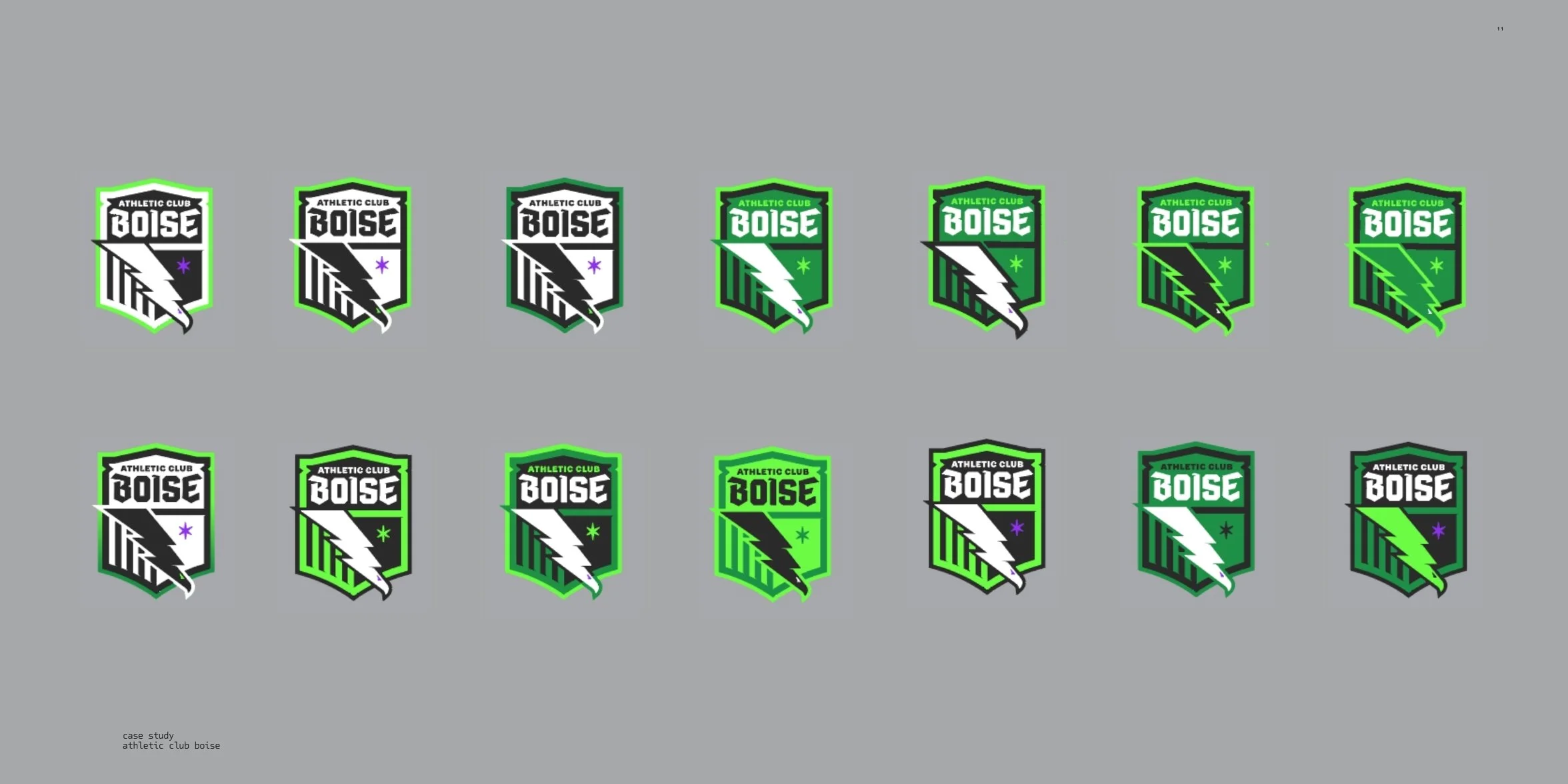
We didn’t invent this palette, we unearthed it.
The colors of Athletic Club Boise are drawn from the land and spirit of the city: the Treasure Valley, foothills, farmlands, mountains, star garnet, Basque heritage, and the falcon’s fierce energy.
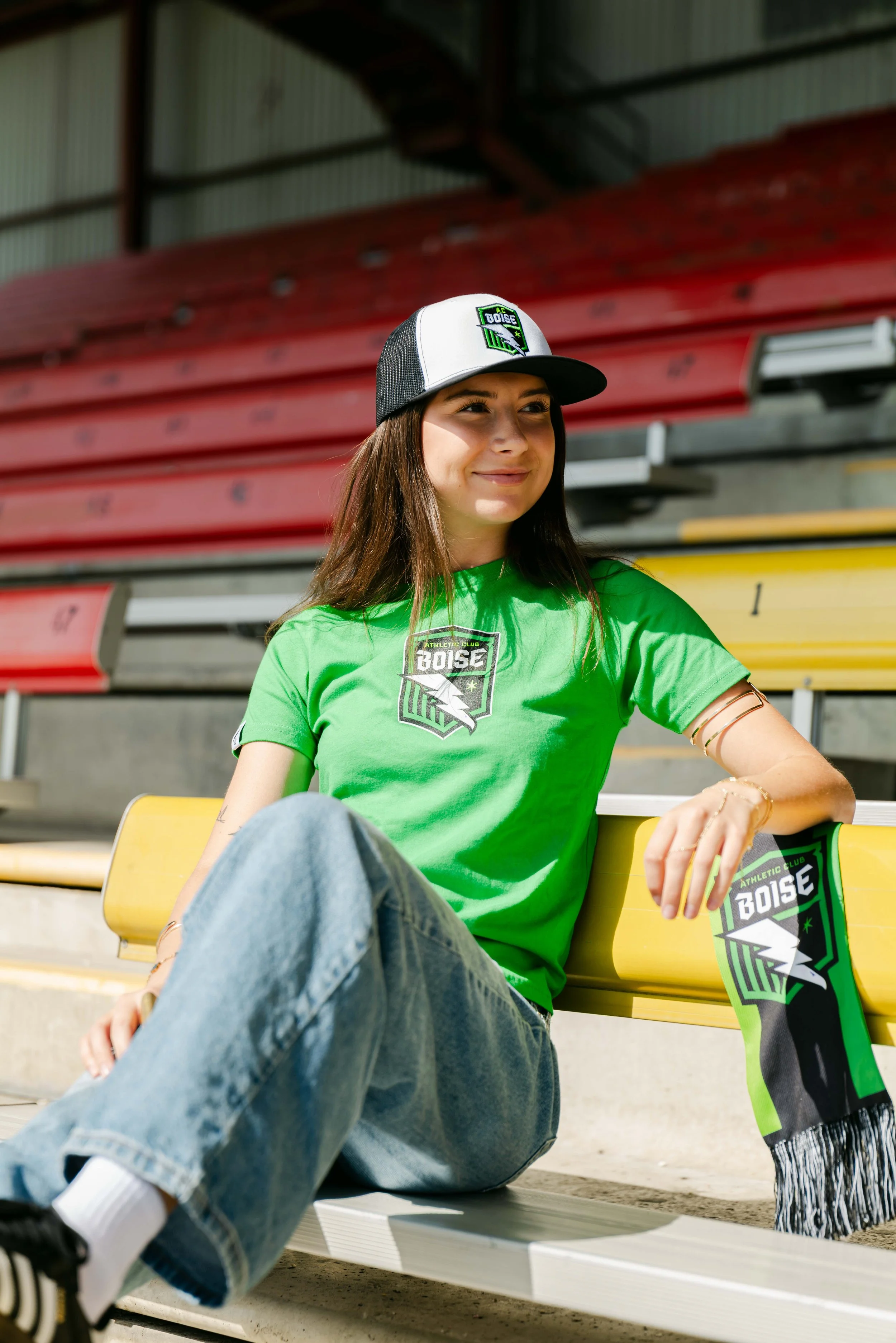
This isn’t about trends—it’s about turning Boise’s grit, warmth, and resilience into something you can wear, wave, and believe in.
Every color has a story. This is Boise’s—reimagined for the future.
The Reveal
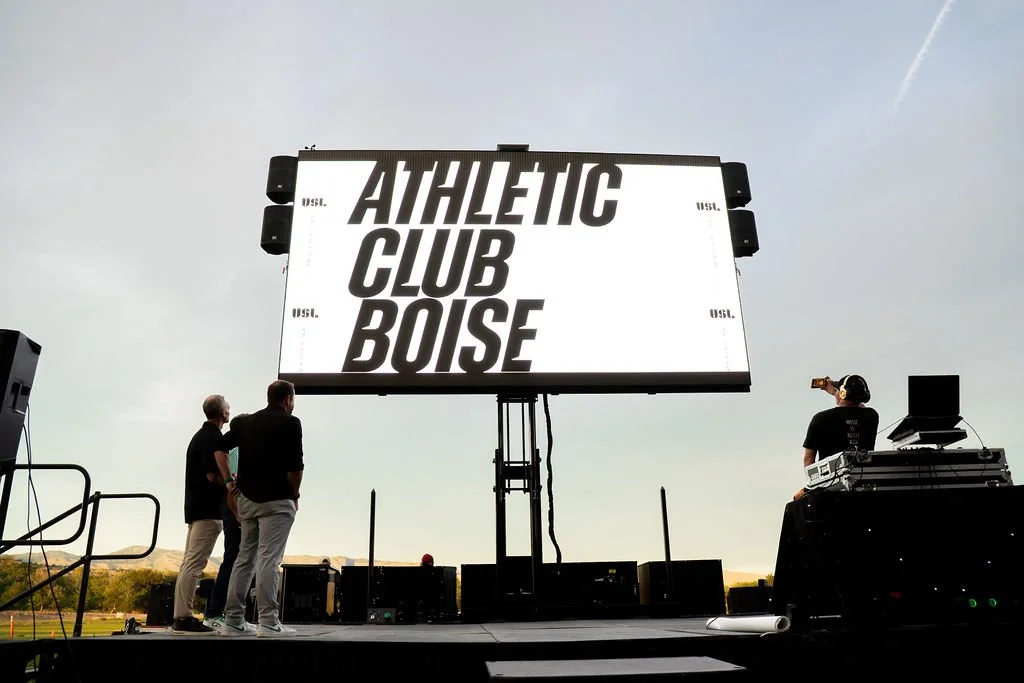
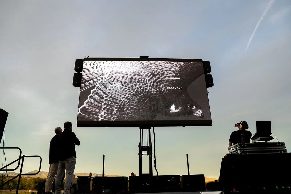
The moment the falcon flew.
The crest reveal wasn’t just a video, it was ignition. In one motion, the falcon took flight. The city didn’t just watch, it felt. This was Boise, reflected back with clarity and claws.
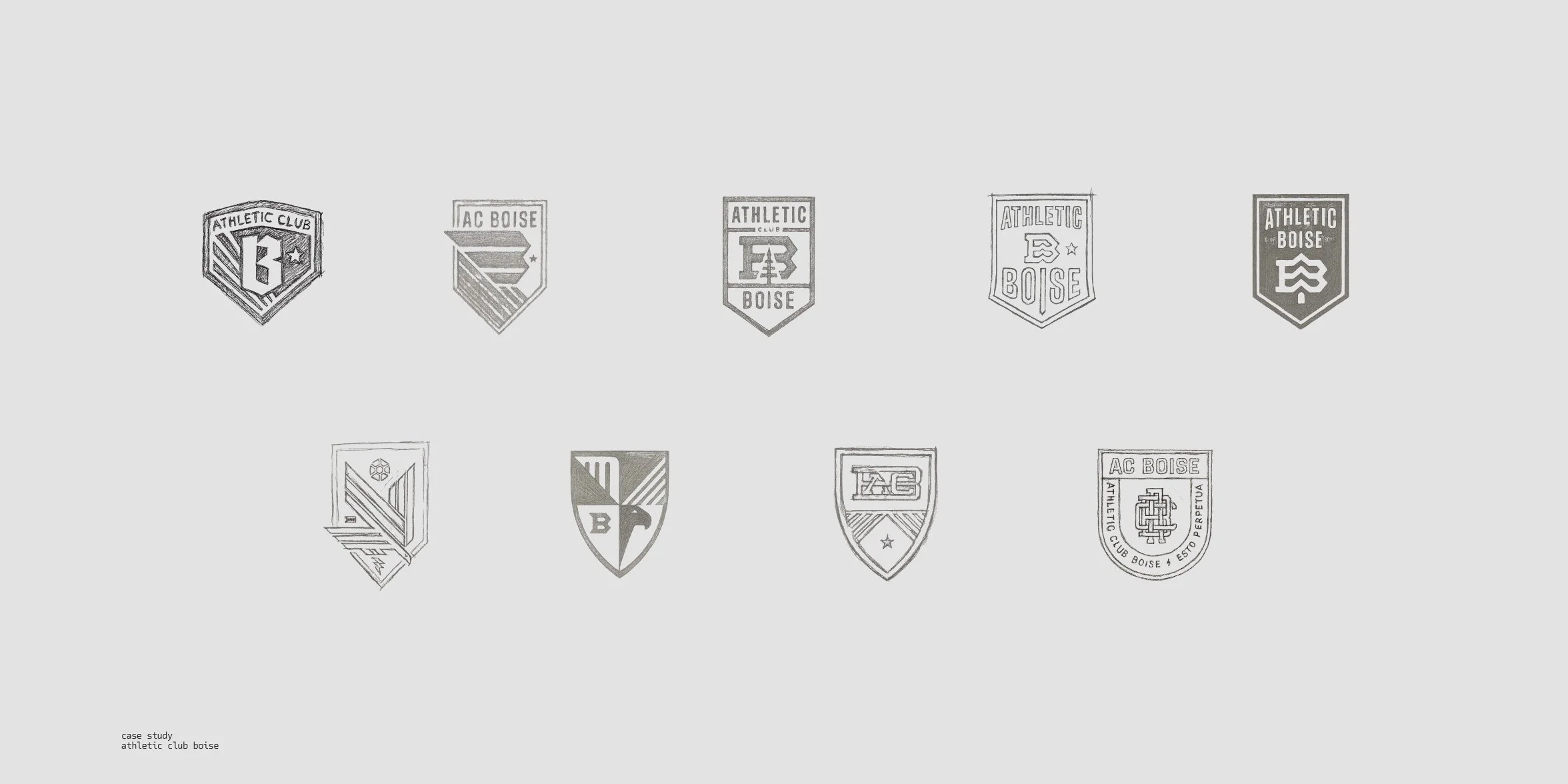
We animated the story of the crest, layer by layer, to show the evolution from concept to civic symbol. It moved from sketch to soul, and sparked a community that had been waiting to see itself represented.
The video didn’t need a stadium to land. It needed belief. And in just a few seconds, that belief took off.
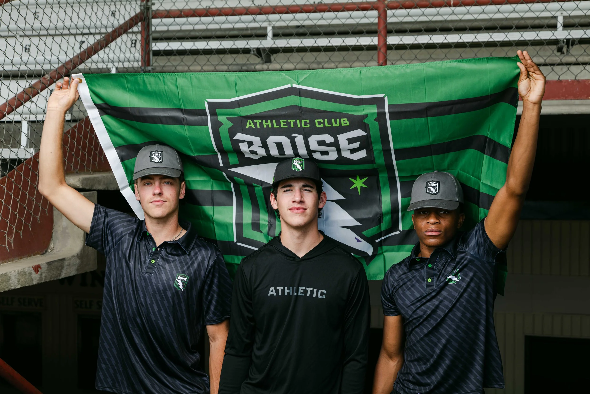
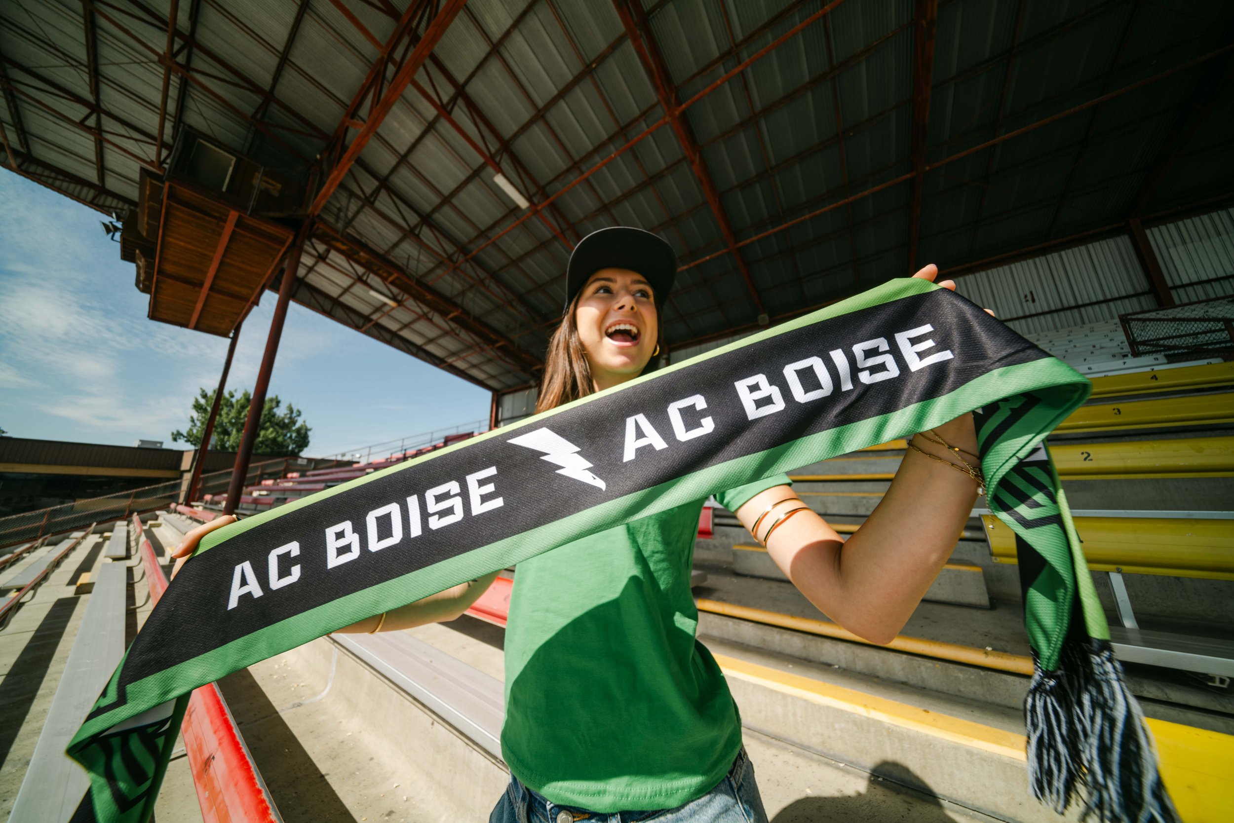
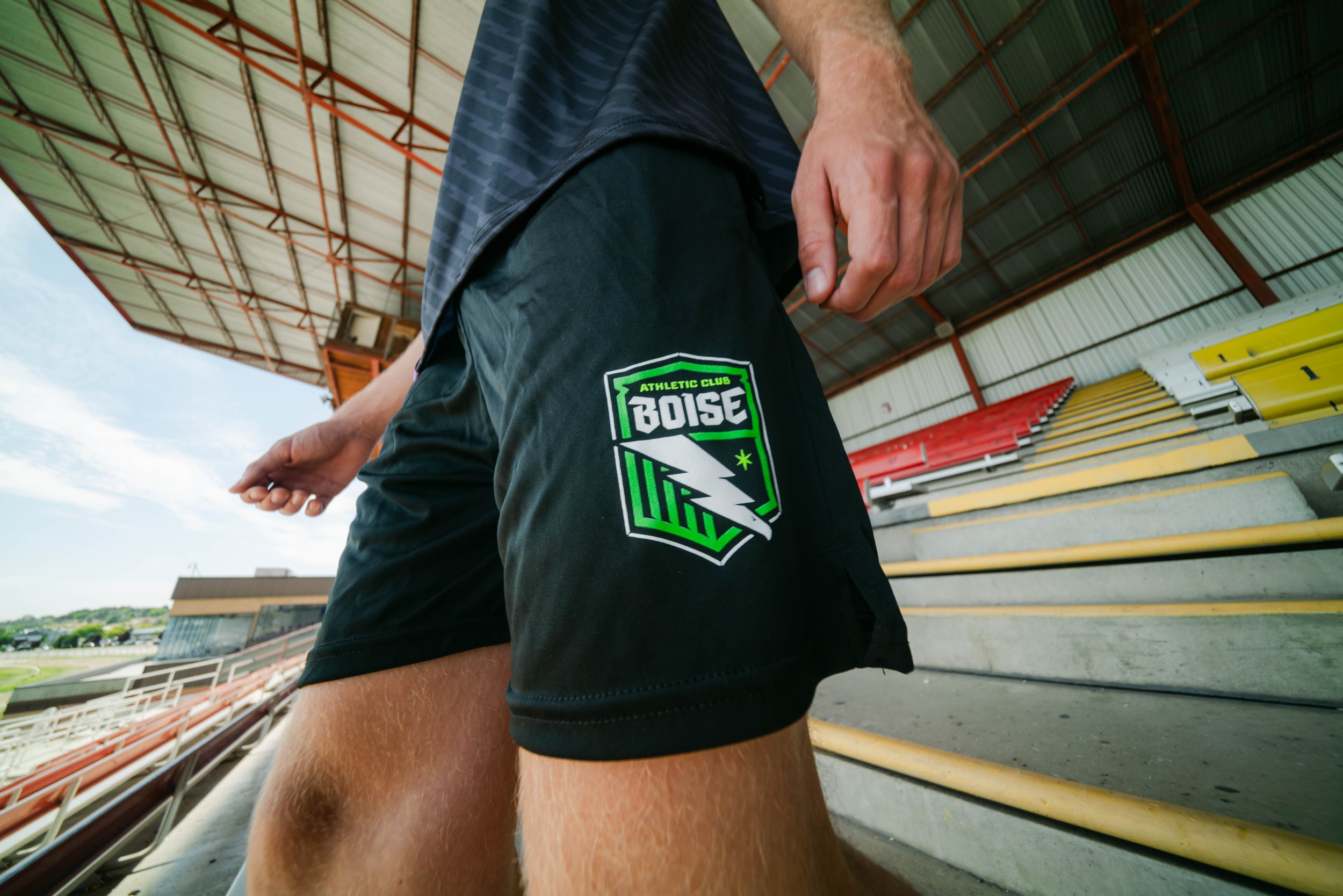
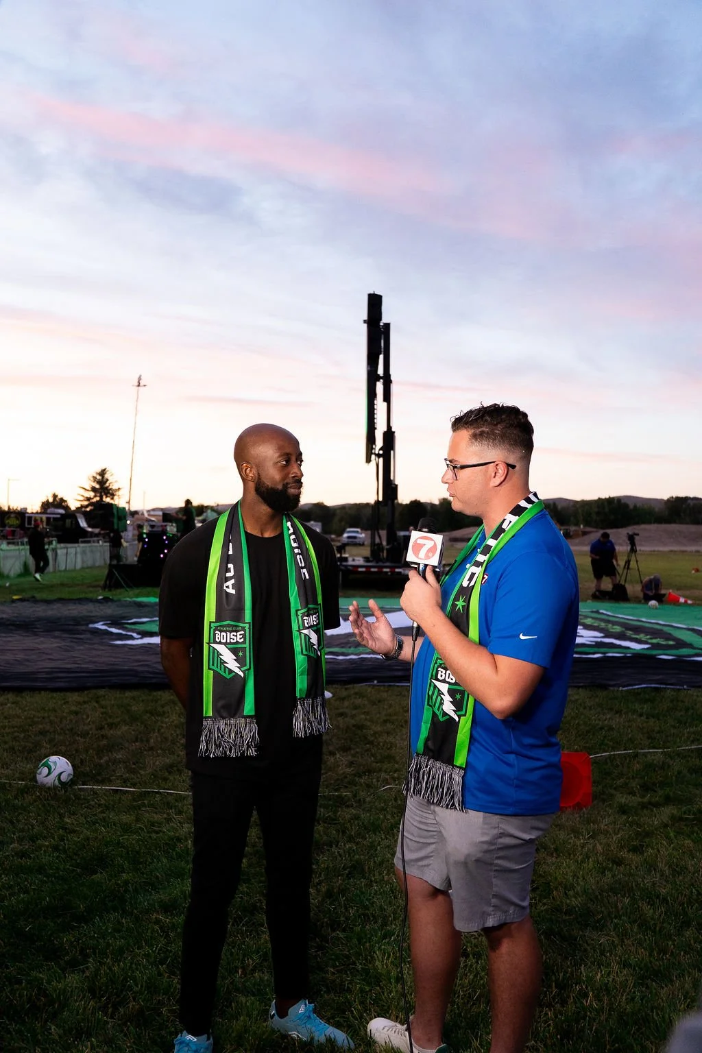
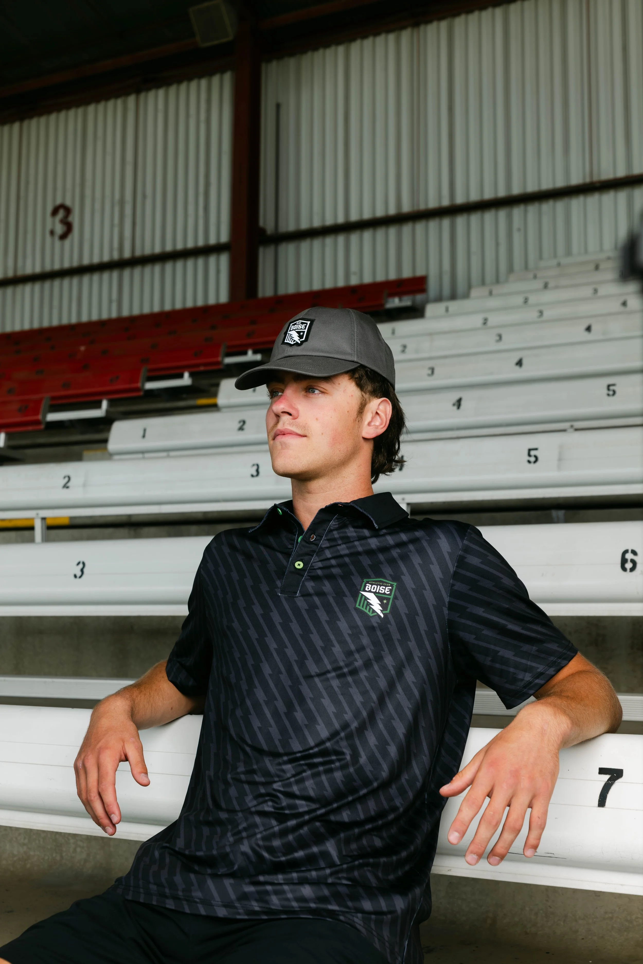
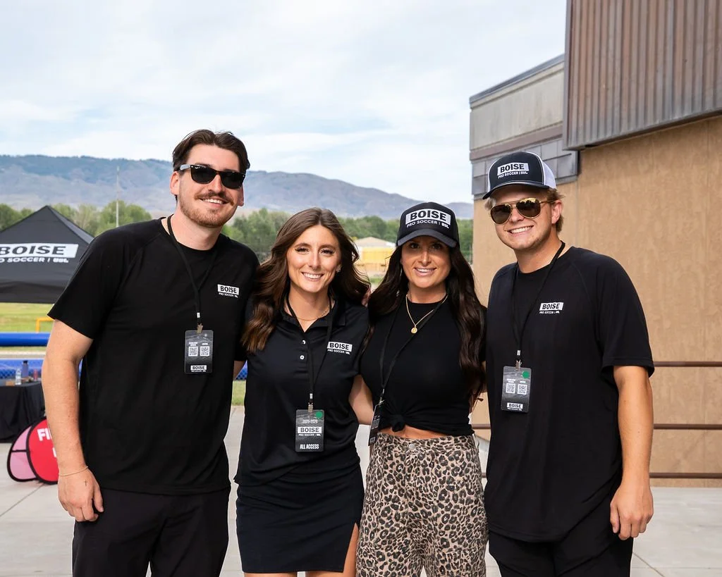
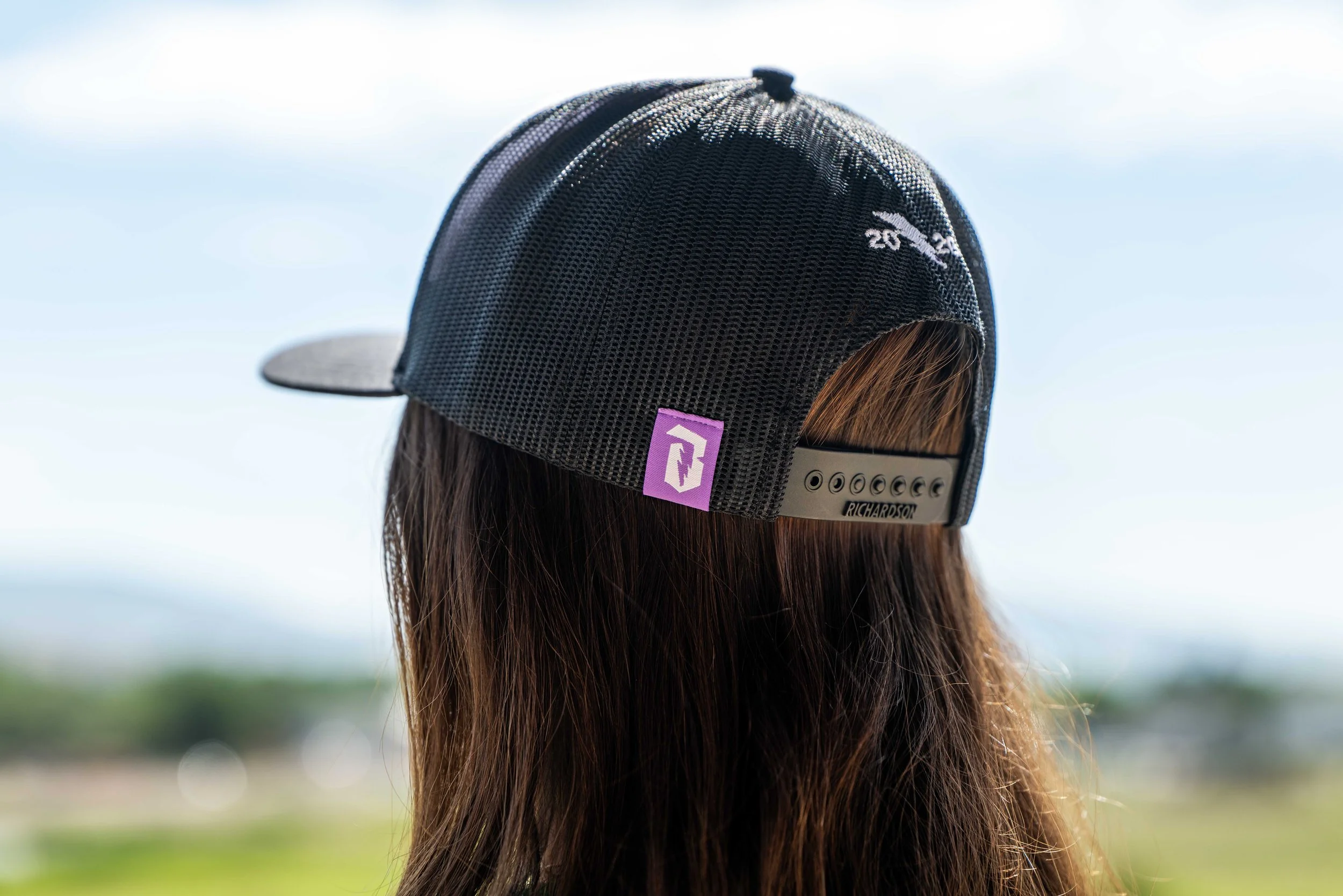
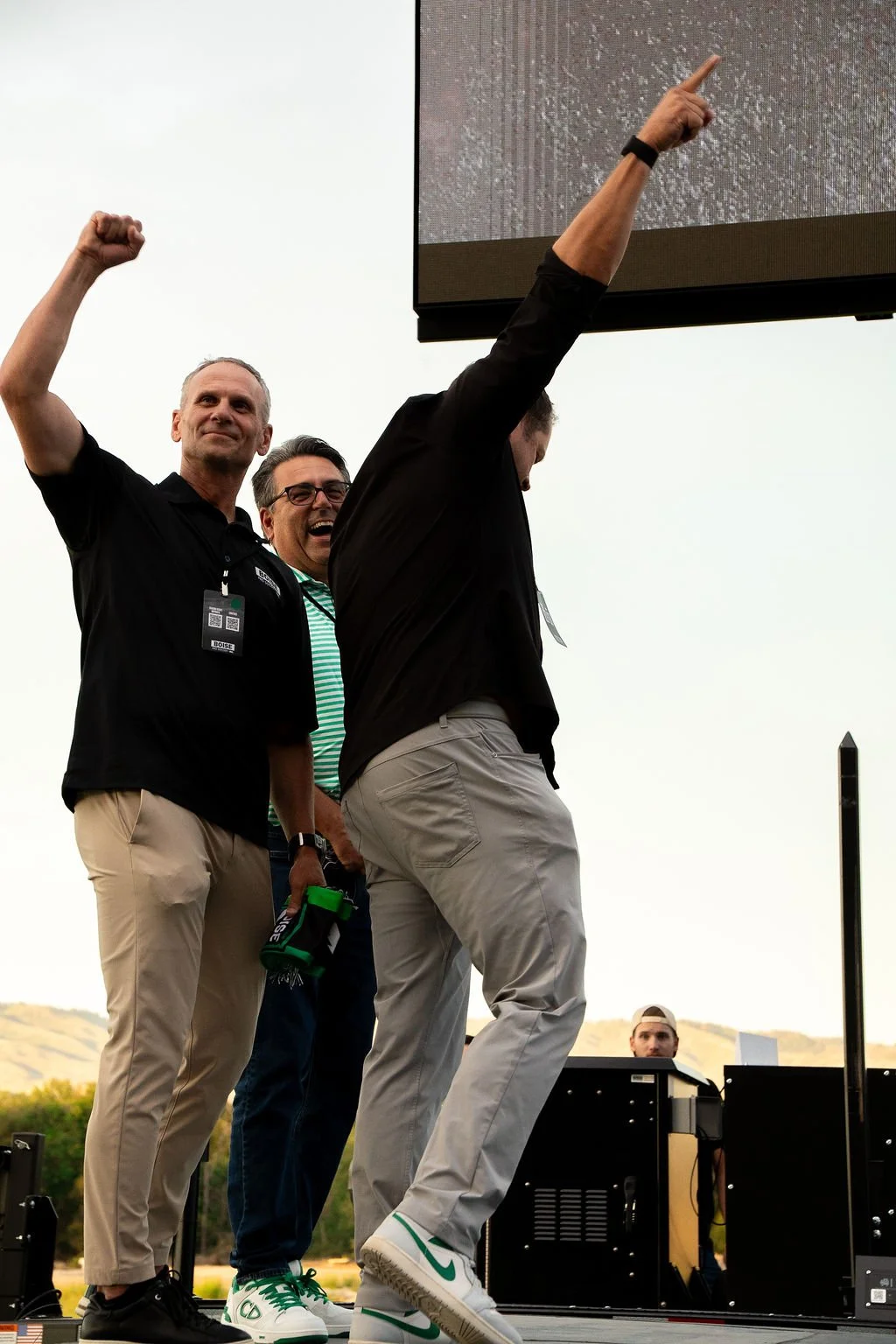
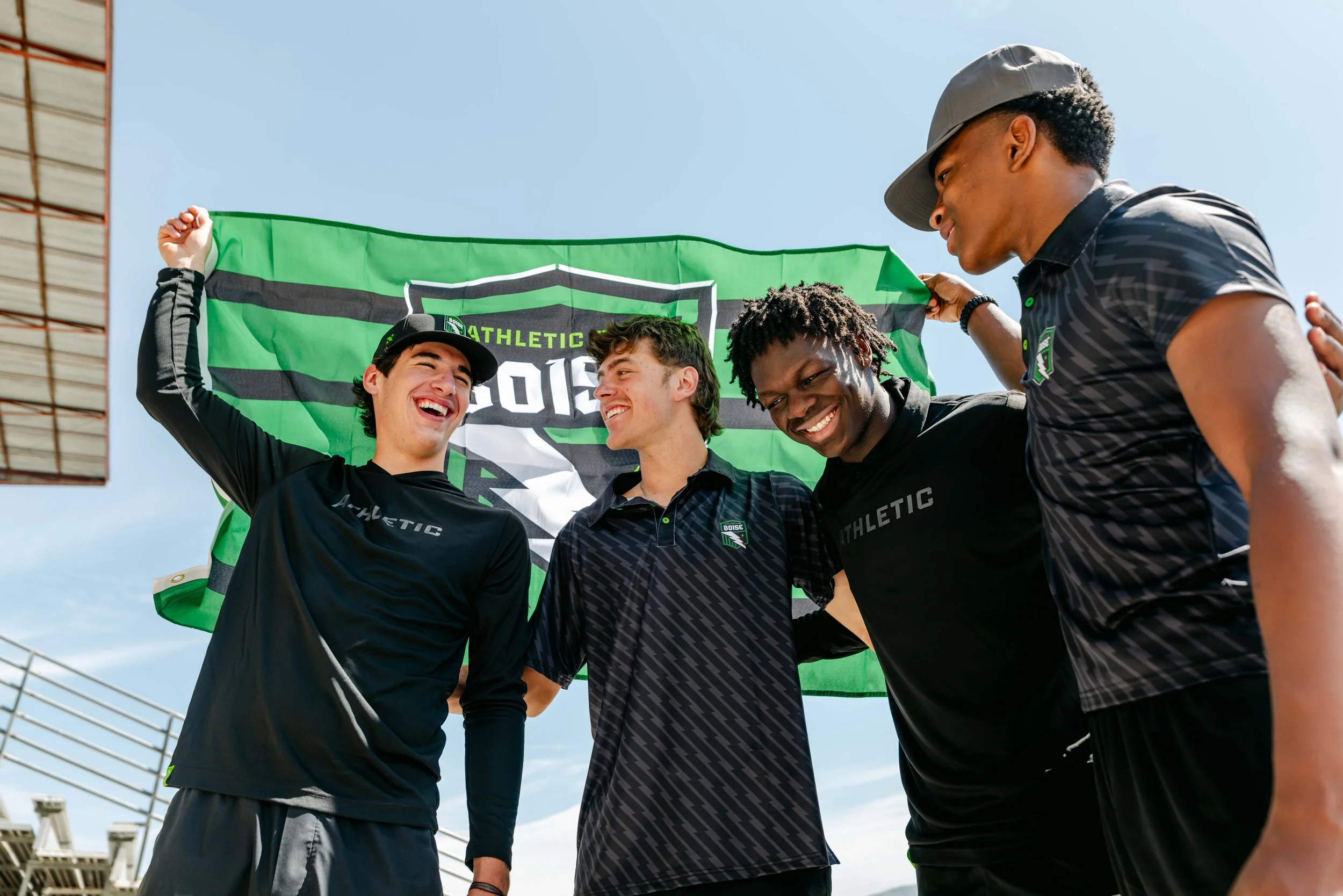
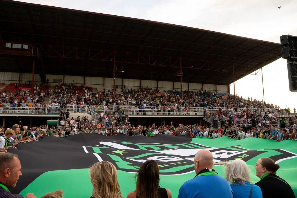
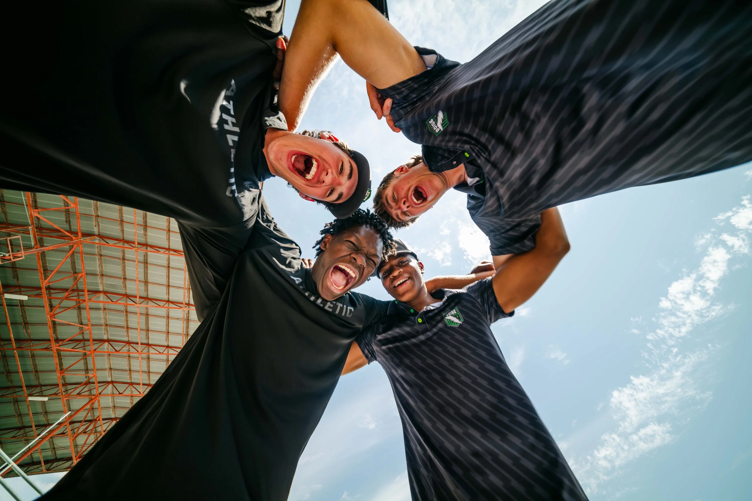
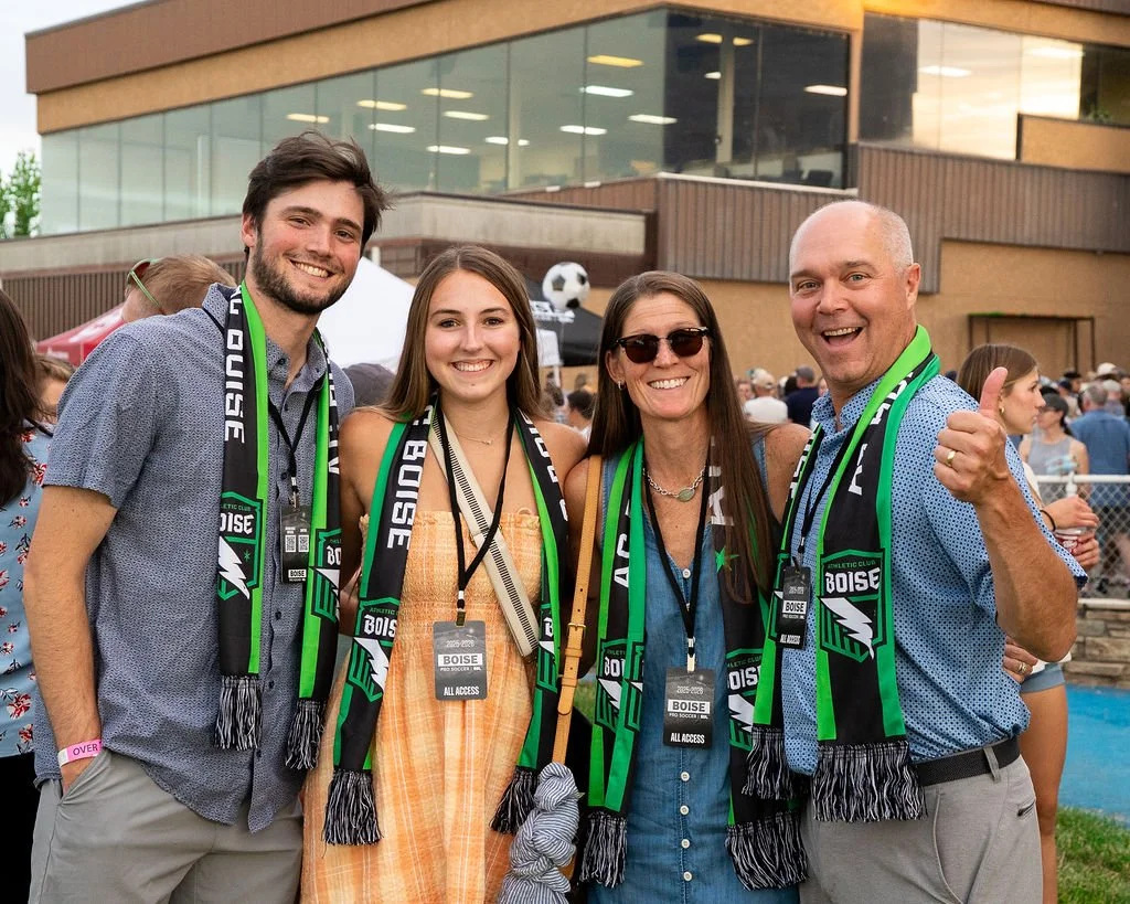
“This is a community asset. This doesn’t belong to me or the other owners, this is our team. It’s an asset that belongs to the people.”
— Brad Stith, CEO & Co-Founder, ACB
“I want to see a stage where you have the grandfather who took his son to Athletic Club Boise games, who is now taking his grandkids with his son… It's just part of everyday life for that family.”
— Kasey Keller, Ownership Group, ACB
When strategy delivers.
12.5M
Earned Media Impressions generated from local and national news outlets.
4000+
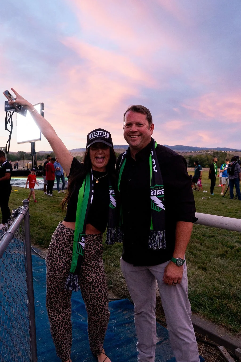
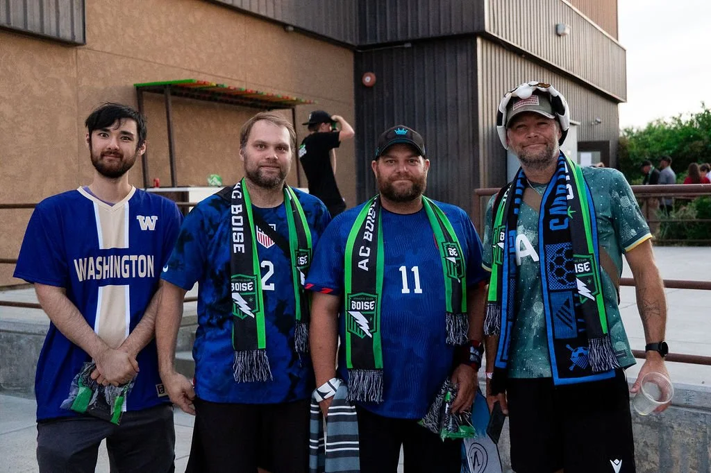
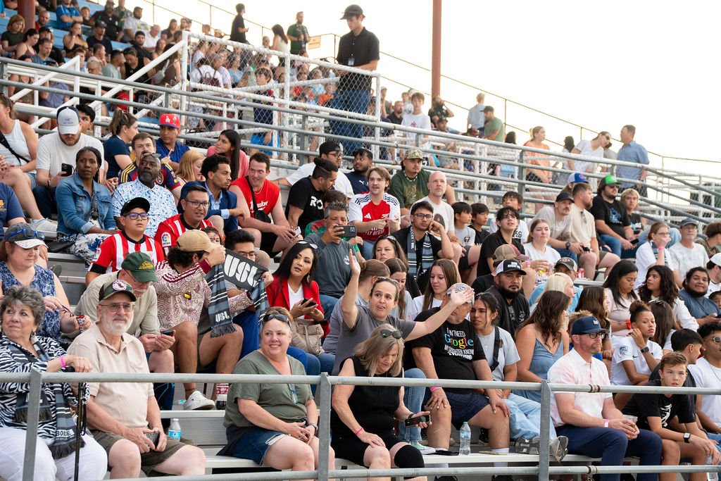
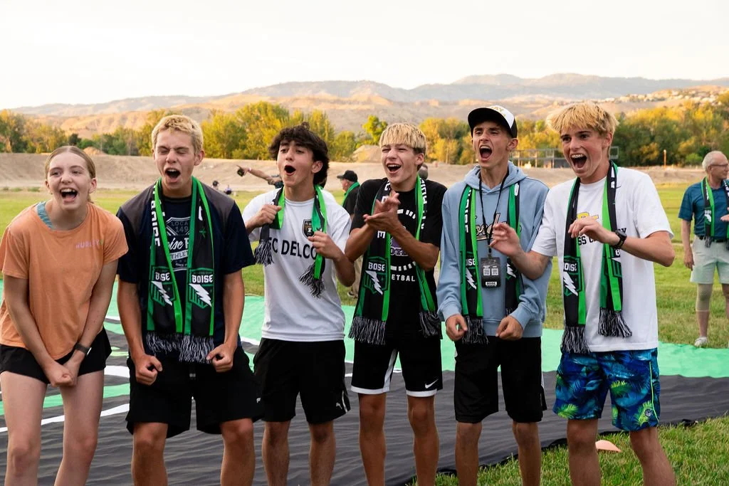
Fans showed up to support the launch of this new brand.
$40K+
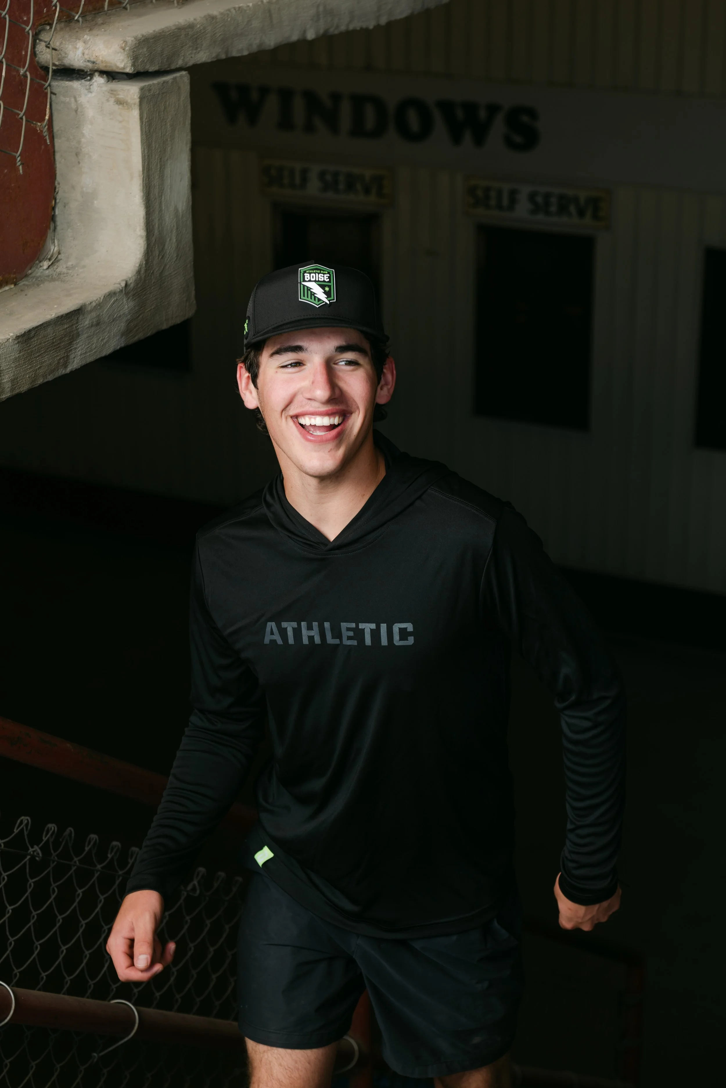
Merch Sales in the first hour after brand launch.
For Athletic Club Boise, we didn’t create a brand—we built belief. From naming to identity to launch, we crafted a system that gave the team instant credibility, connected with fans on day one, and laid the groundwork for future expansion. The result? A brand that feels like it’s always been part of the city, built to grow with the club.
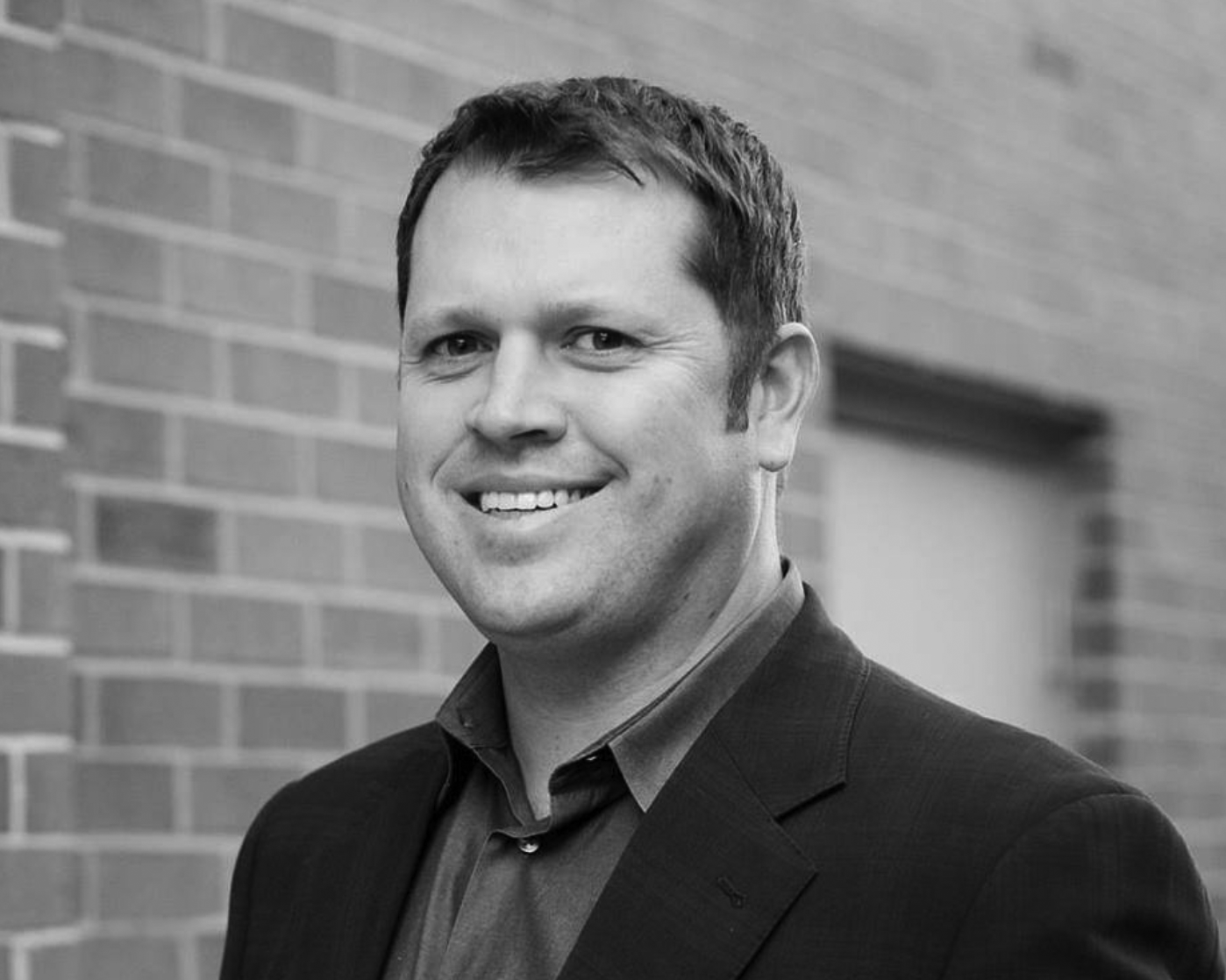
Brad Stith, CEO —
“I’ve worked in pro sports my whole career, and this brand launch felt like we were unveiling a club with 30 years of history. It turned heads across the league. Against nailed it.”